Apart from the making of a good movie, the most important thing in the film industry is being able to sell your production to a wide audience. A movie can be made and undone on the effectiveness of its marketing, regardless of the quality of the film itself. The greatest outcome of a good marketing campaign is when great works of art can come out of it. Movie posters have become popular collectors items over the years, and in some rare cases, can become more famous than the film itself.
Oftentimes, a great movie poster creates an iconic image that not only conveys the film its trying to sell, but can also stand alone as a work of art. I know of many people who will gladly hang a movie poster up in their home or apartment instead of a classic painting. Great artists like Saul Bass and Drew Struzen have dedicated their entire careers to crafting film art, and have left an incredible legacy in their wakes. I have chosen here what I think represent the best of the best. The following are chosen mainly for how well they draw the eye of the consumer in, convey the basic elements of the movie and how well they stand on their own as a work of art.
10.
VERTIGO (1958)
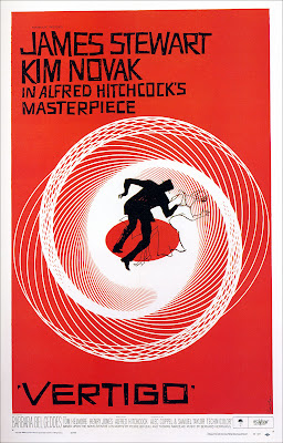
One can’t talk about film art without mentioning the name of Saul Bass. This artistic Renaissance man was the most prolific designer of his time. He designed everything from movie posters, to title designs for a films opening credits (many of the Hitchcock films), to novel covers (James Bond Series), to even corporate logos (like AT&T and United Airlines). Bass’ was a favorite of Alfred Hitchcock, and his artwork is all over a film like Vertigo. The poster above represents Bass at his absolute height, and features some of his most haunting imagery. The spiral at the center immediately draws your attention and gives the observer a sense of falling, which is interpreted well with the silhouetted figures floating within the center. Bass almost always used large blocks of color and sharp geometric shapes to convey an image. The poster for Vertigo stands apart because of how perfectly it ties all of Bass’ many tricks together.
9.
MOON (2009)
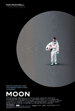
One of the more striking and original posters in recent memory was this image from the brilliant, but sadly under-seen indie film Moon, directed by Duncan Jones. Designed at the All City Media agency in Britain, this poster is a perfect example of the “less is more” approach. The image contains the film’s star, Sam Rockwell, standing on a spherical spiral, against an empty black space. The design seems very influenced by the work of Saul Bass, given the geometric and patterned sphere in the place of an actual Moon surface. The poster is able to very simply convey the film’s theme of isolation, without giving anything away about the plot. And again, the shapes draws your eye in; with the strange patterns that your vision creates when you look at a spiral for a period of time. This poster shows how even a small, quiet film can have an A-quality movie poster.
8.
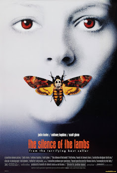
THE SILENCE OF THE LAMBS (1991)
The Silence of the Lambs had a lot of elements that could have easily been exploited in an ad campaign. Although, at the same time, the controversy of the subject matter may have caused the marketing team to stress caution when selling this film. Either way, audiences were treated to the striking image above, which not only presented us with creepy imagery, but also an ambiguous-ness about what it means, which perfectly underscores the fact that this is a mystery film, and not just a horror show. What strikes me is that the designers (BLT Communications) never used the iconic character of Hannibal Lecter in any of the poster art. Instead, we have a ghostly image of star Jodie Foster, with her mouth covered up by a moth with a skull-like pattern on its back. When you watch the film, the moths are hardly a factor in the story at all, and not once do they fly onto Jodie’s mouth. The team behind this poster had the good sense to draw on their own imaginations and create a poster image that instantly drives the viewers curiosity, and appeal to their twisted sides, even when it’s detached ultimately from what the film is about. In the end, getting the mood right is what matters.
7.
CASABLANCA (1943)
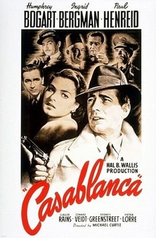
This is the quintessential classic movie poster. It does what every good ad from the era should do, and put its stars front and center. The poster is appealing because of the way the different characters are collaged together, with their eyes all meeting to an axis point in the center. The titles also do a nice job of selling the stars as well; with the names Bogart, Bergman, and Henreid in big, bold letters. The title of the film is boldly highlighted in red lettering, which instantly grabs the attention of the viewer. Back in the old studio system, the stars meant everything when it came to selling a film, and this poster presents that idea with great style. I particularly like how Bogart has his gun out and ready, obviously drawing upon his already strong reputation from the crime films he had done in the past. The poster is packed, but not cluttered, giving each character a clear mugshot on the poster; though Bogie is given preference to be sure. This poster is often the inspiration for many retro posters for period films we see today (i.e. Captain America), which shows a good classic design never goes away.
6.
THE DARK KNIGHT (2008) – JOKER ONE SHEET
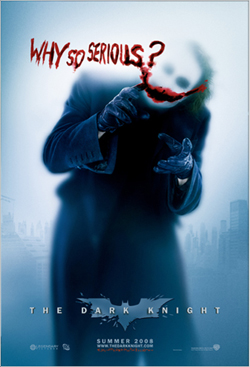
Comic book films often inspire some great artwork for their ad campaigns. Sometimes, the posters can simulate a feeling of a comic book come to life better than the movie itself. The Dark Knight Trilogy from Christopher Nolan took it’s source material in a particularly gritty direction, especially when it came to the characters. In the middle film, The Dark Knight (2008), audiences were treated to the return of Batman’s arch-nemesis, The Joker, and it is clear that the marketing for the film wanted to give this iconic character his due. There was a lot of Joker related artwork made to sell this film, but the one above really stuck out. It’s a disturbing, ghostly image of the Joker, standing in front of a window glass and writing the phrase “Why So Serious” out in what appears to be blood, complete with a bloody Joker grin. This image, also from BLT Communications, sets up this new take on the Joker perfectly, being both chilling and alluring at the same time. This poster took on a whole different resonance only weeks after its release, due to the passing of Heath Ledger, the actor who played the Joker in the film. The fact that actor is obscured within a ghostly mist in the image, makes the artwork feel all the more haunting.
5.
JAWS (1975)
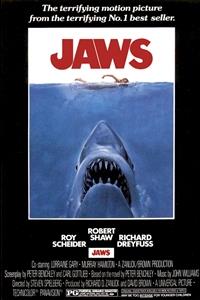
Jaws marked the beginning of the age of Blockbusters, and that was in large part due to the inventiveness of its advertising. Artist Roger Kastel was commissioned to create an image that would perfectly sell a troubled movie production about the hunting of a Great White Shark. What he came up with is the now iconic image of a female swimmer on the water surface, with Jaws the Shark lurking and ready to attack right underneath. It’s a frightening image that tells a story all on its own, without any context with the movie itself. In the actual movie, the shark doesn’t actually appear until halfway through, but that didn’t matter in the end. People’s imaginations were already piqued by the image on the poster and they were willing to sit through the first half, just so that they could see the Shark once he finally appeared. In many ways, the poster image helped to save the filmmakers who were worried that there weren’t enough scenes that showed the actual shark, due to technical problems. The audiences filled in all the off-screen mayhem with their imaginations, knowing what kind of creature was causing all of it and in the end, the shark did work. Just not the one on the screen.
4.
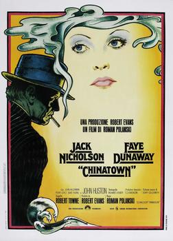
CHINATOWN (1974)
Being both a retro flashback and a sleek work of modern art itself, the poster for Chinatown is almost a great metaphor for the movie that it’s selling. The movie, directed by Roman Polanski, is a brilliant neo-noir that is clearly inspired by the era that it’s trying to recreate, the 1930’s, but done with the styles and and the cynicism that were a part of the era of the 1970’s. In the poster image, painted by artist Jim Pearsall, we see that mixing of two eras in a striking and beautiful way. The image of Jack Nicholson, playing Detective Jake Gittes, looks like its been pulled off the cover of some pulp crime novel from the height of the 30’s. Above that, we get a trail of smoke that frames the ghostly image of actress Faye Dunaway’s face. This part of the image feels very psychedelic in nature, which is representative of the period in which this film is made. Like the movie, the poster is both very classical and very modern; using the best of both styles to create an instantly striking image. The colors also balance well off each other, with the sickly yellows, greens, and blues. It’s a beautifully layered image that reveals a lot more than what’s on the surface.
3.
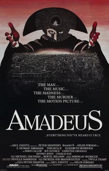
AMADEUS (1984)
This is one of the best examples of movie posters as an art-form. Inspired by the original stage production art, the movie’s ads kept the same iconography, but embellished it more, creating the image above. I have always been struck by the image of the masked figure in this poster. The piercing eyes instantly draws your eyes in, like a macabre Renaissance portrait. In addition, the tri-fold hat it’s wearing looks like a crown, with the performer surrounded by stars in the center looking like a radiant jewel on top of it. And the figure holds out its arms, like it’s trying to embrace you and welcome you in. I was fascinated by this image for years before I even saw the film. Nothing about this image told me that it was about the story of Mozart, and that the mysterious figure is a representation of his father, but I was still fascinated none-the-less. Thankfully, the film lived up to the promise. The poster is a great example of transcending the story it’s trying to tell. Yes, the image does represent a key part of the film, but even without that, it is still intriguing to the eye. It does what great art should do; make the observer want to look deeper into it.
2.
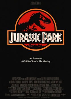
JURASSIC PARK (1993)
This is the best example of simplicity in poster art. Steven Spielberg’s thriller showcased some of the most remarkable visual effects ever put on screen, and featured some of the most realistic looking dinosaurs anyone had ever seen. Yet, the marketing for the film avoided showing all that; at least in the one-sheets. In the poster art, we get nothing but the logo used in the film for the titular park, set against a black background, with the phrase, “An Adventure 65 Million Years in the Making” below. And in the end, that’s all we really need. The image of the logo alone perfectly conveys what the movie is about; an attempt by man to control nature and recreate a race of extinct creatures, merely for the purpose of amusement and financial gain. In a way, the poster is almost mocking the idea of targeted marketing, with the innocuous design of a corporate logo, while at the same time trying to market the film. The designers knew about the power of logo design and used it perfectly here as a way of marketing the film without revealing too much. Simple and effective, and instantly recognizable; all of which makes a great poster.
1.
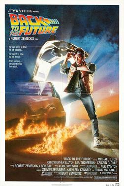
BACK TO THE FUTURE (1985)
Drew Struzen is the not a household name, but he should be. The man has created some of the most iconic poster art in the last 30 or more years. He’s the guy responsible for the poster art on all 4 Indiana Jones films, along with several other Spielberg blockbusters. He’s also done poster art for the Star Wars prequels and movies like Blade Runner, The Goonies, Harry Potter, and The Muppet Movie just to name a few. With his hand-painted artwork, Struzen has the remarkable ability to not only convey the elements of a movie, but to also make it feel as big as possible, even if the movie is not as epic as he’s portraying it.
What I think best exemplifies Struzen’s style, and what also makes it the best film poster of all, is the one above for Back to the Future. The movie at it’s most basic level is a Sci-fi comedy, done on a modest budget with a solid script. In the hand’s of Drew Struzen, we’re delivered an image that seems to convey a great Sci-fi adventure, just by the way the poster is composed with it’s coloring and staging. Struzen took the image of Marty McFly and the DeLorean time machine and embellished it with a glowing aura coming from within the car itself. Add to that, the fire tracks on the ground and the smoke in the sky and we get a sense just by looking at the image that something amazing has happened. This poster is actually one of Struzen’s simpler designs, which makes it a standout. Struzen’s art is often imitated, but I’ve rarely seen one out there copy this. It’s a great example of simple design that gets the point across while at the same time making it seem larger than life. This is a poster that you’ll find in many film geek collections, and with good cause. It’s represents Struzen at his best and is the best movie poster ever created.
That’s my list of the Top Ten film posters of all time. I’m sure this list could change over time whenever there are more great ad campaigns in the future. For those reading this, I would gladly like to hear what you think are the best movie posters ever made. I will also gladly hear any suggestions for future top ten lists. I may do a worst 10 poster list someday, but it may be a while, given that there are so many bad ones out there. Anyway, thank you for reading.