Tinseltown Throwdown – Armageddon vs. Deep Impact

armageddon deep impact

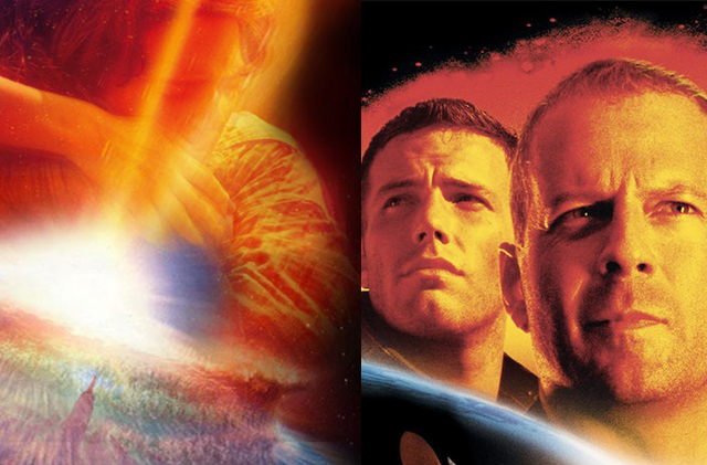
Hollywood is in the not so enviable position of having to fill every week of the year with big, new and expensive movies.  Not all of them are going to be great, but usually the big studios can ride upon the success of one huge hit to help with the financing of all the others.  Usually, these kinds of movies are the tentpoles of each movie season and they are the ones that movie companies place all their resources into.  It’s no wonder why huge action films get more publicity and exposure than the small indie flicks released along side them as a result.  But, in order for the tentpoles to do well each and every year, they must be able to connect with what the audiences are in the mood for, which can change unexpectedly.  Unfortunately for Hollywood, it means that they must rely heavily on fresh new ideas for films, something that they sadly don’t have all the time.  When ideas are sparse in the industry, filmmakers then resort to playing it safe, relying on the tried and true genre flicks.  Now, this strategy works well sometimes, but resorting to old genre standbys sometimes results in making movies that are less original, and more like every other film out there.  And sometimes, Hollywood will even run the risk of not only having an idea that’s already been done, but is also being done at the same time by someone else.  Thus we get what is commonly known as the “copycat” pictures, where two different studios will have competing movies in development with almost the exact same premise. Sometimes there will be a space in between their releases, but there are other times when both movies end up in direct competition with each other, which is what happened in 1998 with the big summer disaster movies Armageddon and Deep Impact.

The releases of Armageddon and Deep Impact came out at an interesting time because it was at a point of ferocious contention between two different studios.  Deep Impact was released by the newly formed Dreamworks Pictures, a joint venture created by filmmaker Steven Spielberg, music publisher David Geffen, and exiled animation producer Jeffrey Katzenberg.  Katzenberg only years prior had been unceremoniously let go by the Walt Disney Company, then under the leadership of Michael Eisner, and part of the formation of Dreamworks came as a direct response to the very public feud between the two studio heads.  Some of that resulting tension manifested itself over the next few years as each studio tried to top each other with their upcoming projects.  After the success of Toy Story (1995), Dreamworks soon put into production their own gritty toys coming to life movie called Small Soldiers (1998), directed by Joe Dante.  After Pixar announced their next film would be A Bug’s Life (1998), Dreamworks quickly announced their own film to launch their animation wing called Antz (1998).  To answer this, after Dreamworks announced their new disaster tentpole, Deep Impact, Disney owned Touchstone Pictures announced that they would have their own doomsday action flick, Armageddon.  For these few years, both Disney and Dreamworks were trading serious blows, and the releases of these two movies represented one of the most contentious battles in the war.  Coming out of battle of egos like this, it’s interesting to see how the two movies measure up against one another, which is what I’m going to look at with this article, and see if there were any winners in this cinematic war, or just all losers.

armageddon couple

“I’m leaving on a Jet Plane.”

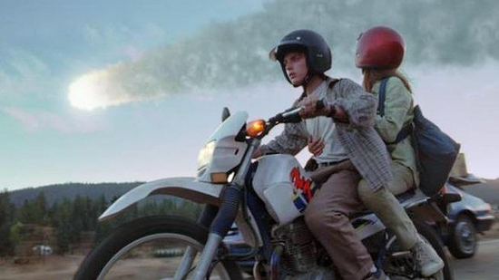
First of all, it should be stated that neither film is any good.  They’re both perfect examples of the dumb action tentpole that Hollywood was fond of in the late 90’s, when CGI opened up the possibilities of the medium.  When the style trumps the substance of the picture, all that you’re left with to the define each movie is the premise, and for both of these movies, it is almost exactly the same story.  A giant celestial object is heading for a collision with the Earth, capable of wiping out all life on the planet.  The fate of mankind rests on the success of risky manned space missions, aimed at intercepting the objects and destroying them with nuclear bombs before time runs out.  That’s pretty much the plot of both movies right there in a nutshell.  Sure, there are subplots throughout, but does anybody really remember them, or care?  All people remember from Deep Impact and Armageddon is the scenes where parts of the earth are nearly destroyed by these massive objects (a comet in Impact, and an asteroid in Armageddon).  But, are any of these films less bad then the other.  The most interesting comparison made about them is that they are flawed, but in very different ways, particularly from a film-making standpoint.  Deep Impact’s main flaw is that it takes itself way too seriously, which comes across as ridiculous once the film tries to portray this over the top premise realistically.  Armageddon on the other hand is more playful with the premise, but is way more excessive; which is no surprise given who made it.  Some of these flaws are definitely attributable to the demands put on them by the studios, but certainly the decisions made by the filmmakers also contribute to the big differences between the movies.

That’s the thing that has favored Armageddon now 17 years later.  It has the distinction of being one of the earliest movies from the King of Excess, Michael Bay.   Bay up until that point had made a name for himself as a highly regarded and stylish commercial director, which he then transitioned into a career as an action filmmaker.  He found success with his first movie Bad Boys (1995), and even more with what I would consider his best movie to date, The Rock (1996).  Coming off back to back hits, Touchstone and Disney trusted him with this huge production and the result was a movie that indeed catapulted Bay’s status as a filmmaker, but also began his decline as a quality storyteller.  Honestly, you can pinpoint the origins to all the problems with Michael Bay’s style from this movie.  The lack of restraint, the excessive running times, the macho bravado of his characters, and his just hyper-kinetic and distracting editing style.  By contrast, Deep Impact is much more subdued, under the direction of Mimi Leder, but that’s also not such a good thing.  Mimi Leder was, and continues to be, an accomplished television director, but her career as a big screen filmmaker unfortunately was short-lived, thanks in no small part to the lukewarm response to this movie.  It was a cool move on Dreamworks part to entrust a big budget production to a female director, something which hadn’t happened before in Hollywood up until then, but Leder’s inexperience unfortunately sinks the production in the end.  Leder doesn’t have a distinctive style, so the look of Deep Impact is very plain and uninspired.  For all the awful, excessive choices made by Bay in his film, like the pointless strip club scene or the way too long space station rendezvous, at least they leave an impact on the viewer.  Deep Impact is sadly the more forgettable of the two.

deep impact comet

“Well, look on the bright side.  We’ll all have high schools named after us.”

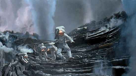
If there is one thing that does work in Deep Impact‘s favor, it would actually be how it uses it’s story.  By taking the more subtle approach, the movie does help to audience garner more sympathy for the characters.  Not only that, but it chooses to place less emphasis on the mission itself, helping to make the scenes where the astronauts make contact with the comet all the more interesting.  Armageddon makes the space mission almost 70% of the movie’s running time, which after a while can become grating on an audience as Michael Bay doesn’t give us any time to rest between the big action sequences.  Now, that’s fine for a movie to do if it’s paced well enough, but Armageddon is over 2 1/2 hours long, and by the end of that audiences are exhausted with the sensory overload that the movie presents.  Deep Impact is more of a slow build, which can be boring at times, but it makes the big action set pieces more worth it in the end.  The landing on the comet is an especially impressive sequence, and is made all the more impressive today after the recent landing of the Rosetta space probe, which sent back pictures of a terrain not unlike the one seen in the movie.  Deep Impact also tells a bigger story, showing the lives of many characters both on the ground and in outer space, and does so within a nice compact 2 hour run time.  Unfortunately, most of the subplots of in Deep Impact are really boring, but the variety is what helps to make it a more enriching story-line compared to Armageddon’s relentless action.

“Look, we’ve got front row tickets to the end of the Earth.”

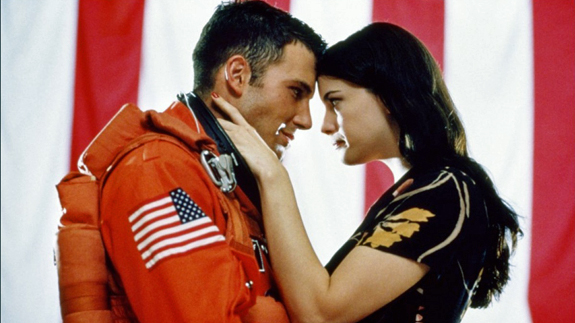
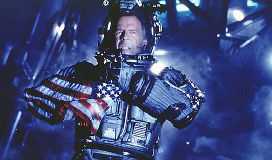
Another distinctive difference between the two movies would also be the cast.  Dreamworks clearly wanted Deep Impact to be a special event movie and that’s represented by the stellar, all star line-up of actors they assembled.  It’s actually quite impressive when you look at all the names on the cast list; Robert Duvall, Elijah Wood, James Cromwell, Jon Favreau, Morgan Freeman, and even unlikely participants like Maximillain Schell and Vanessa Redgrave.  With a cast like that, it’s a shame that they are wasted with such a bland script.  Armageddon on the other hand, you could say, is filled with all the usual suspects.  Action main stay Bruce Willis seems like the natural choice for the lead, and he’s backed up by many notable character actors like Will Patton, Peter Stormare, and William Fichtner.  Sure, there are some award winning actors thrown into the mix, like Steve Buscemi and Billy Bob Thornton, but everyone is operating at pretty much the same low level in this movie, which is to say that no one is giving a damn in their performance.  Now, that can be a plus as it gives some of the more eccentric actors like Buscemi some room to improvise, but otherwise it leads to stilted performances from the other less talented actors.  Chief among the worst performances in the movie are the two actors in the love story; Ben Affleck and Liv Tyler.  This was at a time long before Argo and Gone Girl would elevate Affleck’s acting chops, and his performance here is absolutely laughable.  Couple that with zero chemistry with Tyler, and you’ve got the makings of one of the worst romantic subplots in action movie history.  By contrast, even though Deep Impact‘s characters are boring, at least the actors try their best to make the performances resonate.  Hell, that whole cliche of having the President of the United States be African-American in these disaster movies stems from Morgan Freeman’s stand out performance here.  They may be working with nothing, but at least they do the work.

But, what does elevate Armageddon beyond it’s rival, and has kept it fresh in people’s minds since it’s release is in it’s visual effects.  Both Armageddon and Deep Impact portray global destruction on an ambitious scale.  Unfortunately for Impact, it has become a victim of it’s own adherence to a more realistic style.  Both movies were made in the early days of CGI in film-making, at a time when the industry was still trying to feel out all the different avenues that they could go.  Movies like Twister and Independence Day (both 1996) showed that you could indeed make mass destruction look real on film, and just a year prior, James Cameron’s Titanic (1997) showed that CGI could even put the audience right in the middle of the chaos seamlessly.  But, at the same time, what looked cutting edge in the late 90’s unfortunately can seem dated today, especially if it’s presented unmasked without a distinctive style.  Such is the case with Deep Impact.  Though the comet surface scene does hold up, thanks to the help of hand crafted sets, the actual destruction scene at the end is painfully dated.  The exploding comet and ensuing tidal wave have an unfortunate cartoonish look when seen today, which spoils some of it’s impact it has (no pun intended).  In a way, that’s why Armageddon is helped by the excess of Michael Bay.  His very eccentric style helps to mask the dated CGI and make it less distracting.  Really, it’s everything else in the movie that proves distracting, and the visual effects are just impressive enough to make the action scenes work.  I actually like how the asteroid itself is not realistic by any means, and is almost alien in design, with it’s jagged and dark green terrain, making it a much more interesting setting.  It’s not the most impressive CGI ever done, but Armageddon looks less dated thanks to it’s director’s distinctive style, which has changed little over the years, for good and bad.  Deep Impact unfortunately is now relegated to being a product of it’s time purely by it’s own limitations.

deep impact cycle

“The waters receded.  Cities fall, but they are rebuilt.  And heroes die, but they are remembered.”

When the movies are as deeply flawed as these two, it’s hard to see how any can be considered better than the other.  If I were to choose between the two, I would give the slight edge to Armageddon, just because it sticks more distinctly in my mind, even though it’s mostly because of just how notorious it is.  Deep Impact, despite a capable cast and noble intentions, just falls flat by comparison, not leaving a single impression on me in these last 17 years.  Even after re-watching it, I’m still struggling to remember exactly what happened in the plot.  I think the only reason both of these movies continue to be talked about in the same breath today is because of the once contentious rivalry between two studios.  Things have changed dramatically since then.  Eisner left Disney in the mid 2000’s and the studio no longer competes heavily with Dreamworks Pictures.  In fact, Dreamworks had it’s own schism a few years back when Jeffrey Katzenberg split his animation wing off from it’s parent company and made it independent.  The remaining Spielberg and Geffen wings of Dreamworks ironically teamed up with Disney after this and are now partnering with Touchstone, the distributor that they were once in direct competition with.  For these two movies, it represents probably the most extreme case of two competing “copycat” films in the marketplace and are probably more distinctive as being weapons in this little skirmish rather than as stand out films on their own.  Still, they weren’t the first time Hollywood placed two like-minded films into competition, nor were they the last.  But, even though the fight is interesting to observe, it’s clear that the battle was a losing one for both ends.

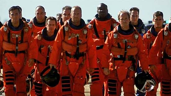
armageddon walk

“Get off…the nuclear…warhead…NOW!!”
Inside Out – Review

inside out

There’s few other movie companies with a track record like Pixar Studios.  Groundbreaking and consistently successful at the box office, Pixar has developed into a brand both admired and envied.  Parent company Disney certainly knew what they were doing when they acquired the studio back in 2005, but their partnership goes back long before even that.  Starting with the phenomenon that was Toy Story (1995), Pixar and Disney have continued their win streak for 20 years strong, winning multiple awards and continually breaking box office records in the animated category.  But, even with the hot streak that Pixar has had, it’s by no means a given that everything they touch turns to gold; although for a period in the mid aughts, it certainly looked like that was the case.  In recent years, Pixar has been showing some signs of weakness, at least in the quality of their storytelling (they have still dominated at the box office).  This was clearly evident with the lackluster Cars 2 (2011), the only film made by the studio that was panned by critics and the first instance where it looked like the studio was just lazy.  Hope was high with the follow-up Brave (2012), but sadly that film also disappointed; it was beautiful to look at but hollow and disingenuous as a story.  I enjoyed the film that followed, Monsters University (2013), but a lot of other fans did not as they’ve grown weary of too many sequels dominating the animated landscape.  And to compound the problem for Pixar, they’ve seen a lot more competition from other studios who have upped their game in recent years and are challenging them for dominance in the market; whether it’s rival Dreamworks (How to Train Your Dragon), upstart Illumination (Despicable Me) or Disney’s own in house animation department (Frozen).

So, with a lagging output from their own lineup of films and more competition from other studios, there’s more pressure on Pixar now than ever before to deliver something special.  I think part of what has been Pixar’s problem in recent years is that they’ve become a victim of their own success.  People’s expectations for the studio have become almost unfairly high, and their ability to exceed those expectations is becoming nearly impossible to meet.  But, at the same time, they’ve opened themselves up to disappointment from audiences by relying too heavily on familiarity in their stories.  They’ve always delivered stunningly beautiful animation, but what’s made Pixar different from everyone else has been their emphasis on story and characters.  The best of their movies also feel complete as stories too, making the experiences worthwhile.  But, if your movies lack cohesion and effort, then they feel incomplete or uninteresting.  Pixar seemed to be falling into this trap by delivering things that felt like retreads rather than original ideas.  Cars 2 and Monsters University told us nothing new about the worlds they depict, and Brave was just another fairy tale and nothing more.  It seems from this recent trend that Pixar was just following the market instead of driving it, which is very uncharacteristic for such a groundbreaking company.  Something new and fresh needed to shake things up to get the studio back on track and thankfully acclaimed Pixar director Pete Doctor (Monsters Inc.Up) has just the movie that they needed right now.  That movie is the remarkably original and endlessly intriguing Inside Out.

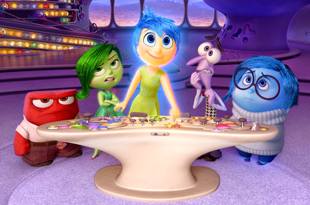
Inside Out is really unlike anything we’ve seen from Pixar or any animation studio before.  Part of the allure of this movie is the concept behind it, where the human mind is visualized as a fully realized world with different communities working together to form a person’s personality, and all of our key emotions are personified as individual characters.  But, for Pixar, it’s not just about the concept alone; it’s how they use it.  The story rolls out on two levels; one, it tells the story of a pre-teen girl named Riley (Kaitlyn Dias) as her family moves to the city of San Francisco, uprooting her into an unknown and challenging new life, and two it follows the lives of the different emotions inside her mind, who govern all the choices and memories that she makes in her life.  Chief among the emotions is Joy (Amy Poehler), and her team is made up of Disgust (Mindy Kaling), Fear (Bill Hader), Anger (Lewis Black), and the troublesome Sadness (Phyllis Smith).  Joy tries her best to keep Riley happy and positive throughout her life, but Sadness wants to help out more, which messes up much of Joy’s plans.  After the two come into conflict over one of Riley’s core memories (which is presented in the form of a glowing sphere), both Sadness and Joy are thrown out of the control room and into the far reaches of Riley’s subconscious mind, leaving only Disgust, Anger and Fear left to steer the ship.  With what seems like an endless expanse between them and home, both Joy and Sadness must overcome their differences in order to return themselves and Riley’s core memories back where they belong.  And the road back is about as complex and treacherous as you would expect the human mind to be.

It’s a pretty heady concept for a movie aimed at kids, but of course this is Pixar we’re talking about; the studio that caters to the child in all of us.  So, how does Inside Out fare against the rest of Pixar’s stable of films?  Pretty well actually.  In fact, I would easily put this in the Top 5 films that they have made.  This is another home run by the studio and is exactly the kind of movie that they needed to get them back on track.  From the very opening shot, showing Joy emerging out of the void to illicit the first squeal of laughter out of a newborn Riley, to the final hilarious montage during the credits, Inside Out is an absolute delight.  It does exactly what the greatest films from Pixar have always done which is take a great concept and make it work with a compelling story and incredible characters.  But, even more remarkable than that is how well they execute the underlying premise of the movie.  Visualizing the human mind as it’s own world is easy enough to comprehend on paper, but to actually make it work on film is another thing.  Making it comprehensible to younger kids is especially challenging, but the movie does a remarkable job of laying out exactly how this world works without ever spoon feeding needless exposition to it’s audience.  In fact, the wonder of this movie is seeing all the clever different ways it visualizes the inner workings of the mind; like having a train of thought appear as an actual train, or dreams being produced inside a movie studio (a literal dream factory as it were).  But, even with all the amazing visuals, Pixar still manages to find the heart at the center of this story and that’s what helps to make Inside Out as special as it is.

Like the best of Pixar’s output, story is paramount to it’s success.  At the heart of it, this story is about polar opposites working together and finding the value in one another.  Although Joy isn’t malicious in nature, she certainly isn’t perfect either, and much of the film’s conflict comes from her unwillingness to let Sadness be a crucial part of the team.  As the story goes along, we see an understanding build between the two, and Joy learns that you need sadness in life in order to appreciate the joy, something in which she had failed to see before.  Essentially, it’s about looking beyond differences just as much as it is about fighting your emotions and finding that right balance.  It also makes us look at complex ideas in a straight forward and entertaining way, which is what Pixar is best at.  Much like how Wall-E (2008) gave us a look at environmentalism, or how The Incredibles (2004) made us look at objectivism, Inside Out makes statements about human psychology and avoids ever trying to lecture to it’s audience.  Pixar has always let the stories carry themselves and statements about the larger world, whether pointed or not, have always seemed like a by product rather than the main focus of their movies.  It’s something that really sets them apart from other, less subtle filmmakers.  And best of all is that it doesn’t distract from the plot either.  Inside Out sticks firmly to it’s goal and that’s to entertain, whether it’s with huge laughs or with tear-inducing heartbreak.

Apart from the story, the other thing that audiences will absolutely love about this movie is the characters.  Each character is instantly recognizable and the look perfectly matches the emotion that they represent.  Disgust of course is green, with a perpetual sneering look of anguish on her face.  Purple hued Fear always looks hunched over like he’s about to roll up into a ball for protection.  Red hot Anger is a tiny ball of rage and literally is only seconds from firing up all the time.  And then we get the key characters of Joy and Sadness, perfectly off setting each other in bright yellow and deep blue.  Each character is distinctive and their personalities are all perfectly realized in their appearance.  The designs are also matched with perfectly cast voices as well.  Saturday Night Live alum Amy Poehler is the natural choice for Joy, as are Mindy Kaling (The Mindy Project) for Disgust and Bill Hader (SNL) for Fear.  Even more perfect is comedian Lewis Black as Anger, considering that his comedy act is famously built around his hilarious over-the-top rage, and there are some laugh out loud bits in the movie that exploit that perfectly.  The Office’s Phyllis Smith’s performance as Sadness however may be the strongest, as she makes the character both hilarious and heartbreaking at the same time, creating a very well rounded character.  Plus, her comedic timing and line delivery are some of the best parts of the movie.  But, the great character work isn’t just limited to the Emotions.  The human characters are also well done, especially the crucial character of Riley.  She may very well be the best animated human character that Pixar has done to date.  The subtlety of her animation is really astounding, and it makes those bizarre looking human models of Andy and Sid from Toy Story seem very primitive by comparison.  Indeed, these are characters that will absolutely earn their place among the likes of Woody, Buzz Lightyear, Dory, and all of Pixar’s other greatest characters.

Now, is Inside Out a perfect movie?  Not quite, but pretty close.  The one flaw I would say that the movie has is the pacing and familiarity of the plot.  Pixar seems to love stories about characters getting lost in an unfamiliar world and finding their true selves on the way home.  We’ve seen it in Toy Story (1995), Finding Nemo (2003), Wall-E (2008) and Up (2009), and the same kind of story plays out again here in Inside Out.  It’s an unfortunate retread of familiar ground, which has been Pixar’s weakness in recent years.  But the creativity put into the journey helps to make this a bit more acceptable this time around.  I for one didn’t mind seeing Pixar reuse this same type of plot, just as long as it did something fresh with it and added in a few surprises, which it does.  But, even still, there are times when you feel like the concept itself could have been explored differently; that way the end result would’ve felt a little more unexpected.  That would be the film’s only other fault; a very rushed and anti-climatic conclusion, though still with some heartfelt emotion present.  Overall, even with faults in some of the plot, the movie’s high points still dominate the overall experience.  As the story goes along, I forgave most of the faults just because the creativity was strong enough to make those things not matter as much.  At some points, I was also just surprised by some of the risks the movie takes.  Though the movie is light-hearted in tone, it’s also not afraid to go a little dark at some points, even to the point of tragedy.  I’m not going to spoil what happens for you, but there was a moment in this movie that actually brought the audience I saw this with to tears; even openly crying in some cases.  Think on the same level of Bambi’s Mom dying or the opening montage of Up, and that’s what this moment managed to accomplish.  Though sad, it thankfully doesn’t spoil the mood of the movie and actually it does help to enhance it.  After all, this is a story about Joy and Sadness working together, so naturally the movie’s plot should reflect that.  But, even still, be prepared to weep in between the many laughs throughout the film.

In many different ways, this is exactly the kind of movie that Pixar needed to reassert itself as the leader in the animation community, as well as in the film industry in general.  It’s got all the elements of a great Pixar movie, but it doesn’t rest on it’s laurels either.  It takes risks, but without alienating it’s audience.  I am relieved to see this powerhouse studio gain it’s mojo back with this one, and I’m sure that audiences will feel the same way.  It may be hard right now to see exactly how this one will line up against some of Pixar’s other classics, but I can certianly say for myself that it’s among their best efforts.  Wall-E is still my favorite overall, and some of the Toy Story‘s still resonate a little stronger, but Inside Out puts to shame most of the other recent output from the studio.  I only wish that the same care with the story and these characters could’ve been used in something as promising as Brave, which sorely lacks everything that this movie has.  Also, unlike other Pixar movies, which work best as self contained stories, I actually believe Inside Out would be well served with a sequel.  The movie feels like it’s only scratched the surface with this concept, and I would love to see the continuing adventures of these characters.  Who knows; maybe if the movie does well enough at the box office, that could certainly happen.  More than anything, this is almost certainly going to be one of the year’s best films, if not one of the most entertaining. As is almost always the case with Pixar, this will be a movie with timeless appeal that will indeed be enjoyed by audiences young and old for generations to come.  And that’s something that Pixar can absolutely be joyful about.

Rating: 9/10


Breaking the Illusion – The Uses and Misuses of Visual Effects

jurassic park t-rex

Though visual effects have been a part of cinema since the very beginning, it’s only been in the last 3 decades that we’ve seen huge leaps and bounds made thanks to Computer Generated Imagery (CGI), up to the point where anything is possible on film.  It has been an undeniable driving force of change in both how movies look compared to several years ago, as well as what kinds of movies can be made.  We have visual effects to thank for making worlds like Middle Earth and Narnia feel like they actually exist, and for also making extraordinary events here on Earth seem all the more tangible on the big screen.  But, even with all the great things that computers can do for the art of cinema, there is also the risk of having too much of a good thing as well.  While CGI can still impress from time to time, some of the novelty has worn off over the years as techniques have become more or less standardized.  Hollywood sadly seems to value CGI perhaps a bit too much and their over reliance on the medium has unfortunately had the effect of making too many movies look artificial.  The curious result of this is that it’s making movies that use practical effects and subtle CGI look far more epic and visually impressive than the films that use it in abundance.  Part of this is because more of the audience is able to tell the difference between what’s digital and what’s real today than they have before, and two, because we also admire the work put into something hand crafted.  Using CGI for filmaking is not a bad thing at all; it’s just that there has to be a purpose and necessity for it to work.

The sad reality of the last decade or so is that filmmakers have seen CGI as a shortcut in story-telling rather than as an aid.  Back in the early days of CGI, filmmakers were limited by what computers were capable of rendering at the time, so if they had to use them, it needed to be perfect and absolutely crucial.  Now, anything can be rendered realistically, whether it be an animal, a place, or even a person, and it comes very close to looking 100% authentic.  But, even with all these advancements in technology, filmmakers are still learning the best ways to use them, and sometimes quantity trumps quality in many cases.  Usually it’s a decision dictated more by studios and producers who want to save a buck by shooting scenes in front of a green screen instead of on location, but then there are also filmmakers who have indulged too much in CGI effects as well.  Thankfully, there are filmmakers out there who insist on using the tried and true practical effects, but their impact doesn’t extend to the whole community.  As it is with all of filmmaking, it’s all about story in the end, and whether or not the tools that you have are able to serve it in an effective way.   Would you rather watch CGI bring to life a talking raccoon and his tree monster friend, or do you want to watch two hours of CGI animated robots fighting?  It really comes down to what impresses us the most and usually the quality of the movie itself factors into that.  But, despite the quality of the flick and it’s effects, there seems to be a lot of bingeing going on with regards to CGI effects and it makes you wonder if Hollywood is doing a disservice to itself by not diversifying.

It helps to look back at a time when CGI still was a novelty to see where it’s value lies.  Developed in the late 70’s and early 80’s, CGI saw some of it’s earliest and briefest uses in movies like Star Wars (1977).  A few years later, Disney created the movie Tron (1982), which made the use of CGI environments for the first time in film, albeit on a very primitive level.  But, even with Tron‘s limitations, it still showed the promise of what was to come, and it stood out strongly in an industry that still valued practical effects like matte paintings and models.  Soon after, the movie Young Sherlock Holmes (1984) introduced the first integrated CGI effect into a live action film (the stained-glass knight scene) which paved the way for more digital additions in movies.  And then, in 1993, we got the mega-hit Jurassic Park.  Directed by Steven Spielberg, Jurassic Park was the biggest lead forward in CGI that the industry had seen to date, and that’s because more than any other film before it, we saw the true potential of what CGI could create.  Naturally it helped to have someone like Steven Spielberg at the helm, given his comfortable history of using special effects in his movies, but this was on a level unseen before.  Originally, the plan was to use stop motion animation to bring dinosaurs to life in the film, just because it was the standard in Hollywood ever since the brilliant Ray Harryhausen made it popular.  Thankfully, engineers at ILM (Industrial Light & Magic) convinced Spielberg to take the risk and the result brought us Dinosaurs that both looked and moved realistically.  Only CGI could’ve made those creatures move as smoothly as they did, and since then, it has been the go to tool for bringing to life characters and creatures that otherwise could never exist.

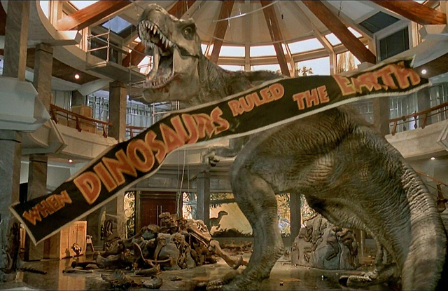
But, what is even more remarkable about Jurassic Park‘s legacy is not just the fact that it was a great movie with amazing effects, but it’s also a film that has remarkably held up over time.  It’s unbelievable to think that the movie was made over 20 years ago at a time when CGI was still maturing.  You would think that time would make the movie look dated now, but no; the CGI still holds up.  This is partly due to the filmmakers who busted their butts to make the CGI look perfect, but another reason is also because the CGI animation is not overdone.  In fact, there are actually not that many computer enhanced shots in the entire movie.  Whatever moments there were had help from practical effects that helped to blur the lines between the different shots.  The only times the movie uses CGI is when the dinosaurs’ are shown full body.  When close-ups were needed, the filmmakers would use an animatronic puppet, or sometimes just a movable limb.  It was a way of keeping old tricks useful while still leaving room for the new enhancements, and the result works spectacularly well.  Filmmaker Walt Disney had a philosophy when using special effects in his movies that you could never use the same effects trick twice in a row between shots because it would spoil the illusion.  You can see this idea play out in many of the amazing moments found in Mary Poppins (1964), a groundbreaking film of it’s own.  Like Jurassic ParkMary Poppins mixes up the effects, helping to trick the eye from shot to shot.  By doing this with the dinosaurs in Park, it made the CGI feel all the more real, because it would match perfectly with the real on set characters.  It’s a balance that redefined visual effects, and sadly has not been replicated that much in the years since.

Jurassic Park has seen it’s share of sequels over the years, with the fourth and latest one, Jurassic World (2015) making it to theaters this week.  And interestingly enough, each one features more and more CGI in them, and fewer practical effects.  Some of them look nice, but why is it that none of these sequels have performed as well as their predecessor?  It’s probably because none of them are as novel as the first one was, but another reason could be that the illusion is less impressive nowadays in a world inundated with CGI.   Somehow a fully rendered CGI T-Rex attacking humans in a digitally shot, color-enhanced image in Jurassic World doesn’t have the same grittiness of a giant puppeteered T-Rex jaw smashing through a glass sun roof on a climate controlled sound-stage in Jurassic Park.  Sometimes it helps to look old-fashioned.  Some of the action may be impressive in Jurassic World, but you won’t get the same visceral reaction from the actors on screen that you got in the original.  The reason why you believed actors like Sam Neill and Jeff Goldblum were in real danger is because they were reacting to full-sized recreations of the dinosaurs on stage.   Chris Pratt may be a charming actor, but you feel less concern for his character in the movie when you know that all he’s acting opposite of is probably just a tennis ball on a stick.  The original Jurassic Park made it’s CGI the glue that stitched together all the other effects, and that made the movie feel more complete.  World has the benefit of having the best effects tools available to it, which is better than what The Lost World (1997) and  Jurassic Park III (2001) had, but it still won’t have the same visceral power of the original, and that’s purely because it’s moved so far in one direction from where it started.

Hollywood in general has abandoned many of the old, traditional effects in favor of more CGI.  Some of this has been for the better (does anyone really miss rear-projection?).  But, too much can sometimes even hurt a movie.  This is especially true when filmmakers, even very good ones, become too comfortable with the technique and use it as a shortcut in story-telling.  George Lucas unfortunately became too enamored with the limitless potential of CGI, and used it to an almost absurd level in his Star Wars prequel trilogy.  Yes, it looked pretty, but nearly every shot in the movie was digitally enhanced, and it only worked to highlight the artificiality of every scene as well as distract from the story.  It gets annoying in certain parts where you can obviously tell that the actors are standing in front of a green screen in scenes that could have easily been shot on location.  For Lucas, I’m sure part of the allure of making his movies this way was so that he didn’t have to deal with location shooting problems like climate and extras.  But, what I think he failed to recognize is that part of the appeal of the original Star Wars was the fact that it was imperfect in spots, which made the special effects stand out that much more.  By trying to make everything more glossy, he unfortunately made his world look fake, showing that CGI is not a fix-all for everything in cinema.  And Lucas wasn’t alone in making this misjudgment.  The Lord of the Rings was also another groundbreaking film series in terms of effects, and that was largely because director Peter Jackson applied an all of the above approach to making Middle Earth appear real, including extensive use of models and location shooting.  When he set out to bring The Hobbit to the big screen, Jackson shifted to rely more heavily on CGI.  While it doesn’t ruin the experience as a whole, one can’t help but miss the practical and intricate model work that was passed over this time around in favor of fully-CGI rendered locations. For both cases, more didn’t exactly equal better.

In recent years, it’s actually become more ground-breaking to avoid using CGI in the crafting of a movie.  Some filmmakers like Christopher Nolan are making it part of their style to do as much as they can on set before having to use CGI for the final film.  When you see something like the hallway fight scene in Inception (2010), you’re initial impression will probably be that CGI had to have been used for that moment at some point.  That is until you’re blown away by the fact that nothing had been altered in that shot at all.  It was accomplished with mounted cameras, a hydraulic gimble machine, and some well-trained actors; a low tech feat pioneered years back by Stanley Kubrick in 2001: A Space Odyssey (1968) and implemented to the next level by Nolan.  That helps to make the scene feel all the more real on screen because it uses the camera and the set itself to create the illusion.  Doing more on set has really become the way to make something big and epic once again in movies.  We are more impressed nowadays by things that took their time to execute, and if the finished result is big enough, it will hold up against even the most complex of CGI effects.  That’s why we’re seeing a come-back of sorts in recent years with regards to practical effects.  It’s manifesting itself in little, predictable ways like using real stunt cars and pyro explosions in Furious 7 (2015) or in big ways like having Tom Cruise really hang off the side of a plane in midair in the upcoming Mission Impossible: Rogue Nation (2015).  And J.J. Abrams is bringing practical effects back to the Star Wars franchise, which is step in the right direction as well.

Overall, a movie’s special effects are more or less tied to how well they work in service to everything else.  Too much or too little CGI effects can spoil a picture, but not using it at all would also leave a movie in a bad position.  Today, CGI is a necessary tool for practically every movie that makes it to the silver screen, even the smaller ones.  A small indie film like Whiplash (2014) even needed the assistance of CGI when it had to visualize a car accident halfway through the movie.   It all comes down to what the story needs, and nothing really more than that.  Of course, there are boundless things that CGI can bring to life out of someone’s imagination, but sometimes a film is better served by taking the practical way when creating a special effect.  Watch some of the behind the scenes material on the Lord of the Rings DVDs and tell me if it wasn’t better in some cases to use practical effects like models and forced perspective to enhance a scene instead of CGI.  Sure, some creatures like Gollum and Smaug can only be brought to life through a computer, but it’s only after the animators had the guide of on set performances given by actors as talented as Andy Serkis and Benedict Cumberbatch.  Plus, physically transformed actors in make-up come across more believably than their equivalents in CGI form, with exceptions (Davy Jones in the Pirates of the Caribbean series).  I’d say restraint is the best practice in using CGI overall.  As Dr. Ian Malcolm (Jeff Goldblum) says about technology run amok in Jurassic Park, “you were so preoccupied with whether or not they could that you never stopped to think if they should,” and the same truth can apply to how CGI has been used in Hollywood.  It solves some problems, but it can also reduce the effectiveness of a story if mishandled.  We’ve seen a lot of mediocre movies come out with wall to wall CGI effects recently, and much of the wonder that the technology once had has unfortunately worn off.  Hopefully, good judgement on the filmmakers part will help to make visual effects an effective tool in the films of the future.  The best illusions are always from those magicians who have something you never expected or seen up their sleeve.

Evolution of Character – The Wizard of Oz

wizard of oz portrait

Fairy tales have had a long history of success in both literature and in cinema.  And key among it’s strengths have been the larger than life adventures of magical creatures in far off places that help to transplant audiences out of reality, whether they be fairies, witches, monsters, or wizards.  Though fairy tales are popular around the globe, they have primarily come from European origins.  That was until American author L. Frank Baum added his own fantastic tale to the mix when he wrote his now iconic 1900 novel, The Wonderful Wizard of Oz.  Though inspired by traditional fairy tale tropes, there’s no denying that Baum’s classic is the first distinctively American fairy tale.  Telling the tale of Dorothy Gale, a rural girl from the heart of Kansas, Oz is an unforgettable journey that has captured the imagination of readers for over a century.  It also marks a transition in the fantasy genre as it moved away from it’s European roots.  By creating a fully realized world in Oz, Baum was also introducing the concept of world-building into the fantasy narrative, which has since become a common characteristic of fantasy writing ever since.  The the multi-layered worlds of Middle Earth, Narnia and Westeros all have their roots in the foundation that Baum laid out when he created the land of Oz.  But, it’s not just the amazing spectacle of the land over the rainbow that has sustained the story’s popularity.  It’s also the characters, many of whom are now icons of the genre.

For the most part, the characters have changed very little through all the many different literary iterations over the years.  Dorothy has always remained the innocent child trying to find her way home, and her companions The Scarecrow, the Tin Man, and the Cowardly Lion have likewise all stayed true to form.  The villainous Wicked Witch of the West has seen more varied interpretations over the years, though more often than not still firmly placed in the role of the antagonist; the popular revisionist musical Wicked being the notable exception.  But if there’s a character whose portrayals have departed more frequently from the books over the years, it would be the titular Wizard himself.  The Wizard is certainly one of L. Frank Baum’s more interesting creations.  Once thought to be a great, all powerful Wizard, he is by the end of the story revealed to be (spoilers) just an ordinary man.  And not only just any ordinary man, but an outsider like Dorothy who has found himself cast away to Oz after being caught in a tornado.  His talents as a magician helped to convince the local people that he had magic of his own, and it’s probably what helped to elevate him into power, as an alternative to the Wicked Witches of the East and West.  But, to keep up the charade, the Wizard uses the tried and true smoke and mirrors routine to make him a figure meant to be both feared and respected.  Though distinctively drawn in the original story, The Wizard is also the one character that is the most open to interpretation, which has been the case in most of his movie versions.  So, in this article, I will be looking at the many cinematic faces of magician Oscar Diggs and see how he’s evolved as the Wonderful Wizard of Oz over the years on the big screen.

Wizard of Oz 1910

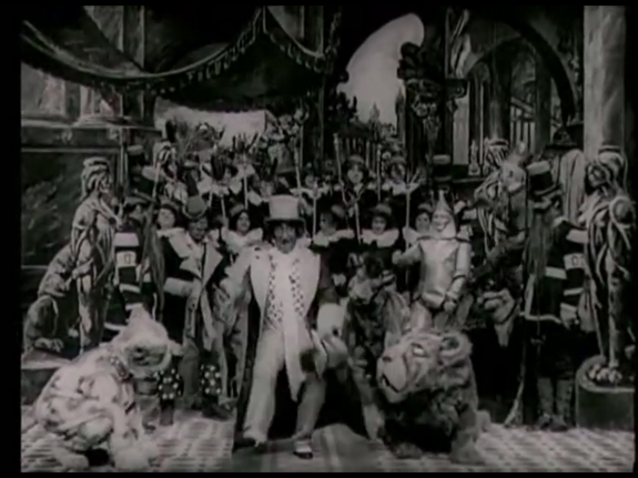
HOBART BOSWORTH from THE WIZARD OF OZ (1910)

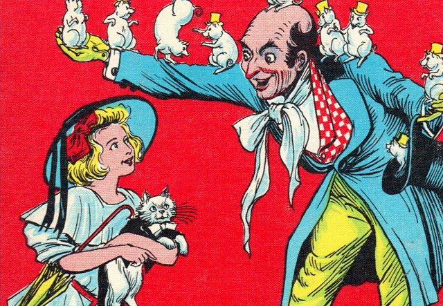
The immediate success of The Wizard of Oz at the turn of the century naturally extended out into other mediums, including the emerging art-form of cinema.  The elements of the story lend themselves perfectly to the film medium.  Even L. Frank Baum wrote and directed a couple of these himself.  This 1910 adaptation was not one of those, but it is one of the better versions of the story to come out during this period.  Like most other films made during these early years of cinema, the production is restrained by the limitations of the time, and most of the movie is made up of tableau shots that condense the story down to it’s bare bones.  It’s more of a showcase for set and costume design rather than plot and character development; much like Georges Melies’ A Trip to the Moon (1902).  But, even still, Baum’s story is still recognizable in those short 13 minutes, and one of the standouts is the Wizard himself.  The film does away with the disguises that the Wizard has used before in the story, and instead presents the man just as the true magician that he is.  It’s a jovial performance from veteran vaudeville actor Hobart Bosworth, who perfectly encapsulates the top hat wearing entertainer that L. Frank Baum visualized, even if it’s perhaps a little too slap-sticky at times.  But, even for a movie made in the early days of film, it does represent a fresh start for such an iconic role.

wizard of oz 1925

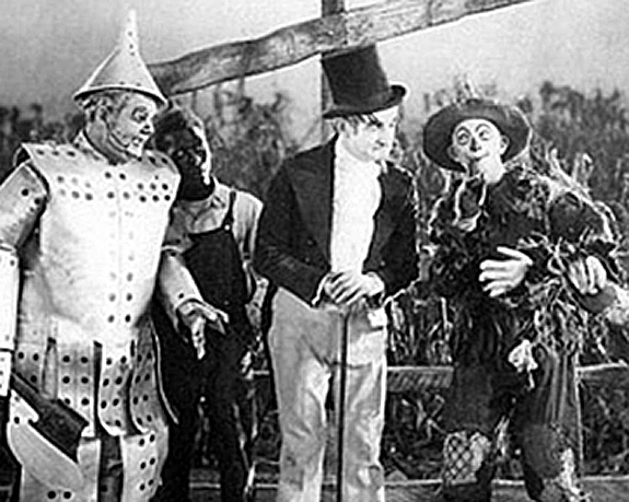
CHARLES MURRAY from THE WIZARD OF OZ (1925)

Now while effort was put into the 1910 version in order to stay faithful to the original novel, the same cannot be said about this 1925 version.  In this retelling, there are no witches and no magic.  Instead, Oz is a far away kingdom here on Earth that is ruled by a cruel emporer who has usurped the throne from the rightful heir, Dorothy.  You heard that right; Dorothy is a princess of Oz in this version, and she’s not even the main character.  That would be the Scarecrow, or rather a farmhand who disguises himself as a scarecrow.  The reason for this change is because the whole film was meant to be a showcase for comedian Larry Selmon, who plays the Scarecrow part.  To spotlight the actor, they reworked the story around him, even if it doesn’t resemble anything like the original.  This lessens the effectiveness of the characters and the setting overall, because it’s ignoring what made them so popular in the first place.  But most problematic is the Wizard himself.  He’s relegated to a minor henchman role.  Sure, actor Charles Murray looks the part, but he leaves such little impact on the story that it makes you wonder why the movie is still titled after him.  This is an odd interpretation of the classic story, and not surprisingly, audiences rejected it.  It’s good to see that even early fans of the story held it up to high standards and dismissed this attempt to exploit the name for other purposes.  Few other adaptations would stray far from the source novel in the years after.

wizard of oz frank morgan

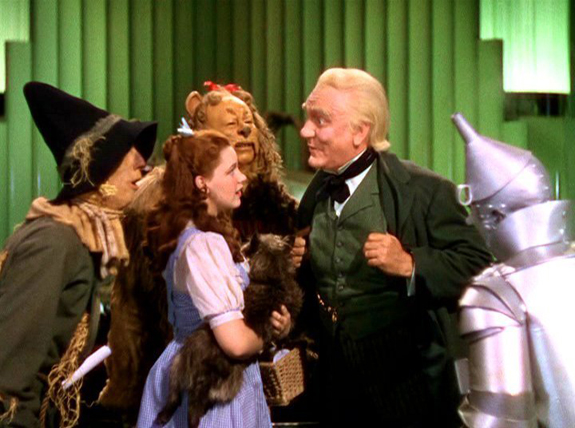
FRANK MORGAN from THE WIZARD OF OZ (1939)

Now we come to what is undoubtedly the greatest cinematic interpretation of Baum’s classic, as well as the most iconic version of the titular character.  1939’s The Wizard of Oz is a masterpiece in every way possible, and rightly stands as one of the greatest movies ever made.  Clearly made as response to the popularity of the animated musical adaptation of Snow White and the Seven Dwarves (1939), MGM Studios sought to take on another popular fairy tale and give it the grandest of treatments.  Thankfully they saw the potential in Baum’s story and the movie production does the absolute best job making the land of Oz come alive and feel unlike anything we’ve ever seen.  The characters are also what makes this such a beloved classic and each one is perfectly cast.  This was especially true for Frank Morgan, who almost looks like he’s leaped right off the page as the Wizard.  Not only does he do an amazing job playing the character, but he’s seen throughout the movie as various other people like the doorman of the Emerald City, as well as a traveling palm reader whom Dorothy befriends back home in Kansas.  But, it’s the Wizard that really highlights his performance, especially when he’s going over the top as the giant floating head in the throne room scenes.  Morgan’s performance is so iconic that every Wizard adaptation since has used his version as a base of inspiration.  And indeed, no other version has ever felt truer to Baum’s vision.  In this classic movie, it is indeed a treat to see the man hiding behind the curtain.

wizard of oz richard pryor

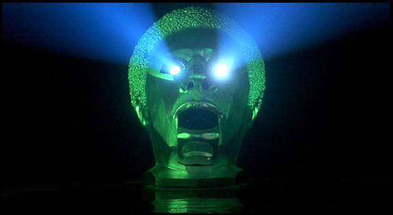
RICHARD PRYOR from THE WIZ (1978)

The enormous popularity of the MGM adaptation kept Hollywood from attempting another version of the tale for quite a while, but Motown Records saw an opportunity in the mid-70’s to take on the tale with a modern twist.  The Wiz imagines the land of Oz as an urban Wonderland full of the musical sounds of Soul and Disco.  The idea of taking the classic story and casting all the roles with African-American actors is certainly a welcome one, and that’s indeed what made it a standout when it appeared on Broadway.  When the movie adaptation happened, the producers from Motown Records reached into their stable of recording artists in order to bring star power into the film, which had some mixed results.  Some of the casting is spot on (Michael Jackson as the Scarecrow; Lena Horne as Glinda) while others are a little off (44 year old Diana Ross as the teenage Dorothy).  But one of the more natural casting choices was legendary comedian Richard Pryor as the Wizard, or Wiz to be more appropriate to this version.  Pryor brings his trademark bombastic comedy style to the role, and it’s a perfect match for the Wizard in his grandiose, giant head form.  The image of the character is also a nice modern twist on the MGM version, with the shiny chrome head feeling both original and true to Baum’s version.  But, once revealed as a fraud, Pryor also captures the timid man behind the curtain perfectly as well.  It may be a revisionist take on a beloved classic, but it’s done with a great deal of admiration for the story, and the movie especially stays true to character with regards to the iconic Wizard himself.

Wizard of Oz 1982

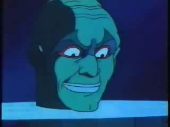
LORNE GREENE from THE WIZARD OF OZ anime (1982)

Just to show how far reaching the legacy of The Wizard of Oz has spread, there’s even a Japanese anime version out there.  And this one isn’t even the first one made, nor the last.  The reason I wanted to highlight this version is because of two reasons; one, it’s the most faithful anime adaptation of the story, and two it’s because it has probably the most accurate interpretation of the Wizard that’s ever been put on film.  In L. Frank Baum’s original story, the Wizard asks to meet Dorothy and her companions individually instead of all together.  Interestingly, each character sees the Wizard in a different form.  For Dorothy, the Wizard appears as a giant, green head; for the Scarecrow, as a beautiful winged angel; for the Tin Man, as a giant beastial creature; and for the Cowardly Lion, as a ball of fire.  This 1982 anime, to my knowledge, is the only time I’ve ever seen these multiple versions of the Wizard actually envisioned.  Even the MGM version strayed from the book here, choosing instead to present the Wizard in one form; the one that Dorothy sees in the books.  That helps to make this version unique out of all the different adaptations, just because it went out of it’s way to accurately represent what’s in the book.  Unfortunately, being too faithful also makes this version a little stilted and dull at times.  Actor Lorne Greene of Bonanza fame performed the English dub for the Wizard, and the voice is a good match.  I especially like the power in his voice when he plays the false versions of the Wizard.  Though not the most exciting version of the story, this is certainly an interesting take on the classic, and offers probably the best visual representation of Baum’s Wizard that we’ve seen to date.

wizard of oz jeffrey tambor

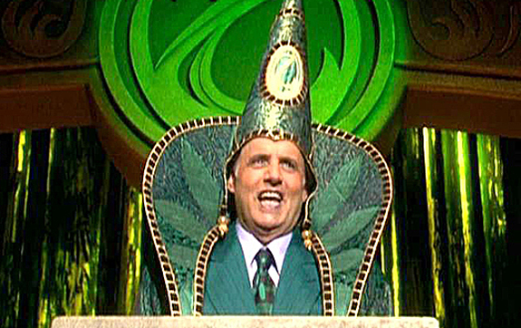
JEFFREY TAMBOR from THE MUPPETS’ WIZARD OF OZ (2005)

Here we have a version of the story built around the legacy of past versions, specifically the classic one from MGM.  On paper you would think that a version of The Wizard of Oz starring the Muppets would be a home run.  Unfortunately, this is not one of the Muppets’ stronger efforts and the whole thing is more of a cash in than anything else.  There’s little effort in trying to be true to L. Frank Baum’s original story, and instead the movie is more concerned with mimicking the movie than the book, to which it does a fairly poor job of doing.  The one exception in this version, however, is the casting of Jeffrey Tambor as the Wizard.  Yes, he’s playing it over the top and completely out of character from the original, but he still brings gravitas to the role that’s missing from the rest of the film.  The Arrested Development star has a gift for making pompousness funny, and that’s what he brings to this role as the Wizard.  It’s the Frank Morgan version but without the humbleness, and that surprisingly works well here.  Truth be told, I wish this version was in a better movie.  Overall, it actually shows how well the story has aged over the years, where the archetypes of the characters are able to withstand a more cynical reinterpretation and still retain their dignity.  Tambor does his best with what he has and helps to make the Wizard a standout in an otherwise pathetic retelling of the story.

wizard of oz james franco

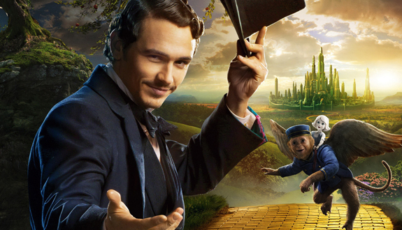
JAMES FRANCO from OZ, THE GREAT AND POWERFUL (2013)

Though a supporting player in the novel that bears his name, the Wizard of Oz nevertheless still has an interesting backstory, seeing as how he has traveled from afar to the land of Oz by accident, just like Dorothy.  Director Sam Raimi saw potential in this backstory and decided to delve into the Wizard’s past with this prequel to Baum’s classic tale.  Oz, The Great and Powerful tells the story of how magician Oscar Diggs came to Oz and became the Wizard and ruler of the Emerald City.  With the help of the good witch Glinda, the story shows Oscar using his tricks to outwit the evil Witches that have taken over Oz while at the same time learning a lesson about using his gifts responsibly and not to just satisfy his own needs.  While a box office hit, some audiences were not pleased with the liberties that were taken with L. Frank Baum’s classic characters; most notably the witches, and some of those complaints are justifiable.  The miscasting of Mila Kunis as the Wicked Witch of the West is especially problematic.  But there’s still a lot that I like about this movie, and chief among them is the casting of Franco as the future Wizard.  He may not be to everyone’s tastes, but I actually enjoy his oddball performance here.  He definitely captures the huckster qualities of the character perfectly, and some of his over the top performance choices are definitely enjoyable.  It’s interesting to see the world of Oz presented in a time before Dorothy, when darker forces were in control.  It’s also the one and only time we see the Wizard hold his own as the center of the story, and overall, I like what they did with the character here.  This may not be what Oz purists want to see presented on the big screen, but I think it does a serviceable job of expanding upon the world that L. Frank Baum imagined over a century ago.

Out of all the many characters who call Oz home, The Wizard is the one character that translates the best over the many different iterations of the story.  Dorothy, the Wicked Witch and the other fantastical characters are so iconic that they must be done a certain way or else they won’t work at all, but with the Wizard there really is no right or wrong way to bring him to life.  He is the most adaptable character of the story.  I think that it’s why so many found it suitable that he should get his own movie with Oz, the Great and Powerful.  The role is also easy enough to fill with any kind of actor you choose, making his many different versions so varied over the years.  It’s the only kind of role where you can have Richard Pryor play him in one version and Jeffrey Tambor in the next.  Though some standards on the character were set by the iconic version in the MGM’s classic, as was much of what we recognize as the World of Oz, there’s still a lot of new avenues that can be explored in each new version of the character.  More than anything, the many varied versions of the Wizard of Oz represent the timelessness of the story, which is a strong sign of it’s definitive place in the pantheon of great fairy tales.  Time will tell how much of an impact The Wizard of Oz will have with future generations, but over a century later, readers and audiences are still happy to follow that yellow brick road and meet that Wonderful Wizard time and time again.