Top Ten Villain Musical Themes

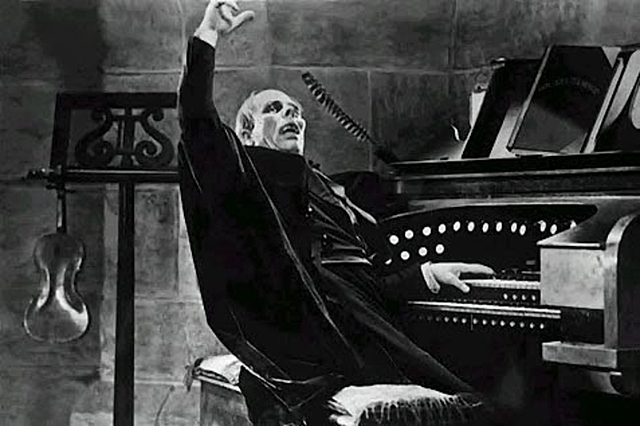
phantom organ

Earlier this year I shared with all of you a top ten list of my favorite epic musical themes of all time.  Beyond each of them being my favorite movie tunes to listen to, the other thing they usually had in common was that they were associated mostly with the heroes of their selective movies.  Whether it was the moody Batman theme from Danny Elfman or the triumphant “Throne Room” theme from John Williams in Star Wars, there’s no doubt that some of the most beautiful music ever written have usually been reserved for heroes.  But, not all memorable themes are written just for them.  Sometimes a villain’s theme may be even more beloved in a movie than the hero theme, or can even be the main musical tune of the film itself; such as Bernard Herrman’s haunting Psycho theme.  Though hero and villain themes usually serve the same purpose in telling a story, they are characteristically very different, and it’s that contrast that really helps to make the villain themes much more memorable.  Usually they are sinister, aggressive, or just plain foreboding, and yet we can’t help but love hearing them.  Hollywood has provided just as many memorable villain themes as they have memorable villains, and you can’t help but love the way that many composers have fun trying new things as they delve into the dark side with their music.

Given that it’s Halloween, I have decided to list a few of my own favorite villain themes, since they can make an enjoyable playlist for the holiday.  Keep in mind, these are my own choices based on how much I enjoy them personally, as well as how I judge them by their significance in the history of cinematic music.  These are all purely orchestral themes, and not villain songs.  That’s a whole other category that I might cover someday; more than likely dedicated almost exclusively to Disney villain songs, since they’re so good at them.  This list may not be everyone’s choices, and some of you may be surprised by a few of my picks.  I just hope that a few of you might discover an unexpected surprise here, alongside some of the more obvious choices.  In addition, I’ll detail exactly why I chose these movies, and include the musical pieces themselves in video form.  Overall, my picks reflect the effectiveness that the themes embody each villain’s character, as well as stand on it’s own as just an overall great tune.  Sometimes, even minor villains might have a great theme or a great villain can have a forgettable theme.  And if both end up being great at the same time, all the better.  So, it’s time we begin this monster mash of music as we countdown my favorite villain musical themes of all time.

10.

GOZER THEME from GHOSTBUSTERS (1984)

Composed by Elmer Bernstein

First off we start with an effectively spooky theme heard in one of the greatest comedies ever made.  Ghostbusters is an interesting movie because even though it plays it’s premise for laughs, it’s also not afraid of throwing some really scary images at it’s audience.  Amazingly, the movie is able to balance the comical and the creepy perfectly and a large part of that is due to the excellent musical score written by the legendary Elmer Bernstein.  Bernstein had one of the most prolific careers in Hollywood as a composer, writing for a wide variety of projects that ranged from the grandiose epic The Ten Commandments (1956) to the intimate social drama To Kill a Mockingbird (1962), and he managed to brilliantly capture the right mood for each project.  His later career had him writing for action films and comedies, which made him a perfect choice here.  Bernstein’s whole score for Ghostbusters is wonderfully spooky in a playful way (making particularly good use of classic horror movie music elements like the theramin), but if there was a standout, it would be the theme for the movie’s sinister, Sumerian God villain, Gozer the Destructor.  The theme plays throughout the film to great effect, building up to the arrival of Gozer at the film’s climax, helping to establish the overwhelming threat that the villain holds for our lovable band of quirky heroes as they face off against an enemy of Biblical proportions.  It only makes sense that a composer of biblical epics would find just the right sound for such a vengeful, destructive force in this classic comedy.

9.

MAGNETO THEME from X-MEN: FIRST CLASS (2011)

Composed by Henry Jackman

Here we have a relatively new villain theme, but one that is nevertheless memorable.  Magneto is one of the more fascinating villains to have ever come out of the world of comic books.  His tactics are harsh and unforgiving, but his motivations come out of a tragic past; one which helps to make him far more sympathetic.  He’s a perfect example of someone who is not born a villain but is turned into one.  This aspect was explored perfectly in the Matthew Vaughn directed X-Men: First Class.  We watch as the mutant Magneto is shaped by his circumstances to become crueler and harsher until ultimately he becomes the unforgiving villain that will forever undermine the good deeds done by the heroic X-Men.  Henry Jackman’s score for the movie primarily tries to emulate the sound of the era in which the movie takes place, which is the 1960’s.  All the other music in the movie fits this motif, except this very modern sounding piece, and I think that it was intentional.  It plays at the very end when Magneto (played brilliantly by Michael Fassbender) makes his first appearance as his newly minted villainous persona, which underlines the idea that this is the birth of a new evil in the world and helps to give us an idea of the mayhem he will bring.  It’s thematically perfect, but also great to listen to.  It only makes sense that a villain with the power to control magnetism would have a theme that’s so, well, metal.  I just enjoy the energy this theme brings.  It’s dark, sinister, and perfectly embodies the state of mind of such a dark and conflicted character.

8.

THE WICKED WITCH OF THE WEST THEME from THE WIZARD OF OZ (1939)

Composed by Herbert Stothart

This is one of the most legendary villain themes to come out of Hollywood.  In the early days of cinema, especially during the silent era, villain themes would often use popular classical music that tended to have a macbre edge to them.  One example of this was Bach’s Toccata Fugue in D Minor in Tod Browning’s Dracula (1931), which was a suitable theme for the legendary bloodsucker.  Original themes became more prevalent in the early sound era, and one of the greatest scores to come from this time was The Wizard of Oz.  Known primarily for it’s songs, The Wizard of Oz also had some orchestral themes that brilliantly underscored the movie, none more so than this villain theme.  The Wicked Witch (played memorably by Margaret Hamilton) is the only main character who doesn’t have a song in the movie, and that’s because she doesn’t need one.  This theme perfectly characterizes the dastardly witch; a swirling cacophony of music not unlike the twister that brings Dorothy to Oz.  I also like how it instantly establishes itself in the movie from the very beginning, as it’s first heard when the sinister Miss Gulch (also played by Hamilton) enters the movie.  Using it for this effect helps to signify for the audience that danger is approaching and whoever follows with it is up to no good.  It’s a great effective way of differentiating the villain from the rest of the cast, with her menacing sounding theme, and this particular piece of music has been a highly influential one over the years.  Many villain themes since have taken their cue from the Witch’s example and it’s still a memorable piece of music to this day.

7.

GODFREY THEME from ROBIN HOOD (2010)

Composed by Marc Streitenfeld

Here we have an example of a great musical theme written for a very bland and forgettable villain.  The Robin Hood adaptation from Ridley Scott has a lot of problems, but the musical score by Marc Streitenfeld is not one of them.  In fact, the music is the best thing about it, and this villain theme is the clear highlight.  Sir Godfrey is the film’s stand-in for the Robin Hood’s legend’s main antagonist Sir Guy of Gisbourne, and though he’s played by a fantastic actor (Mark Strong) he is largely forgettable and stock standard as far as villains go.  And yet, Streitenfeld felt that a grandiose villain theme was needed here.  Though let down by the underwritten character in the movie, I’m certainly glad that Streitenfeld went above and beyond with his theme.  It’s an effectively creepy musical piece that would be better suited in a monster movie than in the legend of Robin Hood.  I especially like the pulsing use of the flutes and how they play alongside the heavy percussion that follows.  It’s the kind of music that crawls under your skin in an unpleasent way.  I remember first hearing this music when I saw the movie in theaters a while back and was struck by how much this theme instantly defined itself.  I’m sure that many of you probably have never heard this one before, so my hope is that this will be a surprise to you.  In my opinion, great pieces of music can come from even the lamest of movies, and this is a perfect example of that.  It does what all the best villain themes should  do and that’s to give it’s character an instant identity.  I just wish the character hadn’t been such a wet blanket throughout the film.  Hopefully, heard apart from the film, I’ve helped to highlight this great sinister piece that I feel hasn’t been given it’s due yet.  It’s a chilling piece of music that deserved a much better villain and a far better movie.

6.

THE KRAKEN THEME from PIRATES OF THE CARIBBEAN: DEAD MAN’S CHEST (2006)

Composed by Hans Zimmer

Han Zimmer’s scores for the Pirates of the Caribbean series are just as wild as the films themselves.  Mixing a lot of different types of styles together, from classical to heavy metal, his music is a perfect accompaniment for this unconventional series.  Naturally people remember the main theme the most, but Zimmer also wrote some memorable scores for the villains in the series.  The main antagonist, Davy Jones gets his own melancholy villain theme that is powerfully centered around the pipe organ instrument.  But, I would say that the more memorable villain theme in the movie belongs to Davy Jones’ loyal “pet;” the monstrous Kraken.  This musical piece is as wild as the monster it underscores.  We’ve heard many themes used in movies that effectively characterize the dangers of what lies out in the open ocean, but none have sounded as ferocious as this one.  When first seen in action the movie, the Kraken rips apart a full sized galleon ship and the music effectively reflects that epic scale savagery.  But, what I like best about this theme is that when heard outside of the context of the film, it does stands on it’s own as a great piece of music.  It’s the kind of villain theme that paints a picture all on it’s own, and it’s a brutal and frightening one at that.  I certainly think it’s one of Hans Zimmer’s best because of that and absolutely one of the best villain themes of all time.  You just can’t overlook a beast like this.

5.

JAWS THEME from JAWS (1975)

Composed by John Williams

And speaking of beasts from the depths of the ocean, here’s the granddaddy of them all.  The main theme from Jaws could very well be the most famous two notes in all of music.  The moment you hear those bass strings play those notes, you instantly know what you’re in for.  Fun fact: when John Williams first played this theme for director Steven Spielberg back during the film’s development, Spielberg thought it was a joke.  But, as the famed director soon learned, the theme based on those two notes would not only be perfect for the movie, but also a life saver as well.  Spielberg was plagued with production problems throughout filming with a mechanical great white shark that never worked properly, and he was forced to edit around the creature, merely implying the villainous monster’s presence through most of the movie.  That’s where Williams’ score came to the rescue.  Even though the audience doesn’t see the shark, the music helps us to know that it’s coming with it’s countdown clock-like immediacy.  I don’t think there has ever been a better piece of music ever written to convey that sense of creeping doom.  Once the shark finally makes his appearance, we’re already prepared to fear it, and that’s a testament to the overall effectiveness of Williams’ theme.  What I also like is the way that the music reinforces the merciless nature of the beast; as the beat grows louder and louder like it’s catching up to you and when it crescendos, that’s when you know that the monster has hit it’s mark.  It’s a brilliant villain theme that belongs to one of cinema’s most unforgettable monsters, and John Williams’ managed to do it with a melody based purely on just two notes.

4.

MAIN THEME from BRAM STOKER’S DRACULA (1992)

Composed by Wojciech Kilar

Naturally, a Halloween icon such as Dracula should get a memorable theme of his own, but it wasn’t until Francis Ford Coppola’s 1992 adaptation of the Bram Stoker novel that we got a musical theme worthy of the Count.  The classic Bela Lugosi Dracula films were mostly silent with only classical pieces used sparingly like the already mentioned Toccata Fugue.  Many of the subsequent Dracula adaptations also played on that same silent terror over the years.  But Coppola’s feature was meant to be epic and operatic, and he called upon Polish composer Wojciech Kilar to give Dracula a truly memorable theme.  And that he did.  This is a wonderfully creepy piece of music, and grandiose in all the right ways.  The constant drumming beat creates a nice sense of rising tension and each movement adds more and more instruments to the mix, helping to build to a sinister cacophony of sound, sort of like a sinister version of Ravel’s Bolero suite.  The piece is perfectly suited for Coppola’s twisted retelling of the Dracula legend, and it gives it the right amount of epic grandeur that helps to set it apart from other versions of the story.  Of all the themes on this list, this is the one that really feels at home in this Halloween season, giving the listener a true sense of feeling like something monstrous is on it’s way.  It’s the type of music you can imagine playing in the background of a haunted house tour.  But the best thing about it is that it gave the iconic Dracula a worthy musical theme that he was sorely lacking.

3.

ISENGARD THEME from THE LORD OF THE RINGS: THE FELLOWSHIP OF THE RING (2001)

Composed by Howard Shore

Howard Shore’s multiple Oscar-winning scores from the Lord of the Rings trilogy feature many memorable and now iconic musical themes.  Most of them are tied to the many different cultures an peoples of Middle Earth, giving the series a deep sense of history as Tolkein’s world is brought to life.  Shore also gave specific characters their own memorable themes, the best of which belong to the trilogy’s many memorable villains.  Each villain’s theme is great in their own right, including the delirious “Barad-dur” theme for the main villain Sauron, the twisted “Minas Morgul” theme for the Witch King, as well as the melancholy one for Gollum.  Why, even the Ring of Power itself gets it’s own villain theme.  But, if I had to pick the best villain theme out of the bunch, it would be the one that belongs to the white wizard, Saruman.  This is far and away the most memorable villain theme from the series and one of my absolute favorites as well.  It perfectly reflects the persona of the villainous Saruman, which as the character Treebeard states in The Two Towers (2002) is now “a mind of metal.”  Howard Shore took many industrial sounding instruments and incorporated them into his theme, which helps to underscore the scenes within the mines of Isengard perfectly.  Not only does it convey the industrial theme perfectly, but it also sounds menacing at the same time.  This was a perfect sounding theme to associate with the wizard, and it couldn’t have been better suited for a physically imposing actor like the late, great Christopher Lee who played the role.  Of all the great music in Howard Shore’s epic scores, this is a real standout, and that’s saying something.

2.

WALTZ TO THE DEATH (THE JOKER THEME) from BATMAN (1989)

Composed by Danny Elfman

Of all the great comic book villains that have received a suitably dark and menacing villain theme over the years, you just know that the absolute best has to belong to the Clown Prince of Crime; The Joker.  Now, there are excellent villain themes to be found in The Dark Knight trilogy by Hans Zimmer, notably the ones for The Joker and Bane.  But, it’s Danny Elfman’s masterpiece of a musical score from the original Tim Burton Batman that has the more memorable musical pieces.  Namely, this amazing tune from the movie’s climax.  Of all the villain themes on this list, this is the most unconventional.  Instead of creating a dark and sinister theme for the Joker, Danny Elfman wrote this colorful and exuberant piece that is perfectly evocative of this particular villain.  It’s comical, but also unnerving and wild; just like the villain himself.  It’s especially well used in the movie, as Jack Nicholson throws himself hilariously in the role as he waltzes around with Kim Basinger’s unwilling Vicki Vale while Batman fights the Joker’s henchmen in the background.  Elfman’s score is full of pleasant surprises, and none more so than this piece.  Though used in pieces throughout the film, we don’t hear it in it’s full form until the climax and it’s presented gloriously.  What I like best about it is that it’s the perfect antithesis to the moody and dark theme of the hero, showing the duality of the hero and the villain perfectly.  The only music suitable for a clown is the kind that is terrifyingly silly, and this Joker theme is just that.

1.

THE IMPERIAL MARCH from STAR WARS EPISODE IV: A NEW HOPE (1977)

Composed by John Williams

Really, what else was going to top this list other than one of the most famous, and possibly the most recognizable villain theme of all time.  And once again, a piece of music from John Williams tops my musical theme top ten list.  But, I don’t think there won’t be any doubt about that here.  This is probably the first piece of music that comes to mind when someone thinks of a typical villain theme.  Though most commonly associated with the iconic Darth Vader, the music is actually themed to the entire force of the Galactic Empire and it’s military might.  This overwhelming threat in the film series is perfectly characterized by this music.  It’s a percussion and brass heavy beat symbolizes a feeling of unstoppable power and unbending will.  And with the presence of Darth Vader onscreen, it becomes a theme of rigid superiority and overwhelming might.  Basically, when heard today, it symbolizes the power of authority, and many people will sometimes use it as a fun way to mock either their bosses at work or a politician they don’t like, given it’s near universally recognized reputation.  As a story element, it’s also a perfect theme for the villains in the Star Wars series, conveying a sense of approaching danger every time it’s played.  John Williams’ Star Wars score is considered the greatest ever written by many and his Imperial March is certainly one of the jewels in that crown.  It’s also just a plainly great tune on it’s own; instantly recognizable and perpetually beloved.  Really is there any other villain theme out there that people of all generations, young and old, can hum along to right off the top of their heads.  That’s the sign of a truly memorable piece of music.  All together now; duh duh duh, duh d-duh duh d-duh.

So, there you have it, my choices for the best villain themes of all time.  Some of these are no brainers like the Imperial March and the Isengard theme, as well as the classic Jaws and Wicked Witch themes.  But, my hope is that I’ve alerted some of you to villain themes that haven’t yet been given their due recognition, like the Godfrey theme from Robin Hood.  That one was just as much a surprise to me, but I still think it is worthy of being listed here.  Some of you may have favorites of your own, and I’m sure they are good as well.  The great thing about music, especially those from the movies, is that anyone can find something that suits their tastes, and it can come from the unlikeliest of places.  That’s why I find it so intriguing that some of the best and more beloved pieces of music are given to the villains more than the heroes.  I think that it’s because the villains are the more operatic and definitive characters in the story, so their musical themes should reflect their larger impact on the narrative.  They are the more impactful characters, so each melody devoted to them must be grander as well.  Thankfully, many great composers have devoted some great music to some of our best villains and hopefully I’ve highlighted some of the best here for all of you.  This will hopefully be a nice selection of tunes to give your Halloween a suitable playlist.  And with that, have a Happy and Scary Halloween.
Collecting Criterion – House (1977)

hausu

Though the vast majority of Criterion’s titles fall into the range of prestige art films, there is a small selection in the Collection that’s devoted to highlighting the strange and bizarre from cinema around the world.  That’s where you’ll find some of the more unique examples of horror and suspense ever put to celluloid, and it’s a special treat that Criterion devotes as much care and respect to these titles as they would to some of the more honored films in their catalog.  Some of Criterion’s horror titles include Roman Polanski’s breakthrough classic Rosemary’s Baby (1968, Spine #630), as well as early movies from David Cronenberg like Scanners (1981, #712) and The Brood (1979, #777) and from Guillermo del Toro like Cronos (1993, #551) and The Devil’s Backbone (2001, #666).  The more interesting horror titles in the Collection are the international ones however, which range from the truly disturbing to the really bizarre.  Some of these include the lyrical and gory French thriller Eyes Without a Face (1960, #260) and the silent Danish film about witchcraft Haxan (1922, #134).  But, if there’s an international body that has consistently put out the most disturbing and visually arresting horror movies over the years, it would be the nation of Japan.  Criterion has thankfully assembled some of the most groundbreaking titles from Japanese horror, all influential not just within their own domestic cinematic traditions, but also to horror filmmaking worldwide.  These include the Masaki Kobayashi epic scale ghost story Kwaidan (1965, #90) and the moodily atmospheric Kuroneko (1968, #584).  But perhaps the most interesting horror title to come from Japan found in the Collection is the very one-of-a-kind oddball, House (1977, #539)

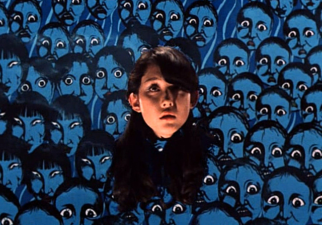
Oh, where to begin with this movie.  House is unlike any horror film you will ever see; or any movie for that matter.  It’s probably better described as a psychedelic trip than as a movie.  The film was directed by a former Japanese commercial director named Nobuhiko Obayashi, and his commercial background definitely shows in this film.  With a near manic tone and surreal uses of mattes, collage effects and animation, House feels very much like a Japanese TV commercial on steroids.  And that was probably the desired effect on Obayashi’s part.  This was meant to be a showcase for his own bizarre style and there seems to have been no better genre to make that work than in horror.  It should be understood that not all horror is the same and not every horror film is meant to leave you scared.  House is a perfect example of creepy horror, where the chills come not from the sudden scares but instead from the constant uneasiness brought on by the grotesque imagery on screen.  Honestly, nobody who watches House will ever be scarred out of their minds by it, but it will no less be a disturbing experience.  Amazingly enough, Obayashi was able to get studio funding for his artsy project, by no less than Japanese powerhouse Toho International (the studio that brought Godzilla to the world).  Toho probably didn’t realize what kind of movie they had just underwritten, but their gamble did allow for Obayashi’s imagination to be fully realized on film and as a result, it has become one of their most influential movies.

The story of House is just as basic as the title itself.  It’s essentially a haunted house movie, where a group of characters (in this case, Japanese schoolgirls on a field trip) must survive through a spooky night in a decrepit old home while it’s deceased inhabitants pick them off one by one.  Even the characters themselves are purposely archetypal, down to their names being representations of their personality.  The characters include Gorgeous (Kimiko Ikegami) who pridefully obsesses over her good looks, Melody (Eriko Tanaka) who likes playing music, Mac (Mieko Sato) the chubby one who likes eating, and Kung Fu (Miki Jinbo) who, well you can already guess what her thing is.  Together they take a trip to the mountains where they will stay at the home of Gorgeous’ ailing Aunt (Yoko Minamida), who is wheelchair bound and lives with her fluffy white cat.  As they stay longer at the house, the more they notice that not everything is as it seems, and soon more and more bizarre things start to happen.  Not only that, but some of the girls begin to disappear and/or are found brutally murdered around the house.  Thus begins a string of some truly strange and at times very creepy moments as the girls are suddenly consumed by the house as it becomes clear that it has a mind of it’s own.  Shattered mirrors cause the skin to peel off a girl who is looking into it; another girl’s disembodied head tries to eat her nearby friend; another girl is consumed by a carnivorous piano; and there’s even a demonic painting of the fluffy white cat that spews blood and fills the entire room with it.  Overall, the flow of the story is less about delving deeply into these girls’ stories and is more about finding weird circumstances to put them all into, and the crazier the better.  And that’s essentially the overall appeal of House; no holds are barred in this crazy ride of a movie and it’s more than anything about the experience than the narrative.

Now, as imaginative as House may be, it can also polarizing.  Those looking for a scary cinematic experience may be disappointed in this movie, because more often than not, this movie is more inclined to tickle your funny bone than to give you goosebumps.  I think that the description on the back of the Criterion box for this movie says it best when it states that it’s like “an episode of Scooby-Doo as directed by Mario Bava.”  This movie revels in it’s absurdity while at the same time not shying away from showing some really disturbing imagery at times.  That sometimes jarring contrast between tones can often times give you whiplash, but Nobuhiko Obayashi still manages to make it resonate despite the inconsistencies.  I especially admire the fact that he just goes for the most ridiculous ideas possible, throwing away all reason in the process.  The overall effect helps to give this movie the feeling of a feverish nightmare, which helps place it comfortably in the horror genre.  It may not make you jump out of your seat, but it will disturb you by it’s unrelenting assault on the perceptions of reality.  In addition, there’s also a beauty to be found in the movie’s surrealism.  Obayashi has said that the ideas in the film came to him from a short story written by his daughter, and there is indeed a childlike wonder in all the mayhem on screen.  Obayashi’s style certainly has a playfulness to it, even when what you’re seeing is freakishly disturbing, like when a piano chomps off the fingers of the girl playing it, and then those disembodied fingers begin to play the piano on their own afterwards.  It may be an aquired taste for some, but those who go for this kind of absurdist horror have made this movie a cult favorite for many years.

What I admire most about this film however is just how stunningly beautiful it is.  Nobuhiko Obayashi clearly wanted this movie to be as removed from reality as he possibly could make it, and it succeeds at doing just that.  Almost nothing was shot on location, except for a couple exemptions.  The majority of the scenes were filmed on soundstages with some incredible matte paintings used to fill out the background scenery, each of them exaggerated in their own way to give this movie a very storybook look.  Couple this together with some interesting uses of animation and some groundbreaking green screen effects, and what we get is an art show collage come to striking life.  The green screen effects in particular are the standouts, because Obayashi almost revels in the limitless possibilities he can have with the technique.  He uses it to create some rather striking visuals, like the crumbling of Gorgeous’ face in the mirror, revealing an inferno underneath her skin.  He also puts multiple layers of these effects on top of one another, making impossible to film angles and images come to life.  It’s really amazing watching this movie and realizing that nothing  was aided with CGI; that all the effects were done in camera.  That’s the benefit of having someone directing this with a commercial background, because a director of Obayashi’s type would understand the power of visual stimuli a bit more.  In addition, the color cinematography by Yoshitaka Sakamoto is both vibrant and daring, perfectly supporting the zaniness of Obayashi’s imagery.  For me, it almost feels like what a live action anime would look like, and by that I mean in terms of it’s visual energy and unbounded sense of reality.  It wouldn’t surprise me if more than one anime film in the last few decades took a few inspirations from this movie, especially some of the more horror based ones.

Criterion’s treatment of the film is as expected.  Given the cult status of the movie, it’s not at all surprising that Criterion would jump at the opportunity to include this film in it’s Collection, especially if it means giving it a spotlight to help it find a larger audience.  The movie has thankfully been well cared for in the Toho Studio vaults through the years, but even still for a movie it’s age, there needed to be an extensive restoration to make the film sparkle more in high definition.  For their edition of House, Criterion gave the movie a new high-def transfer for it’s blu-ray release, and if there was ever a movie in the Collection that deserved a blu-ray, it’s this one.  The HD scan of the movie really makes the colors pop, which is a blessing for a color driven movie such as this.  The background mattes also are more stunning to look at in this transfer, allowing the viewer to see all the fine detail of the craftsmanship behind them.  Of course some of the visual effects will look dated in this transfer, as the seams behind the effects are more clearly defined in HD causing the illusion to become a little less effective, but it’s no more glaring than any other effects film of that era.  In fact, I think Obayashi’s intent was for his audience to be more aware of the artificiality of his movie, because that’s a part of the overall experience.  As long as the visuals still retain their impact, it doesn’t matter how obviously fake they look, and thankfully the HD transfer makes those visuals as stunning as ever.  The uncompressed soundtrack likewise runs that fine balance between the natural and the unnatural, and Criterion has also given it a respectable restoration.

There’s also a healthy sampling of bonus features that both celebrate the film as well as gives us the audience a look into it’s making.  Perhaps the most substantial feature on the blu-ray is the Constructing a “House” featurette.  This newly filmed piece made by Criterion features interviews with director Nobuhiko Obayashi, as well as his daughter Chigumi, who like I stated before was the one who came up with the story originally.  The two talk about how the movie came to be and how Obayashi was able to get it made, despite his lack of experience in features.  Some of the movie’s most notable visual moments are touched upon as well as how they were able to make those groundbreaking effects work.  Screenwriter Chiro Katsura is also interviewed in the featurette, explaining the challenges of creating a cohesive story-line around all these imaginative set pieces.  Next is an experimental short made by Obayashi in 1966 called Emotion.  It’s a neat, if strange little half-hour film that helps to show us how the director was trying to find his voice in his early years as a filmmaker, and how that would soon be reflected in the more ambitious House years later.  Some of the director’s manic editing style and trick photography are clearly noticeable in this short film, and it’s good that Criterion has included it here as a comparison point for showing the evolution of Obayashi as a filmmaker.  Also included is an appreciation video from American horror filmmaker Ti West, who helps to put the legacy of the movie into perspective, including it’s influence on his own style.  Lastly, there is an original theatrical trailer, which rounds out a small but still very welcome collection of supplements for this Criterion edition.

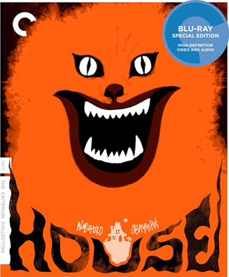
House is a difficult movie to recommend, because it’s really hard to tell how someone might respond to it.  If anything, I would say just watch it once for the experience and see if it’s you’re type of horror movie or not.  I for one admire the movie for it’s originality.  It’s safe to say that there is no other film like it, ever.  The manic uses of absurd imagery are riotously funny to watch, but it’s also balanced with a macabre sense of foreboding that helps to make it effectively creepy at the same time.  That’s a blend that you see lacking in many horror films today, many of which seem more concerned with throwing scares at you than trying to establish a sense of terror.   But, you can see some of the influence that House has had in the horror genre over the years too in many different ways, whether it be the absurdly graphic murders committed by Freddy Kruger in the Nightmare on Elm Street series, or the blending of humor and horror found in the films of Edgar Wright.  Or even the graphic design similarities that this movie shares with the medium of anime.  It’s a cult movie for a reason and it’s great to see something this completely original find it’s place in cinema history.  Criterion of course have done their part to give this movie a respectable presentation, and many Criterion collectors would be well served by having this on their shelf.  I would say that it’s even worth getting just for the striking box cover art along, which uses the iconic painting of the demonic cat from the movie to great effect.  That eerie image will really stand out on your blu-ray shelf.  Overall, for a good Halloween movie experience, you can’t go wrong with Nobuhiko Obayashi’s House.  It’ll make you laugh out loud even while you’re chilled to the bone by it’s visually vivid house of horrors, and that’s a cinematic treat that’s perfect for this spooky time of the year.

https://www.criterion.com/films/27523-house?q=autocomplete

hausu criterion

Crimson Peak – Review

crimson peak

The Halloween season always has room reserved for a horror entry or two.  And usually the best kinds of horror films are given the spotlight at this time.  When you’re a bad horror movie, you usually get shipped off to the beginning of January, where all the worst films go to be forgotten.  But, when you’re a high-quality horror film, a late October release is all the more timely.  Horror fans prefer to be shocked out of their wits and have their tolerances for gore challenged, because it’s a part of the entertainment.  It’s much more of a communal audience experience watching a horror film in a theater than any other type of genre, because the entertainment comes from our shared reactions.  Now, typically, horror films are low rent productions that make due with their limitations and will oftentimes be tongue-in-cheek experiences, depending on the execution.  But, there are also movies that fall into the category of prestige horror films, where the budgets and production values are increased significantly and the end result can be seen as artful in the film community, without betraying the rules of the genre.  A prestige horror film can sometimes come from a magnificently executed and high value production of a story with horror elements, like The Silence of the Lambs (1991) and The Exorcist (1973) or from a highly artistic rendering of the genre tropes through an acclaimed director’s vision, like Stanley Kubrick’s The Shining (1980).  This Halloween season offers us a new horror film of this second type from one of Hollywood’s most unique visionaries.

Mexican born filmmaker Guillermo del Toro has been something of renaissance man in Hollywood in terms of trying different genres, but always with his own unique vision.  He has taken on Science Fiction (2013’s Pacific Rim), Superheros (2004’s Hellboy and it’s 2008 sequel), as well as Fantasy and War Drama (2006’s Pan’s Labyrinth).  But, perhaps his favorite genre to tackle above all the others is horror, and in particular, ghost stories.  This was evident in his earlier films like Cronos (1993) and The Devil’s Backbone (2001), both of which centered around themes of death and the supernatural.  In fact, all of del Toro’s movies have a little bit of the macabre to them, including something as rollicking as Pacific Rim.  It’s very clear from watching any of his films that the man loves horror and his work often reflects that same love.  At the same time, he’s also a filmmaker who knows when to have a little fun while working within the confines of a genre and his movies are often purposefully over the top, which gives them an extra level of entertainment.  While he isn’t consistently sticking with a particular genre, his movies still almost always have a sense of character to them, which has made him a highly regarded director.  This year, he returns to his roots and has crafted another ghost based horror film called Crimson Peak.  It’s another stylish production from the visually driven filmmaker, but here for the first time, he is working within a Victorian Gothic setting.  It’s a style that’s well suited for a prestigious horror movie, but through the eyes of Guillermo del Toro, it becomes something even more incredible.

The story, which was co-written by Guillermo del Toro himself, follows the supernatural journey of Edith Cushing (played by Mia Wasikowska), an aspiring writer and only child of a New York based mining tycoon (Jim Beaver).  Since she was a little girl, she has been haunted by the ghost of her departed mother who periodically returns to tell her daughter to “beware of Crimson Peak.”  As an adult, she crosses paths with an English playboy named Thomas Sharpe (Tom Hiddleston) who seeks financial assistance with a mining venture that he wants to exploit on his home estate.  Edith is charmed by the stranger, but her father disapproves of the man and Edith’s childhood friend Dr. Alan McMichael (Charlie Hunnam) has his suspicions of him as well.  Edith nevertheless pursues a courtship with Thomas and agrees to marry him after she tragically loses her father in a sudden “accident.”  After the wedding, Thomas and Edith return to England where they begin married life in a decrepit old mansion called Allerdale Hall, which sits atop Thomas’ mine and is slowly sinking into the red clay beneath it.  The couple try to make due with the inconveniences of the house, but Edith feels unease under the watchful eye of Thomas’ overbearing sister Lucille (Jessica Chastain), who becomes more menacing the longer Edith is there.  Not only that, but Edith is visited by ghosts who haunt the house, each appearing more grotesque than the last.  Though frightened by them at first, Edith soon discovers that the ghosts are trying to deliver her a message, one which becomes more clear once she learns that the red clay that Thomas is digging up has given the hilltop she lives on another nickname by the local village folk who live near it; Crimson Peak.

Overall, it’s a very straight forward ghost story, which serves del Toro’s film well.  Like most of his other movies, it’s not about the intricacy of the plot, but the way it’s presented.  Guillermo del Toro works within the genre confines of horror, sometimes even embracing it’s cliches, all with the purpose of giving it his own spin.  Del Toro very much likes to make his movies work as examples of the genre, and not as parodies of it.  I can honestly see Crimson Peak standing confidently alongside the classic Hammer horror movies of the 60’s and 70’s, which themselves were purposely over-the-top.  Guillermo also milks the Victorian aesthetic and tone very well here, making the atmosphere of the film feel even more genuine.  While not particularly original, I did enjoy what this movie was trying to be and I felt that it overall worked as a genre flick.  Is it the scariest movie ever made?  No, but the atmosphere that del Toro builds up is enough to satisfy die hard horror fans.  There are some especially creepy moments in the movie, particularly it goes silent for some moments.  For the most part, I felt that the movie was at it’s strongest when it just let the atmosphere of the scene speak for itself, with the moody lighting and the eerily tuned sound design taking over.  The story is not particularly deep; you already know where the plot is going long before it gets there.  But at the same time, I believe that’s del Toro’s intention.  He purposely takes story shortcuts in order to spend more time exploiting the tension and horror of each particular scene; something he also did effectively well with sci-fi in Pacific Rim. Some may find the long drawn out scenes of dark, shadowy halls tedious, but I felt that Guillermo’s style really shone in those moments.  It’s especially refreshing to see a movie get it’s best moments not from a jump scare, but from the eerie build up to the frights.  The scenes where the ghost Edith’s mother slowly reveals herself across a shadowy corridor still give me chills and has me looking over my shoulder.

But, while the ghosts are frightening in design, and the atmosphere is superb, there were some unfortunate cinematic elements that sadly took me out of the film at times.  In particular, I had a problem with the obvious use of CGI in the movie.  Now, Guillermo del Toro isn’t a novice when it comes to using CGI.  In fact, he used it to great effect in Pacific Rim.  But, he’s also been a known to use some really cool looking practical effects as well.  In particular, the amazing make-up used in Pan’s Labyrinth and Hellboy, where he brought to life some amazing creatures that become all the more terrifying because of their seemingly organic presence on screen.  What helped those movies out was a balance between the different kinds of effects needed.  In Crimson Peak, the CGI seemed to be favored a bit too heavily and it robs the movie of some of it’s effectiveness as a result.  There are CGI elements that do work, like a ghostly, pale shadow appearing out of the dust in an attic over a wheelchair, but there are others that look too artificial to be taken seriously.  I felt that the appearances of the many ghosts at Crimson Peak weren’t quite as horrifying as Guillermo had intended them to be, and that’s because the CGI used to create them looks a bit too cartoonish.  While their designs are unique (some of which del Toro illustrated himself), their animation left something to be desired and I could never fully feel scared as I was watching these ghosts chasing poor Edith through the house.  Had Guillermo del Toro used a more subtle approach with the ghosts in the movie, like old fashioned green screen and make-up effects, I might have bought the effect much better, but instead the movie suffers from unrealistic ghosts in a movie that’s dependent on them being scary.

But, the inconsistency of the film’s effects are balanced out by some incredibly effective, and sometimes scary performances from the cast.  Mia Wasikowska may have the most difficult time carrying much of this film and trying to convince us that she is seeing spirits all around her, but she does an effective job of giving Edith the depth of character needed to pull it off.  Edith, if handled poorly by another actress, could’ve turned into another boring ghost story protagonist, relegated to just reacting to the horrors around her instead of taking action.  But Mia manages to avoid portraying Edith as one note and part of the character’s charm is her curious nature, which comes out perfectly in her intelligent performance.  Tom Hiddleston also manages to perfectly embody the character of a playboy scoundrel without sinking too far into stereotype, and his character actually gets one of the more interesting arcs in the story.  But, if this movie belongs to anyone in particular, it’s Jessica Chastain as the sinister Lucille.  Chastain is relishing her role here, chewing up all kinds of scenery and managing to become even more chilling than the ghosts that haunt the mansion.  I just love the way that she goes over-the-top, but not to the point where it becomes detrimental to the story.  She’s unhinged, but grounded.  There’s an especially creepy bit with a spoon midway through the movie that is so perfectly creepy.  It’s the kind of performance that really sticks with you and it’s a testament to Jessica Chastain’s talent as an actress that she could make the insanity of this character feel so believable.  She’s by far the best thing about this movie and is probably the thing most worth watching overall, even with all the eye candy on display.

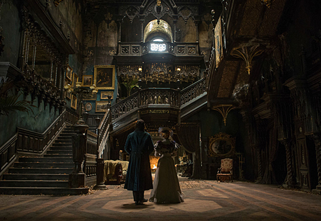
Of course, given that this is a Guillermo del Toro movie, there has to be something said about the production design.  For one thing, del Toro proves to be surprisingly adept with the Victorian period details, making the setting feel for the most part authentic to it’s time.  Likewise, del Toro also puts lavish excess into the movie when needed, particularly when it comes to the mansion itself.  The decrepit haunted house that serves as the setting of this movie feels very much like a Guillermo del Toro creation, with it’s twisted and foreboding nature.  Even simple design choices, like a patch of snow in the foyer originating from a hole in the ceiling, as well as the spiked archways in the halls, carry the del Toro signature.  Guillermo is probably only rivaled by Tim Burton for being identified by a particular aesthetic with his movies, which favors medieval Gothic inspiration along with a little Grand Guignol grotesquery thrown in.  In this movie, the designs used on the mansion help it to stand out and it almost makes the house a character in it’s own right.  I particularly like the way that the battered state of the home belies a little bit of what the mansion was like in it’s glory days, which makes it feel even more eerie once you take in the details.  There’s also a neat visual idea of the house sinking into the red clay that lies below it’s foundation.  This almost gives the audience the visual impression that the house bleeds, given the bright red hue of the clay once it liquefies and seeps through the floors and walls.  It’s a grotesque reinforcement of the mansion’s sinister nature, though it can come off to some as a little heavy handed to some.  I found it to be an interesting visual idea that stays true to the style of it’s visionary director.

Crimson Peak works as both a throwback to traditional ghost stories and as an unconventional horror movie.  Sure, it’s predictable and simplistic in many ways, but that’s part of the charm of it.  I just wouldn’t go into this movie expecting to be scared out of your mind.  This movie is much more of a triumph of production design, with some of the most beautiful imagery that you’ll see on the big screen this year.  The gore and horrifying scares are only in here to give this film it’s character as a horror flick.  And while not every idea or design hits it’s mark, like the less then effective CGI, the movie will still have enough for everyone to enjoy.  It has some effectively creepy atmosphere, some really standout performances, and also a surprisingly macabre sense of humor, which is another trademark of Guillermo del Toro’s style.  Compared to the director’s other films, I would say that this is a very solid exercise in genre film-making and not a particularly game-changing triumph.  It certainly doesn’t resonate as emotionally as Pan’s Labyrinth, but at the same time I don’t think Guillermo was trying to reach that far anyway.  This is his love letter to the ghost stories and horror films that he grew up with and he wanted to bring his own visual style into this kind of tale to see if he could do it justice, and in that regard, I believe he hit his mark.  So, I highly recommend Crimson Peak as a viewing experience, especially if you’re looking for something effectively spooky this Halloween season.  If anything, it’s just refreshing to see a horror movie that doesn’t have to rely on sudden jumps to scare it’s audience and instead relies on the dread of what may lurk around the corner in the shadows.

Rating: 8.5/10

Focus on a Franchise – Scream

scream ghostface

With Halloween looming just around the corner, I thought it would be appropriate to highlight another horror franchise in this series, and examine how it progressed over time, and whether or not it stayed true to it’s original concept.  What I decided to do this week was honor the the recently departed horror icon Wes Craven with a spotlight on one of his most popular titles, that being the Scream franchise.  Wes Craven’s movies may not be to everyone’s tastes, and I wouldn’t exactly consider myself a huge fan of his either, but there’s no denying that he is one of the kings of the horror genre; probably without equal.  No other horror film director was as prolific nor as resilient.  He’s as synonymous to the horror genre as John Ford is to Westerns, and though many of his movies aren’t what I would consider masterpieces, you can’t help but admire him for becoming a master of his craft.  Horror as we know it today owes a lot to the film-making style of Wes Craven.  Craven brought gore into the mainstream of the horror genre.  What Dario Argento pioneered in the art house independent market, Craven made it work in Hollywood.  He began with low budget schlock-fests like The Last House on the Left (1972) and The Hills Have Eyes (1977) before making his big bloody splash in the 80’s with A Nightmare on Elm Street (1984), the movie that turned Craven into a household name and introduced the world to one of Horror’s most iconic monsters; Freddy Kruger.  Over time, Wes Craven had trouble living up to the legacy of Elm Street, but that was until he reinvented himself again in the late 90’s with a new horror movie that turned the genre on it’s head, in more ways than one.

When Scream premiered in 1996, the horror genre had largely lost a lot of it’s luster, in no small part because few if any horror movies ever felt original.  Most horror franchises usually would start strong and then later peter out the longer they went on.  The sequelizing of these movies became monotonous to audiences who saw the same cliched things happening over and over again without ever getting better.  Wes Craven, to his credit, was not only a contributor to the horror genre, but also an appreciator as well, and over time he was compelled to address the declining state of the genre.  One thing that he did observe in the mid nineties was the rise of movie savvy audiences who were more keenly aware of all the different tropes that make up a horror movie, given that many of them had grown up with them in their youth.  He also observed the way that some horror movies over time would develop cult followings, and how that would in turn drive the success rates of some franchises.  Though it was well before the rise of the internet, which would compound this phenomenon to unprecedented levels, Wes Craven did see a new kind of horror movie culture that had emerged and he saw in it a new kind of subculture worth exploiting for a horror movie.  He found the voice he needed to tap into this newer, younger audience with screenwriter and Dawson’s Creek creator Kevin Williamson and the end result became a movie that not only dissected horror cliches, but also revitalized them for a new generation.  It was horror for the MTV generation, and for better or worse, Wes Craven had changed the genre once again.  For this article, I will be looking at the Scream series as a whole and see how it fared from the groundbreaking first film all the the way through it’s less effective follow-ups, and how they reflected the back on the career of it’s creator as well.  Fair warning; some spoilers ahead.

scream 1

SCREAM (1996)

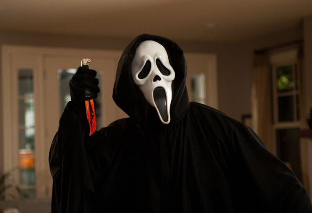
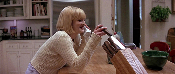
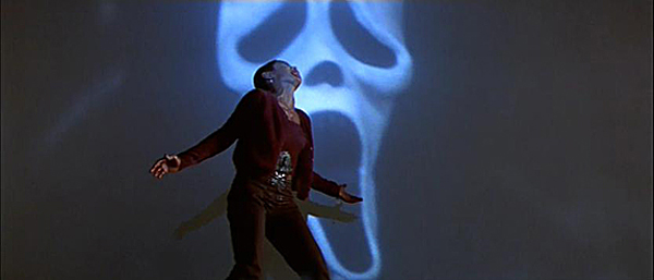
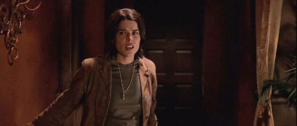
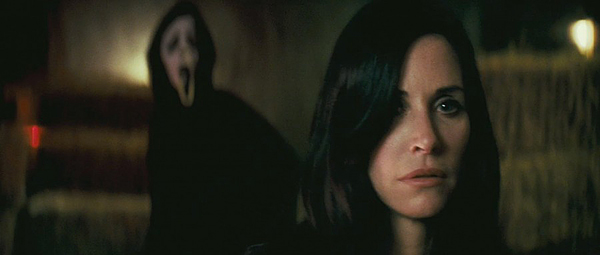
This is the one that started it all, and is in-arguably one of the most influential horror movies of all time.  Wes Craven’s movie stands out for a number of reasons; it modernized the genre, it was self-aware in ways that most horror movies weren’t, and it introduced a new iconic monster to the genre that would become quite literally the face of a franchise; Ghostface.  The movie starts off with bang in it’s opening prologue, and talk about a movie wanting to make a statement right off the bat.  In it, a lonely girl named Casey (Drew Barrymore) is confronted over the phone by a mysterious stranger who asks her about her favorite scary movies.  Playful at first, the conversation quickly turns menacing as Casey learns she’s not alone and that whoever is on the other line is out to get her.  Soon, she is chased down by a person in a black robe wearing a ghost mask and wielding a knife.  Suffice to say, she doesn’t make it.  It’s an effectively gruesome and tense scene that sets the tone perfectly, both with the horror elements and also with the self-aware critiquing of the genre itself.  The rest of the movie introduces us to Sidney Prescott (Neve Campbell), who will inevitably be the focus of all the horror tropes going forward in this movie along with the remainder of the franchise.  She’s  accompanied along the way by Deputy Dewey (David Arquette), who’s trying to find a link between all the murders happening in town by the “Ghostface” killer, as well as by reporter Gale Weathers (Courtney Cox) who is after a story to help boost her career.  Over time, Sidney learns that she’s target number one on the killer’s hit list, and that even her friends like boyfriend Billy (Skeet Ulrich), horror film nerd Randy (Jamie Kennedy), and class jock Stuart (Matthew Lillard) might be the killer behind the mask.

Overall, I would have to say that this movie is easier to respect than to admire.  For one thing, I do like the way that Wes Craven turns the horror genre on it’s head by making us aware of the horror movie cliches before they happen, helping to make this movie both frightening as well as refreshingly silly.  One of the best things about Craven’s style is the way that he doesn’t take himself too seriously.  He goes for the ridiculous and absurd constantly in his movies, which was a staple of Nightmare on Elm Street.  The same thing happens here too whenever necessary, particularly in some of the more gruesome killings, like Rose McGowan’s character getting crushed in a retractable garage door.  But, where the movie falters is in the plot itself.  However clever the death scenes may be, the movie sadly gets bogged down in a generic thriller plot involving Sidney and the mystery around her family’s dark history.  Of course, horror movies aren’t renowned for their intricate plots, and using a cliched story may be by design on Craven’s part, but it still acts as an inhibitor to the overall movie.  In addition, time hasn’t been kind to this movie either.  What seemed groundbreaking back then feels very dated today, probably because the movie is so steeped in it’s time period.  It’s a 90’s movie down to it’s core, which may give it some nostalgia value today, but probably not positive overall.  But, at the same time, whatever faults it has as a story doesn’t diminish it’s impact.  This was a highly influential movie that really shaped the language of horror for a decade thereafter.  There were so many copycat horror films that tried to do the same thing in the following years, but never quite made it.  For me, it’s a respectable benchmark in the genre, but one that never did rise up to the level set by it’s brilliant opening scene.  But, the question remained; could Wes Craven ever rise to that level again?

scream 2

SCREAM 2 (1997)

Released right on the heels of the first movie, with little over a year in between, Scream 2 picked up right where the last film left off.  And, remarkably that quick turnaround for Wes Craven yielded a superior product.  This, to me is the best film in the franchise, because it fixes most of the story problems of the first movie and it plays upon the self aware aspects of the genre in an even more pointed way.  Taking Sidney into college provides the film’s subtext with even more ammunition, as this movie gets to poke fun at the way that younger audiences respond to horror movies at the time.  Since the murders of the first movie, Sidney’s has turned into a mild celebrity, with her ordeal having been adapted into a movie itself.  As a result, she is hounded by the spotlight, having to re-confront the reality of her worst life experience constantly.  This becomes even worse when it seems that a copycat killer is on the loose, bringing “Ghostface” back from the dead.  Given the first movie’s phenomenal success, the meta narrative actually manages to self-examine itself, making the observations by the characters feel all the more resonant and the use of the cliches a lot smarter.  And it doesn’t address horror movie cliches only, like the seemingly indestructible killer or the predictably timed death of two lovers after they’ve had sex.  It also critiques sequel cliches as well, like how the stakes and scale are raised but the same results still happen.  And the way that the first Scream influenced so much of horror in it’s wake, including turning Ghostface into an instant icon, helps Wes Craven address the cult like following that horror movies can have in a much more effective way here, given that it actually happened it to this franchise in reality.

Like what most great sequels do, it ups the ante without having to rehash old ideas.  This is evident right from the opening scene, which manages to both surpass the first movie’s opening while at the same time poking fun at it.  It involves a couple (played by Omar Epps and Jada Pinkett Smith) going to a theater to see the film adaptation of the murders in the first movie.  The audience around them proves to be full of rabid fans, all coming to the theater in the “Ghostface” costume.  Though most of crowd is friendly, if a bit rowdy, the couple soon learns too late that a real killer is among them.  This leads to a chilling revelation as the couple are slaughtered there in the theater as the movie plays along with a tongue-in-cheek recreation of the first movie’s opening scene.  It’s a brilliant juxtaposition that represents the best of Wes Craven’s horror movie tropes; his mercilessly gruesome vision and his macabre sense of humor.  Thankfully, the remainder of the movie lives up to the opening and the two sides of Craven’s style help to elevate the story rather than get in the way.  Even with all the horror movie cliches being lampooned, it still manages to offer up a few surprises.  Like I said, spoilers coming, and one of the film’s more pleasant surprises is the revelation of the murderer, who turns out to be the mother of Billy, the original film’s killer, played here effectively by Laurie Metcalf.  It’s a nice nod to another horror franchise, as this movie uses the Mrs. Voorhies twist of Friday the 13th (1980) to great effect and makes the murders in this movie revenge killings, which is a logical next step to go with for a sequel.   Overall, Scream 2 surpasses it’s predecessor in every way and shows that Wes Craven had enough good ideas for more than one movie in this franchise.

scream 3

SCREAM 3 (2000)

Unfortunately, this is where all the good ideas ran out.  Naturally, the success of the first two movies led to a third film, but none of what made the other two movies effective translated over.  I think one big reason for this is the loss of Kevin Williamson as screenwriter.  Instead, Wes Craven had this sequel written by newcomer Ehren Kruger, who has since gone on to be the writer behind the Michael Bay Transformer movies.  That should give you an indication of the intelligence level of this movie.  While not one of the worst horror movies I’ve ever seen (being largely saved by Wes Craven’s stylistic direction), this movie is still remarkably stupid. The self-aware humor that defined so much of the first two movies is clumsily handled here.  There’s even an awful deus ex machina element where Jamie Kennedy’s Randy (who was killed off in the previous movie) somehow had left a tape for the main characters to find where he details exactly how a trilogy capper works, giving them insight into how they should respond to the new set of murders happening around them.  Also, this movie has one of the most preposterous twist endings that I’ve ever seen.  Even Scooby Doo and his gang would laugh at how stupid a choice the main killer ends up being.  The movie’s one saving grace is the addition of some genuinely funny comedic actors like Parker Posey and Patrick Warburton into the mix, both of whom are sadly underused before they are inevitably killed off.  Parker Posey, in particular, actually elevates the material here, making what could have been a horribly written obnoxious character into a welcome comic relief.  It seems like all those years working in Christopher Guest movies paid off for her improv skills.  Her character gives me the feeling that Wes Craven wanted to go into a more comical direction with this movie, but somewhere down the line he lost control of the tone and it ended up not working as well as he hoped.  Sadly, with a dumb downed plot and a lazy screenplay, this was a big step backwards for the franchise and one that put it on ice for over a decade.

scream 4

SCREAM 4 (2011)

The decade long gap in between Scream 3 and Scream 4 proved to be a transition period for the horror film genre.  The result of the first Scream‘s success proved to be an era of a lot of failed wannabes, all trying to match Scream’s more crass and self-aware style.  Instead of originality taking hold, we got a lot of ludicrous horror movies that tried to be too clever for their own good.  This was the era of the PG-13 horror flick, which were aimed more at the teenage set, which Scream so effectively connected with despite it’s R-rating.  And of course, PG-13 gore is not at all scary.  But, thankfully at this same time, fresh new ideas were made in response to the watered down Scream clones with R-rated fare like Saw (2004).  There were also new horror filmmakers emerging like Rob Zombie (The Devil’s Rejects) and James Wan (The Conjuring) who helped to bring credibility back to the genre as well.  During this time, Wes Craven had developed his name into a brand, which had it’s good points as well as it’s bad.  The good side was that he was able to lend his name to projects that normally would’ve gone under the radar, like his 2005 thriller Red Eye, but the bad side was the standard to which he had to live up to.  Thus, after years away from the genre he helped to reshape, Wes Craven delivered another Scream sequel, and quickly proved that this was a franchise way beyond salvaging.  It’s not as stupid as Scream 3 (though some moments come close like a character telling the “Ghostface” killer that he can’t die because he’s gay and that it’s against the genre rules), but it commits an even worse crime of just being boring.  Mainstays Neve Campbell, Courtney Cox and David Arquette return, but they are sidelined by a new group of teenage victims, all of whom are bland genre archetypes.  In a sense, Scream 4 became just another wannabe, which is sad given that this came from the series’ original creator in what turned out to be his swan song as a director.  It’s too bad that a decade of waiting didn’t yield anything more for this franchise than just a cash in for the studio that made it.

Overall, the Scream franchise may be a clunky and inconsistent addition to the horror genre, but at the same time you can’t help but respect it.  It did modernize the genre at a time when it was desperately needed and it also allowed audiences in on the joke as it gave away some of it’s tricks.  One only wishes that it had been more effective at getting it’s point across with each movie.  The only time where I felt that the franchise got the formula down perfectly was in Scream 2, a movie that was much better than it had any right to be.  The first Scream is a mixed bag, but it’s high points far outweigh the bad, and it’s impact is still something to respect, even if it did spawn some rather lame results.  Sadly, Wes Craven had a hard time living up to that legacy, but even still, it’s admirable how he managed to rewrite the rules of the genre consistently throughout his career.  Scream may seem dated today, but you can honestly say that about any horror film made by Wes Craven.  He liked to have his movies reflect the era that they existed in and that’s a great sign of an evolving filmmaker.  He embraced the new attitudes and tastes of his audiences and rewarded them with the things that they wanted, even if he wasn’t always successful at it.  And what made him so effective in the horror genre was his ability to make effective monsters.  Ghostface is rightfully as iconic as other horror mainstays like Jason Voorhies and Freddy Kruger, and one of the scariest aspects of this killer is that it’s iconic nature is what fuels it’s resurgence throughout every movie, living on a mask for new killers.  Unlike it’s peers, Ghostface lives on because someone always picks up the mantle and dons the mask again, keeping the cycle going.  It’s a movie monster built out of legend rather than mysticism, making it all too realistic and as a result, even more terrifying.  That’s the great legacy of Wes Craven’s Scream franchise; connecting the horror genre with the modern world and showing how the subculture of horror can even bring out monsters of it’s own.  We live in a modern society today where horror is not so imaginative and copycat killings are sadly all too real in our society.  In the end, Wes Craven gave horror a new face, and it was one that was horrifyingly human.

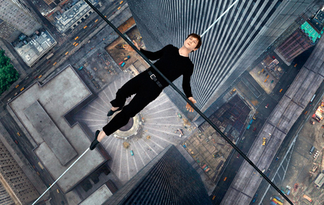
The Walk – Review

the walk movie

As we enter October, we are beginning to see the first wave of Hollywood prestige pictures arriving at our local cineplexes, all with the purpose of either getting a head start on awards season buzz or just hoping to be a big enough draw to become a box office hit.  This October, we’ve got some of Hollywood’s most notable filmmakers all releasing their newest features in a jam packed couple of weeks, and in some cases in direct competition with one another.  This proved to be a dilemma for me, because even though I knew that I wanted to write a review for all of you this week, I didn’t exactly know until yesterday what it would be.  Certainly the big draw this weekend will be Ridley Scott’s new space-based adventure The Martian, which is already earning some outstanding reviews, but the local L.A. theaters near where I live gave me another movie option to choose from.  In certain IMAX theaters across the country, they are presenting an advance showing of Robert Zemeckis’ new big screen extravaganza The Walkand fortunately one of those theaters is near me.  So, given two very promising options to choose from, it ultimately came down to a coin flip, and The Walk won out.  In the end, I think that this probably ended up being a better option to review.  For one thing, I get to review a movie that is not yet available everywhere, thereby giving you my readers a good early impression of a coming attraction, and secondly, after spending the last two fall seasons reviewing space themed movies like Gravity (2013) and Interstellar (2014), it was probably time to review something else out of a different genre.  So, let’s talk about The Walk.

This is the second film in director Robert Zemeckis’ thankful return to live action film-making, after spending  much of the 2000’s dabbling in motion capture animation with The Polar Express (2004), Beowulf (2007) and A Christmas Carol (2009).  After earning raves for his live action film Flight (2012), Zemeckis needed a story that appealed to his epic and sometimes unconventional tastes as a follow-up.  He managed to find that story in the true life tale of legendary tightrope walker Philipe Petit.  Petit gained notoriety in the 1970’s for his larger than life personality and his death defying stunt work, much of which he did illegally.  Trained for years in the circus, Petit later performed on the streets of Paris before getting the idea to walk a tightrope in some of the most dangerous places possible.  A successful walk across the towers of the Notre Dame Cathedral on his tightrope turned him into an international celebrity, but he felt that he didn’t command enough respect in his native France, so he sought to take his act on the road and find an even greater place to hang his wire.  And that place turned out to be the newly opened Twin Towers of the World Trade Center in New York City.  And that journey to that fateful walk between the towers became the inspiration for this particular film.  Adapted from Petit’s own memoir, “To Reach the Clouds,” The Walk tells the story of how Petit’s monumental stunt came to be and what was involved with pulling it off, and it’s a story that is comfortably within Robert Zemeckis’ range as a storyteller.  It’s epic, it’s colorful, it doesn’t take itself too seriously, and most importantly it’s just fun to watch.

The story is told entirely from Petit’s point of view, with the man himself (played by Joseph Gordon-Levitt, with an over the top French accent) addressing the audience directly.  This first hand account helps to drive the tone of the movie, which like Petit is energetic and unpredictable.  We see his early life as a street performer, walking tightrope on the streets of Paris to the amusement of passers-by.  There he meets Annie (Charlotte Le Bon) who would become the love of his life and the first accomplice in his greatest stunt, the walk between the towers, which he keeps referring to as “the coup.”  For years, he plans out the monumental walk, gathering more accomplices along the way including mathematician Jeff (Cesar Domboy) and photographer Jean-Louis (Clement Sibony).  Once the Towers are finished being constructed, Philipe makes his way to New York and covertly takes notes on every aspect of the building, making sure that every safety measure is taken before he makes his walk, something he learned from his longtime mentor Papa Rudy (Ben Kingsley).  In New York, he gains the help of more accomplices like J.P. (James Badge Dale) and Albert (Ben Schwartz) and has everything he needs to pull off his stunt.  The remainder of the film follows Philipe and his team as they put the plan into motion, trying to have everything go off without a hitch.  Much of the drama of the movie’s latter half comes from all the unexpected roadblocks that get in the way, including nearly getting caught by security and almost losing the wire when one of their support lines breaks.  Not to mention all the death-defying prep work that they must do on the edge of what was at the time the tallest structure in the world.  All this leads to a tense and harrowing road to the titular walk between the towers.

The Walk does an excellent job of dramatizing this true life event, but it’s not entirely a perfect adaptation either.  Perhaps part of the reason why this movie didn’t grab a hold of me as strongly as I hoped is because I had already seen the Oscar-winning documentary called Man on Wire (2009), which told the exact same story as this film.  Because of the documentary, I already knew where the story was going to go, which took some of the tension away from my experience watching this movie.  But, at the same time, if someone were to watch this movie without knowing what happens, they’ll probably be on the edge of their seats because this movie does indeed do an effective job of laying out the stakes involved.  I think my bone of contention comes from the contrasting depictions of the event from both movies.  They both do a great job of showing all the details that went into Philipe Petit’s walk, giving the story a very heist movie feel to it.  Unfortunately, the cinematic treatment feels more superficial in comparison, with the all embellishments becoming far more apparent and distracting as the story unfolds.  The Walk works at it’s best when it doesn’t try to show off how clever it can be and just let’s the story take hold on it’s own.  Now, using the embellishments may be an intentional choice on the filmmakers part, because the story is told solely from the perspective of it’s protagonist, something the documentary didn’t have as it used multiple accounts to tell it’s story.  That helps to make the cinematic excesses feel somewhat less intrusive, since it’s clear that Zemeckis wants the audience to see the experience from his main character’s sometimes boastful perspective.  But, even still, I felt that some of the cinematic flourishes reduced the tension in the story, which the documentary better conveyed overall.

But, in the end, it becomes a minor nitpick in an over effective movie.  One of the film’s best strengths is the direction of Robert Zemeckis.  Over his long and productive career, Zemeckis has become a master of blending drama and comedy together in his movies, and making both work to the story’s advantage.  He’s also been a director who has loved to push the medium of film further, trying out new techniques in camera work and visual effects, such as blending Live Action with Animation in Who Framed Roger Rabbit? (1988) or digitally inserting Tom Hanks into old news reel footage in Forrest Gump (1994); and let’s not forget that he changed cinema forever with a little trilogy of films called Back to the Future.  One of the reasons why I’m not as enthusiastic about his years in motion capture animation is because it took away some of the creativity from Zemeckis’ style away, as he no longer was bound to the constraints that the medium of film had put on him, and had forced him to be creative in order to overcome them.  Now that he’s returned to live action, the old rebellious Zemeckis is back, and his visual flair is just as strong as it was back in his heyday.  There are plenty of neat little ideas that he plays with in this movie, like showing a passage of time in Philipe’s training through the visual of his tightrope getting thinner with every step he walks across it.  Plus, Zemeckis keeps the tone light throughout, with Petit’s grandiose personality driving much of the tone.  It never gets too serious and much of the movie’s entertainment comes from it’s sense of humor.  Much like it’s subject, the movie has to keep a tight balance between it’s tense, action packed moments and it’s lighter comical tone, and Zemeckis proves to be a perfect match for this kind of project.

One thing that could prove difficult for audiences is the character of Philipe Petit himself.  Let’s just say subtlety is not one of the words you would use to describe the man.  He’s impulsive, confrontational, stubborn, but also something of a hero as well.  He manages to inspire the support of his friends, while at the same time driving them crazy with his seemingly death wish-like zealotry towards his mission.  This is largely reflected in Joseph Gordon-Levitt’s performance, which may be grating for some viewers.  Gordon-Levitt, who is not French, speaks throughout the movie in a very thick accent that may or may not make some people believe he is overacting in an embarrassing way.  I, however, didn’t mind his performance, because I think that his work here is meant to be over-the-top on purpose as a reflection of the real life Philipe Petit.  For those of you who have seen Man on Wire, you’ll know that Philipe has a very explosive personality and is certainly a show off.  I think that’s what Joseph Gordon-Levitt wanted to capture in his performance and it works to the advantage of this movie.  Philipe may be an obnoxious nut, but he’s a lovable nut too.  What matters is that you want him to succeed, and the movie does an excellent job of getting us on his side.  In that respect, Joseph Gordon-Levitt’s wacky performance is exactly what is called for, and he manages to carry the film as a result.  His works is also grounded by an able supporting cast.  I particularly like the subplot involving Cesar Domboy’s Jeff, who’s fear of heights is challenged greatly by Philipe’s mission.  Overall, Gordon-Levitt’s Philipe Petit fits right in line with many of Robert Zemeckis’ other larger than life characters, and becomes a hero worth rooting for, even while he spends the whole movie breaking the law.

But, of course, this wouldn’t be a Zemeckis film unless it had a sense of scale to it.  And where The Walk really shines is in it’s visuals.  The movie was shot in 3D, which does help enhance the experience in some ways, but the movie can still hold up in 2D as well, thanks to a strong visual presentation throughout.  Shot by cinematographer Dariusz Wolski (Pirates of the Caribbean), the movie is very colorful and does an effective job of establishing the sense of place within the movie, especially when capturing the look of the 1970’s time period.  Of course, the biggest challenge of the movie is getting the high wire walk itself to look just right.  One of the movie’s best achievements is recreating the Twin Towers themselves, which almost becomes a character in their own right; a mighty and unpredictable beast that our hero must conquer.  Because of the attacks on 9/11, the towers no longer exist today, so the entire location of the film’s climax had to be recreated from scratch, and amazingly, with the help of practical sets and visual effects wizardry, the Twin Towers come alive again in this movie.  Not only does the movie authentically make you feel like you are there, but the size and scope of the setting also really enhances the experience of seeing Philipe make his walk across his wire.  I especially like the moments when the camera glides overhead, showing us something that only Philipe would have seen during his stunt and that’s the precipitous space in between the towers, which he refers to as “the void.”  And that visual of the void is one of the things that really makes the 3D experience worth it.  It’s a great triumph of epic film-making when you make a moment like that work in your movie, and it’s one of the advantages that this film has over the documentary.

So, in conclusion, I would say that The Walk is a worthwhile movie experience, even if it’s not a perfect one.  It does hold up within the Robert Zemeckis filmography with it’s delightful blend of humor and tense drama, and it doesn’t try to make itself feel more important than it should, which is refreshing for a Hollywood prestige picture.  It may not be as laugh-out-load funny as Back to the Future, nor as emotional as Forrest Gump or Cast Away (2000), but it’s a worthy product from one of Hollywood’s great masters.  And being in a monumental year for the filmmaker, given that Back to the Future (1985) is reaching it’s 30th anniversary, this movie helps to re-confirm that Zemeckis is still going strong all these years later.  The only thing that could have been more perfect is if the movie was released on October 21 this year, since that’s the date featured in the fictional future from Back to the Future Part II (1989), but I guess that would have been too much of a nerdy expectation to hold the director to.  For what it is, The Walk is an invigorating movie experience that does an adequate job of depicting a remarkable human achievement and the steps it took to pull that event off.  If you want a more in depth look into the story, I recommend watching the documentary Man on Wire, which gives you more perspective from everyone involved.  But, to get a sense of what it was actually like to be on the wire itself, then you’ll get a magnificent experience out of this as well, which treats the subject with as much attention to detail that a good movie can.  If it’s at your local IMAX screens right now, then I highly recommend that you check this out, but if you have to wait another week, I hope that this review has been helpful in convincing you to check it out.  If you see it, find the biggest screen possible, because this is one movie that uses every inch to it’s maximum.

Rating: 8/10