The Science Behind Pixar at the California Science Center – Film Exhibition Report

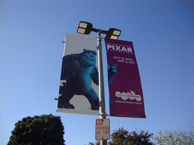
Up until now, the film exhibitions that I’ve reported on for this site have mainly focused on one or two things; mainly film history or film art, or a combination of both.  I have also taken a look at festivals that give a look at the future of film-making.  But, this week, I decided to take a look at another new exhibit in my area that focuses not on film history or art, but rather the science of film-making.  Taking advantage of my Los Angeles residence, I took a short trip downtown to the California Science Center located in Exposition Park (across from the University of Southern California campus).  Started in October of last year and running through April this year, the scientific institution is showcasing a special exhibit dedicated to the technological breakthroughs accomplished in the movies by Pixar.  Created in collaboration with Pixar themselves, the exhibit doesn’t necessarily showcase Pixar related artifacts, but instead offers up hands on demonstrations about how their movies get made.  It’s little different than what you would usually find in Science Centers across the country, where every exhibit is meant for learning and play.  But, when given to a film-making giant like Pixar, you get that extra special presentation and polish throughout.  The exhibit is worth checking out if you are an especially ardent fan of Pixar films (myself included), because it really gives you a deeper understanding of all the rigorous hard work that goes into the making of each one.  Some of it is pretty mind-boggling too.  It’s also worth checking out for anyone who is just interested in the mechanics behind film-making, even when it’s entirely done within the computer.  So, with a healthy sampling of pictures taken by me from inside the exhibit, let’s take a look at “The Science Behind Pixar” at the California Science Center.
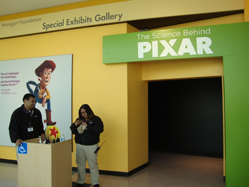
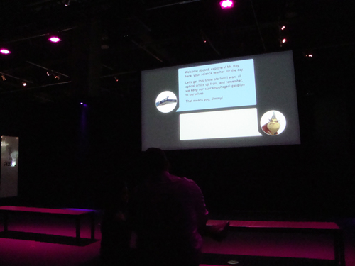
You first enter the exhibit through a modest doorway and enter a tiny theater for a short 5-minute introduction.  The video is basically a tour of the Pixar Studios in Emeryville, California, with two of the staff artists leading us through the many different departments.  In the video we meet two key founders of Pixar, John Lasseter and Ed Catmull, both of whom represent the creative drive behind Pixar and the scientific innovation drive; the two primary factors that make Pixar who they are.  Through each department shown, we get a glimpse of how every person at Pixar is encouraged to push the boundaries of what can be done in their field and constantly push the medium forward.  But apart from stating the mission statement behind Pixar, the video also gives those of us that about to enter the exhibit a good primer about what we are going to see.  Essentially, the making of Pixar movies boils down to several distinct stages; story and concept, design, modeling, rigging, surfaces, sets & camera, lighting, simulation, animation, and finally rendering.  Each of these departments ultimately make up the exhibits that we will find in the next room.  After the conclusion of the video, which includes a recorded etiquette spiel from Pixar director Bob Peterson, voicing two of his more notable characters from Pixar movies (Mr. Ray from Finding Nemo and Roz from Monsters Inc.), the doors open and we are welcomed into the exhibit floor.
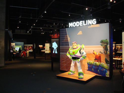
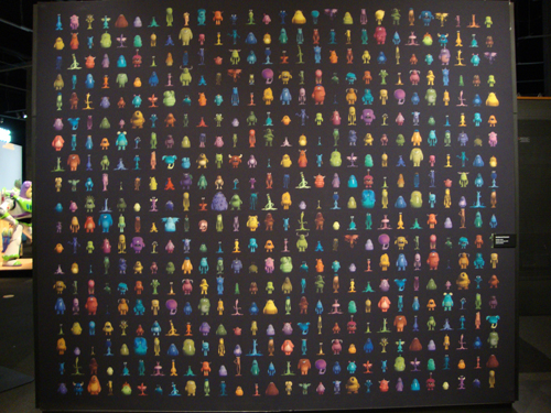
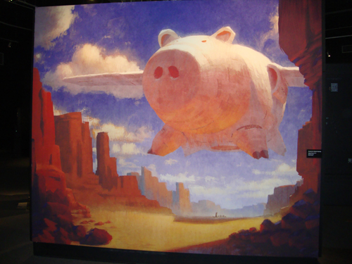
The room is loosely laid out for everyone to choose their own path through the exhibit.  Of course, every section is spotlighted with large overhead signage, and in a few cases, also by large, full sized figures of some famous Pixar characters.  Not only do they give this gallery a pleasing aesthetic, but the figures are also popular photo opportunities for guests.  The exhibit is broken up into two rooms, the first concentrating on the more scientific elements of Pixar’s work.  Story and Concept doesn’t get it’s own section, because I think that it was mainly laid out in the introduction.  It’s basically where all movies start; an idea.  Pixar takes their ideas and then moves them over to Design, where the first artistic representations of those ideas help to shape what the movie will ultimately look like.  Many of those images are then turned into storyboards, which are then filmed together to create a blueprint for the movie as a whole.  It is from Design that the movie finally moves to construction, and that’s where the science behind Pixar finally starts to kick in.  There is no section dedicated to Design either, but several recreations of original art are littered throughout the gallery, just to give us a sense of the long journey it takes to bring an idea and make it a reality in three dimensions.  So, going in order of production, let’s look at each section individually.
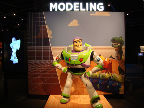
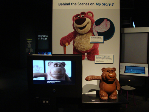
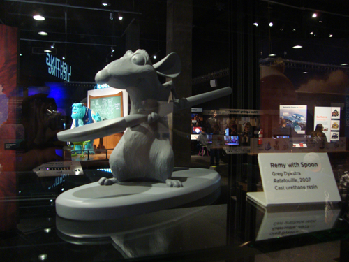
After Design, the next stage of production is modeling.  This is where the artists take what’s drawn on the page and crafts a 3D representation of it which will then be animated in the computer.  This starts with sculpting, which can be accomplished in two different ways.  Some things can be sculpted by scratch within an axis based construction within the computer, but Pixar has also achieved the same with scanning hand made sculptures within the computer.  They have sculptors create Maquettes, which is primarily used for character models.  The maquettes are small sculptures made out of clay (a practice that goes all the way back to early Disney animation) and helps to give the artist a full view of what the final appearance of the character will be on all sides.  The maquette is then scanned in high resolution, which then creates a fully, three-dimensional sculpture within the computer.  But, this is only meant to finalize the model.  Making it move is a whole other step.  The section focuses mainly on the Toy Story films, with maquette recreations of Buzz Lightyear and Lotso from Toy Story 3 (2010) displayed for a hands on interaction.  There is however a display case featuring real maquettes on loan from Pixar’s archive, which includes Remy from Ratatouille (2007), Russell from Up (2009) and Heimlich from A Bug’s Life (1998).  After learning about the way these characters are built, we then move over to see how they are given movement.
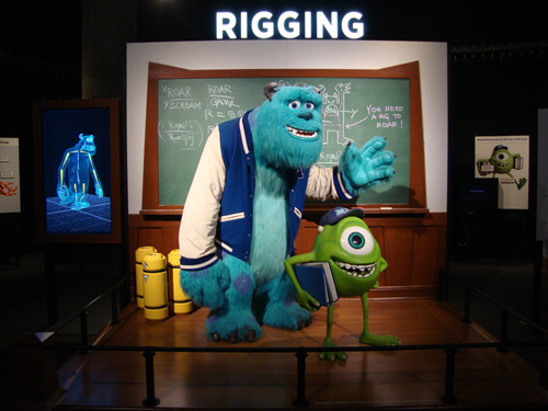
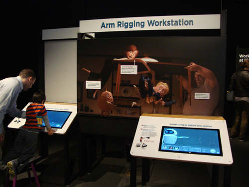
Rigging is the next section, with Monsters Inc. (2001) and Monsters University (2013) being the primary focus here.  The Rigging department is responsible for taking the models sculpted in the Modeling department and giving them an internal skeleton that will help it move.  It is here that we find the first of many demonstration stations littered throughout the exhibit.  At each station, guests are able to work with a computer simulation of the actual programming that Pixar artists use.  In the Rigging demonstration, we are shown how every character is built up with a series of rigid arms that are ultimately given movement through joints.  Much like how joints work inside our own bodies, these virtual joints not only create movement but also flexibility.  The demonstration allows us to select between different numbers of joints, and shows us how the greater number of joints we add, the greater freedom of movement we are allowed for the model, and it’s shown through a difference between one rigid joint and eight floppy joints.  There is also a separate station that shows the rigging done on character faces, which itself is a tricky science.  The station gives us the opportunity to change the expressions on the face of Jessie from Toy Story, and believe me, it’s not as simple as that sounds.  It’s a nice, easy to understand demonstration of how Pixar creates the mechanics behind their characters.  Essentially this where they put the strings on their puppets, which can end up being upwards of many hundreds of strings, depending on the character.
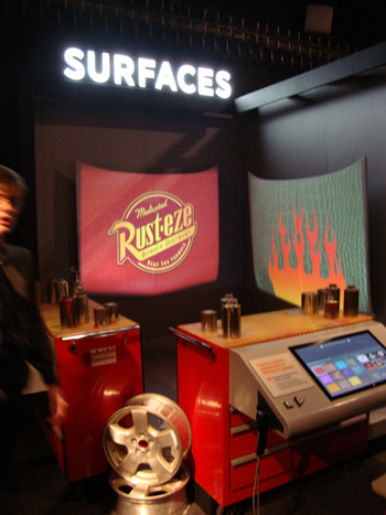
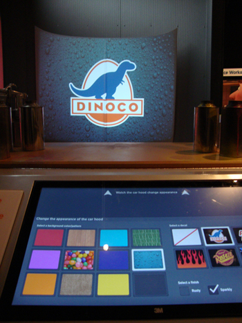
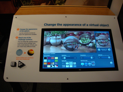
Next up is Surfaces.  This is where character models go to receive their final dressing.  Up until now, characters are just three dimensional, featureless objects that have an internal skeleton that will help them move.  It’s in Surfaces where they go from smooth and featureless, to textured and life-like.  Crafting the skins of an object is just as difficult as crafting the actual model, because you have to take into account things like the roughness of the skin, it’s transparency as well as it’s reflective-ness.  The Cars movies are spotlighted here, mainly because those films offered up an especially hard challenge for the Pixar artists.  With a cast full of anthropomorphic cars,  the filmmakers had to take into special account the different properties that real cars can have and apply those to the characters.  This varied from Lightning McQueen’s super reflective surface to Mater’s very rusted surface.  Both of those skin surfaces react to their environment in different ways, so that’s why special care was devoted to making them look as natural as possible. The big demonstration station here allows us to change the appearance of different engine hoods, combining a variety of different things like sparkling paint, logos, and rust to the surface.  Another station let’s play with the texture of objects, showing how fine details add to the overall life like image of what we’ll see on the screen.  Essentially, this is the final stage of character modeling, and the last stage of crafting all the pieces needed for the film.  What follows is where the actual art of film-making begins.
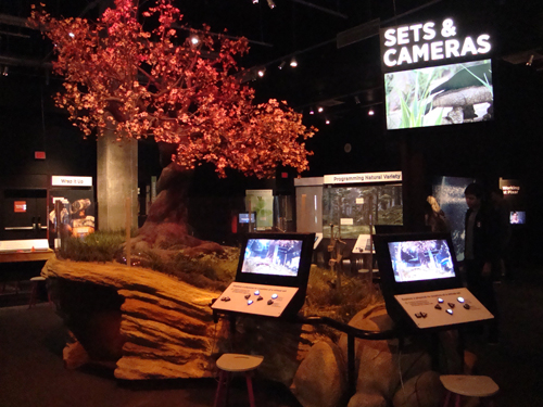
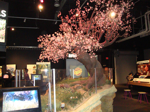
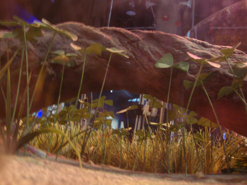
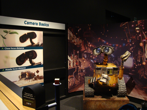
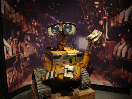
The next section is Sets & Camera, and it is spotlighted by a stunning recreation of Ant Island from A Bug’s Life.   The level of detail on this model is astounding, right down to the little “altar of offering” that is a focal point in the film.  The best thing is that there is a crawl space underneath that has little glass domes in the middle that allows you to look at the model from a bug’s point of view.  Unfortunately, the crawl space is tiny, and is meant more for younger visitors.  Still, if you don’t mind squatting through a tight space, it’s a neat view.  The model also includes live cameras that you can shift up and down.  This is obviously meant to represent how camera perspective is used to tell a story; in this case, viewing the world from the point of view of a bug.  But, this section also demonstrates the amazing work that goes into composing the shot of each movie.  So much detail is put into the sets of Pixar movies, and most of it will be unseen by the viewer, and this is mainly because they need to apply the same rules to virtual film-making that apply to actual film-making.  And that means never having anything in frame look out of place.  The remarkable thing about computer animation is that everything is done from scratch; including set dressing down to the smallest detail.  But, even with the limitless freedom computer generated imagery can give us, Pixar still applies the same rules to film-making from the real world into their virtual one.  The camera that doesn’t exists still has to act like a real one; like it’s there rolling on a set.  That’s why they build programming to recreate camera effects like shallow focus, depth of field, wide angle distortion, etc.  These are all demonstrated on a nice full size replica of the robot Wall-E, with a live camera demonstrating all the same properties.  This section in particular really drives home how science not only influences the construction of computer animation, but also the basic storytelling tools of film-making.
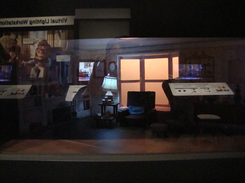
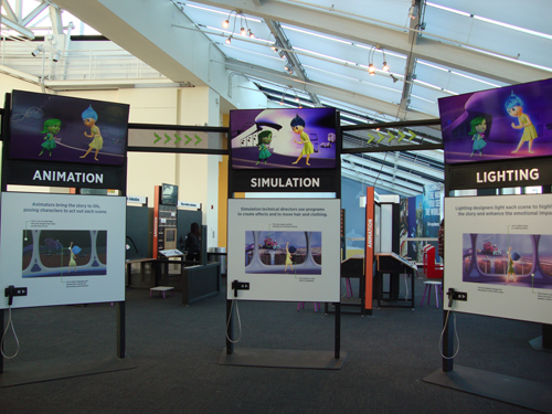
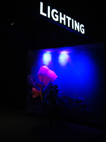
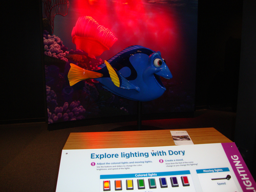
Next up is Lighting.  This is a stage where Pixar artists must take everything that’s been built for each scene, and give it lighting that makes it look natural and film like.  Just like everything else, light sources are virtually created in the computer, and can be dimmed or brightened depending on the necessities of story.  Lighting influences mood, so it becomes an instrumental part of the storytelling of a film.  For this section, the exhibit highlights Finding Dory, because it’s the film that represented the biggest challenge to the Pixar artists in this respect.  Not only did they have to create natural looking light for each scene, but they had to also add the extra prism of lighting through virtual water.   Needless to say, a lot of research went into seeing how light dispersion works underwater and that’s demonstrated very well in this exhibit.  Spotlighted in the middle is a nice demonstration on a figure of Dory.  Here, you can change the brightness of the light, as well as the color, and it shows how much those changes change the appearance of the character, how it sets the mood, as well as the environment around Dory.  There’s also another neat station that allows you to set up the lighting in a scale model of the living room from Carl and Ellie Fredrickson’s home in Up.  It demonstrates how source lighting affects a scene in the same set in many different ways.  Plus, it’s just neat to look at the house from up recreated in miniature with an interactive element.  At this point, this is where the film will start to take on it’s final look, but not before some final tinkering.
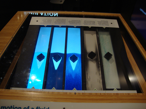
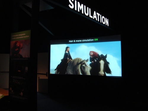
Next is Simulation.  This is where they tune everything built up to now to react to it’s environment in a natural, realistic way.  This is usually everything that is attached to their models and is meant to act automatically without having to be directed with it’s own animation.  This can be everything from the clothing that characters wear, to leaves on trees, to even flowing water.  Pixar’s Brave is spotlighted here because of one particular element that they had to innovate with in order to make it work on film; that being Princess Merida’s wild, untamed head of hair.  The hair on her head had to act like normal hair would, including having the same springiness to the curls as you would see on a real person.  That’s difficult to simulate in the computer, so what this demonstration shows you is how they create an internal structure just for Merida’s hair and allowed it to move naturally as the character moves, without having to animate it separately.  The demonstration also showed how they applied this same programming to clothing, running water, as well as large crowds.  It’s surprising how much automation is put into things that you wouldn’t expect.  There is also a neat demonstration station nearby, where the exhibit had constructed a tilting see-saw that runs real water down a slide, alongside round pellets and digital recreations of animated water, just to show the different stages of how they get virtual water to act like the real thing and how they can make it an automatic thing in the computer.  It’s this fine tuning that really shows the level of detail that Pixar puts into every frame.
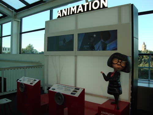
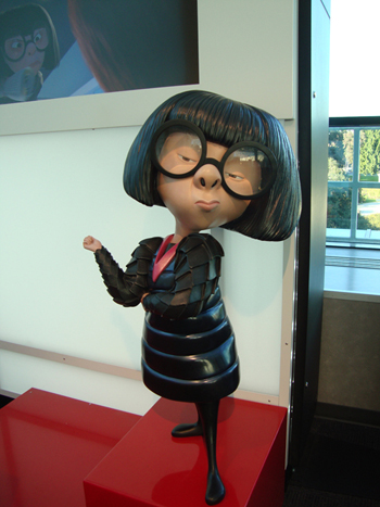
From there, we move out of the first room and out into the last, which is on the outside terrace looking over the lobby of the Science Center.  Here, we see all the science mechanics come together to create the story itself.  And this begins with Animation.  Spotlighted by Brad Bird’s classic The Incredibles (2004), we see how all the elements of Modeling, Rigging, and Simulation is put into motion to allow the digital puppets to finally act.  This is where the illusion of life truly happens.  The demonstration station has several scenes from the movie playing on screens above, and in front are wheels that when turned slows down the image rate of the playback.  The slower the turn, the slower the frame rate.  Essentially this is meant to show how each frame of character movement reveals the mechanics of what we have just learned in the previous room, and how they all work together to reveal character in the models.  It’s fitting that a life size figure of fashion designer Edna Mode stands nearby, given how much each frame of a movie, especially Pixar ones, require so much work in their design.  Nearby, there’s a neat little demonstration activity that allows quest to craft a short stop motion film, using a prop Luxo Lamp Jr. (Pixar’s mascot) as their subject.  You can move the Luxo Jr. along a wall, posing anyway you want, and snap a photo from a stationary camera, and through the magic of film, you can create a short second of animation right there before you.  It’s of course meant to show how many frames a film needs to fill up a second of screentime, and given the lengths of these films, the incredible work it takes to build just one frame.
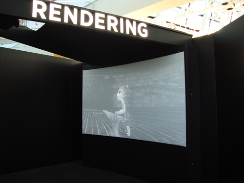
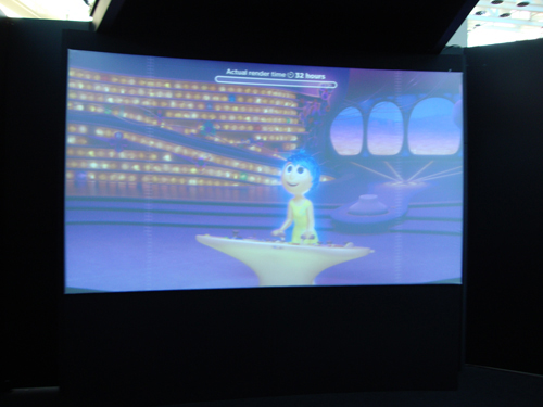
From here we enter a rotunda that illustrates all the previous stages of development needed for Pixar’s films, all shown simultaneously in a select scene from 2015’s Inside Out.  It’s a neat showcase to see all the stages shown together and how many steps it takes to get to that final step in computer animation; Rendering.  This is the animation equivalent of picture locking, but it’s a far more complicated step that is incredibly time consuming.  Basically this is the step where everything we’ve seen up to date is run into Pixar’s server to create a full, seamless high definition image that will then be used as their original source image for distribution.  It removes all of the imperfections, locks all the animation movements down, and smooths out all of the aliasing pixels to make the image flawless.  And the staggering thing you learn from this section is that it takes 36 hours to render just one frame.  Considering how long some of these movies are, it could take up to close to half a million frames at least to make up a single movie.  So, from this station, we learn that Pixar has hundreds of computers at their offices that do nothing but render images, and these computers run round the clock endlessly in order to get a movie completed on time.  Not only that, but some are rendering multiple projects at the same time.  The station here demonstrates the final render process, showing how each image is constructed from it’s bare wires to it’s final life like image.  From here, you really get the sense of how science comes together to create beautiful imagery, and how that has become Pixar’s hallmark.
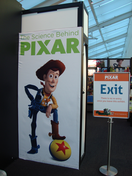
After this, in typical Disney fashion, we exit into the gift shop, with Toy Story’s Woody smiling back as we walk out.  Overall, it’s an impressive way of demonstrating to the average person how Pixar movies are made.  Naturally, with this being a Science museum, the focus is on the many scientific breakthroughs Pixar has made in the field of computer animation, and how they’ve used all of that to create this impressive filmography.  But, at the same time, the exhibit shows that none of these breakthroughs would’ve meant anything had there not been stories worth telling that supported them.  One of the best elements of this exhibition are the little video stations found in each section, where it allows you to listen to individual artists in each department tell their story, and how they brought their knowledge of science and discovery into the work they do.  It’s that mixing together of scientific innovation and creative storytelling that has always been at the heart of Pixar’s soul, and it’s represented fully by the people who work there.  This exhibit not only let’s you share in the warm memories of seeing all these again, but also understanding the mechanics that went into them.  Back in the 1950’s, Walt Disney showcased on his Disneyland television series several shows that actually demonstrated the craft of animation, and that in turn inspired future artists to want to do the same thing, and out of this arose the next generation of inspired animator, of which includes many Pixar employees.  My hope is that an exhibit like this creates that same kind of fascination for younger audiences, and inspires them to take an interest not just in learning about film-making, but in the sciences as well.  The exhibit runs through April, so if you are in Los Angeles before then, it’s worth a look.  Young or old, you’ll find a lot of joy in seeing art and science work together in such a beautiful way.
https://californiasciencecenter.org/exhibits/the-science-behind-pixar-exhibition
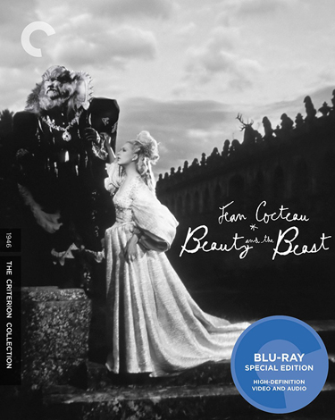
Collecting Criterion – Beauty and the Beast (1946)

Among the many different international communities represented through a collection of films, the Criterion Collection has an especially strong fondness for the French.  French cinema is distinct from others in the rest of the world; glossy and poetic like Hollywood, but with far more edge and style to them.  And the whole breadth of French cinematic history is well represented within the Collection.  In fact, the very first Criterion title released at the launch of the brand was a classic French film; Jean Renoir’s anti-war masterpiece Grand Illusion (1937), carrying Spine #1 in the collection.  Renoir, often looked at as the godfather of French cinema, has 11 films in total found in the Criterion library, including his international hit, The Rules of the Game (1939, #216), considered by many as one of the greatest films ever made.  Criterion also spotlights perhaps the most influential period of French cinema, the New Wave, with a whole host of notable films that best represent the movement.  New Wave icons, François Truffaut and Jean-Luc Godard, in particular have many films made available through the Criterion label, including some of their most famous like The 400 Blows (1959, #5) and Breathless (1960, #408).  Even the quirky comedies of Jacques Tati (Playtime, 1967, #112) and the sumptuous musicals of Jacques Demy (The Umbrellas of Cherbourg, 1964, #716) receive the Criterion treatment.  But there is one title in the Criterion Collection that not only stands out as a remarkable piece of film art, but also signifies the very definition of a French film.  And it’s a story that’s both timeless and internationally appealing.  You might even say, it’s a tale as old as time.  Of course, I am speaking about the classic fairy tale feature from Jean Cocteau’s La Belle et la Bete (1946, #6), more commonly know to English speaking audiences as Beauty and the Beast.

The story is one of the most renowned and famous fairy tales told all around the world, but it is also one that is undeniably French in both origin and in it’s character.  First written by French novelist Gabrielle-Suzanne Barbot de Villeneuve in 1740, the story has been adapted and re-adapted constantly in many different forms.  Though brought to life in many different ways over time, the story does lend itself best to the medium of cinema, and the first truly outstanding version of this story came about through the imagination of Jean Cocteau.  Cocteau was a true Renaissance man during his heyday; excelling in a variety of arts, including painting, poetry, as well as novel writing and playwriting.  He only made a handful of films, but the few that he did make have withstood as iconic works of art praised by the entire film community.  In particular, he was an innovator when it came to special effects in movies.  To him, playing around with camera and editing tricks were a form of real life magic, and he styled himself as a cinematic magician of sorts.  I guess that’s what made a fairy tale story like Beauty and the Beast so appealing to him.  It was the perfect opportunity for him to put on the cinematic equivalent of a magic show, using every trick of the trade to make the fantastical feel real.  And like many other French films, Beauty and the Beast is self aware of what it wants to be.  The opening credits even pulls back the curtains to let the audience know that they are being treated to the illusion of reality; with Cocteau and his two lead actors Jean Marais (The Beast) and Josette Day (Belle) writing their names on a chalkboard in the studio, followed by a stagehand holding a clapboard before the story even begins.  It’s a highly influential film for both French and world cinema, and it’s no doubt that it’s beloved status gave the story more prosperity, inevitably leading to the other most notable version; the animated musical by Disney.  With a legacy like that, it’s no wonder that the movie has been given Criterion’s honored recognition.

Cocteau’s version of the fairy tale is far more faithful to the original 18th century story than more contemporary ones; especially more than Disney’s.  The story focuses on a young woman from a small village in the French countryside named Belle (Day).  She is the youngest child of a wealthy trader, whose riches are more often than not squandered on the lavish tastes of Belle’s two older sisters Felicity (Mila Parely) and Adelaide (Nane Germon).  Not only is Belle responsible for picking up the slack of her slovenly sisters in the household chores, but she is often subjugated to the sometimes unwanted advances of a handsome admirer, Avenant (Marais).  Belle’s father (Marcel Andre) leaves on business and Belle asks simply for a single rose as a gift on his return.  After getting lost on the way, her father stumbles into a lavish castle, with fixtures that magically come to life to serve and wait on him.  As he attempts to leave, he plucks a rose from the garden only to be confronted by the master of the castle, a fearsome Beast (Jean Marais again).  The Beast shows him mercy, just as long as someone takes his place as the Beast’s prisoner.  When the father returns home, Belle selflessly volunteers, but her father refuses.  After her father takes ill, Belle leaves on her own to spare him and become the Beast’s prisoner.  At the castle, Belle learns of the agonizing toll of the curse that made the Beast who he is, and how it tortures him everyday.  She begins to take pity on him, and he in turn shows a softer, more caring side beneath all of his gruffness.  However, after leaving the Beast for a visit to see her ailing father, she sadly comes to the realization that she has left him vulnerable, and that there are others who seek to do him harm; especially the envious Avenant.

Unfortunately for Cocteau’s Beauty and the Beast, despite it’s legendary status, it’s always going to have to face scrutiny when compared to Disney’s blockbuster.  But it’s just the reality; Beauty and the Beast has been adapted into two genuine cinematic masterpieces.  Disney’s version is different in many ways (not least of which it being a musical), but it owes a great amount of debt to Cocteau’s version for some of it’s more imaginative elements.  For one thing, Jean Cocteau was the first to imagine all of the architecture and furnishings of the Beast castle as living things.  Some of the examples in his version are quite striking, including the wall candle fixtures fashioned to look like human arms, and were in fact provided by actors standing behind the facade wall.  It’s simply executed, but hauntingly beautiful when seen in the film.  The same with the statuary in the fireplace mantle, who eerily stare back at us from the background.  Disney took this element and went a step further by giving the household objects names and distinct personalities, creating the beloved characters of Lumiere, Cogsworth, and Mrs. Potts in the process.  Cocteau also invented one other element that Disney’s version also owes a great debt to.  The character of Avenant, Belle’s persistent human suitor, is not from the original story, and was created by Cocteau as a way of counterpointing the growing sensitive relationship that Belle has with the Beast.  So, you can thank Jean Cocteau for creating what would eventually be the villainous Gaston.  Of course, there are still many difference that still give the Disney version some distinction.  They excised Belle’s older sisters (probably because they were too close in resemblance to Cinderella’s ugly stepsisters), and of course the animation medium gives them a lot more freedom to fully portray the magical elements of the story.

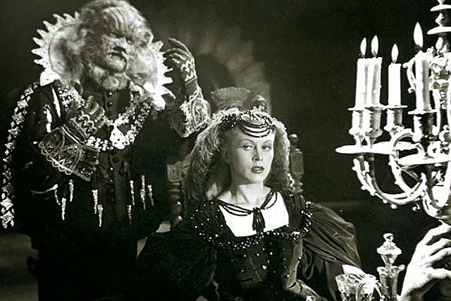
What is most interesting about Cocteau’s version is the portrayals of it’s two lead characters.  In particular, Jean Marais as the Beast.  I find it interesting that Marais filled dual roles in the film; as the Beast and as Avenant.  It shows great range in his ability to portray such antithesis characters, even down to the difference in their body language.  Of course, Marais is able to pull this off when his face is covered in a giant fur mask, but it’s still a feat that his performance shines through even with the extra encumbrance.  Admittedly, the cat like face mask provided by make-up artist Hagop Arakelian looks pretty ridiculous when compared to work done today, but it is iconic in it’s own way.  With the air of aristocratic sophistication mixed in with the mangy feral characteristics of a wild animal, the Beast in Cocteau’s film is an unforgettable creation, and one strongly reliant on the talents of a gifted actor.  It wouldn’t be until the Disney version that would would see a fully realized Beast brought to the screen, with nothing left on the surface of the human inside, but given the limitations that Cocteau had to work with, his Beast still is a work of creative art.  The portrayal of Belle is an interesting one as well.  In a way, the selfless girl who uses her perceptive mind to understand the Beast from the get go comes off as a bit more subtle than Disney’s defiant, book-obsessed princess.  Not that Disney’s Belle is any less welcome; she is in fact an icon in her own right, and thankfully a female role model that stresses intelligence over beauty.  But I appreciate Josette Day’s Belle as well.  She captures the character’s heart and shows that she is far more than a thing of beauty in the story, but rather one defined by her compassion more than anything else.  Considering when this movie was made, Belle could have easily been portrayed as just a pretty trophy to be sought after (which would have been the case if this was a Hollywood picture in the 1940’s).  Thankfully, with the more French sensibilities towards male and female identities, we have a more balanced portrayal of our heroine Belle, and one that I’m sure left a big impact on all future fairy tales princesses as a result.

The Criterion Collection again has devoted a great amount of time and effort to restoring this classic to it’s full glory.  Because of the film’s beloved status in France, it has been thankfully preserved in their national film archives.  The original nitrate negative still exists, but time has taken it’s toll and care was still needed to bring the film back to it’s original glory.  In 1995, the original negative was given over to the Centre national de l’audiovisuel in Luxembourg to do a full restoration of picture and sound to create a new restored master negative for digital preservation.  The results are astounding, and help to greatly enhance the meticulous work that Jean Cocteau put into the visual effects of the film.  The movie utilized a lot of in camera  and editing effects to give the movie a more magical feel, including a spectacular slow motion sequence of Belle running through the halls of the Beast’s castle in this almost ethereal way.  With the film properly restored to the correct 24 frames a second that it needs run consistently at, this sequence is able to play out in the best possible way for the effect to work.  The cleaned-up image also looks excellent, with gray levels in the black and white photography feeling natural and true to life.  Scratches are minimized and the movie looks as polished today as some of it’s other beloved contemporaries from Hollywood.  In addition, the monaural soundtrack is free of distracting hisses and pops, and sounds natural and clean.  It is from this 1995 restoration that Criterion derived their high definition transfer from, and it looks amazing on blu-ray.  Sometimes the detail does expose the seams that Cocteau probably didn’t want exposed in the image, but a lot of the effects still hold up to the scrutiny of high definition, including the Beast’s make-up.  It’s another stellar restoration by Criterion, meeting their already high standard.

In addition to the transfer, the blu-ray also includes some worthwhile supplements that round out the package.  First of all, the most substantial feature is a bonus soundtrack that can be played with the movie.  Composer Phillip Glass crafted several operas based on the movies of Jean Cocteau, and the one for Beauty and the Beast is included in full here, presented in 5.1 surround sound.  It’s a great option for anyone interested in hearing the opera synced up with the movie that it’s meant to play with.  Criterion has also provided two audio commentary tracks recorded just for this edition.  The first is by film historian Arthur Knight, who shares insight into the cinematic contributions that the movie has made, and the other is by cultural historian Sir Christopher Frayling, who discusses the film’s cultural significance, as well as it’s influences.  In addition, there is a lengthy documentary that coincided with the film’s restoration in 1995 called Screening at the Majestic.  It features interesting interviews from many of the cast and crew, telling us about the making of the film and it’s legacy.  There is also an interview clip conducted on Luxembourg television from 1995 with the movie’s cinematographer Henri Alekan, who gives an interesting insight into what it was like working with Jean Cocteau and how they were able to create some of those amazing visual effects.  There is also an excerpt from a French television expose on famed make-up artist Hagop Arakelian, where he talks about and demonstrates his craft.  Sadly, this feature doesn’t go into enough detail about his work on the Beast in the film.  Lastly, there is an interesting featurette on the film’s restoration, as well as galleries devoted to behind-the-scenes pictures and publicity stills, and an original theatrical trailer, directed and narrated by Cocteau himself.  It’s another full package that lives up to Criterion’s high standards.

Upon watching Jean Cocteau’s Beauty and the Beast, you see why it is widely proclaimed as one of cinema’s crowning achievements.  Just through the imagination of it’s visual effects alone does this movie achieve masterpiece status.  There are some effects in here that are so remarkably done that even after 70 years, it will still leave you wondering how they were able to pull them off.  There’s one bit where an ugly string of garlic turns into a string of pearls within the same shot that still tricks my eye every time, because it’s done in the illusion of one continuous unbroken shot.  I’ve watched the movie a few times now, and I still can’t spot the edit.   It’s cinematic magic like that that defines the movie, but it also stands as the defining example of a French film.  I’m positive that it’s overwhelming French identity is the reason why Disney chose to preserve the French setting in their own version, as opposed to making up some Euro-centric, unnamed kingdom for the setting like they had done to their fairy tale films in the past.  There is a strong connection between the elegance of Jean Cocteau’s version and the extravagance of Disney’s, and I’m sure that it’s one built upon admiration.  The people who worked on Disney’s Beauty and the Beast I’m sure aspired to follow Cocteau’s lead, and try their best to achieve something close to what he accomplished.  It’s a high standard set by both versions that I hope the upcoming live action musical remake by Disney also aspires to.  My worry is that it’s going to be too derivative of one and not enough of the other.  Jean Cocteau showed with his imagination what the medium of cinema can do, and he demonstrated that with a few simple tricks, he could create true magic on the big screen.  Criterion has done an outstanding job of preserving the magic on display here and my hope is that those of us introduced to the story through Disney’s version will be able to discover this version in our adulthood and see just how magical cinematic art can be.

https://www.criterion.com/films/177-beauty-and-the-beast


Turning the Old into the New – Making Retro Popular in Hollywood

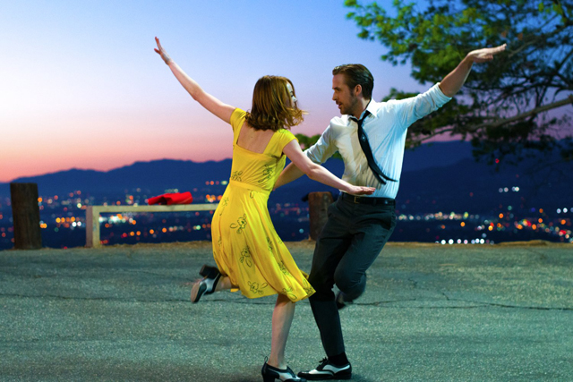
So, as we stand now in the first leg of the 2017 awards season, the movie that looks like a clear front runner for the top prize of the season, the Academy Award, appears to be Damien Chazelle’s La La Land.  Truth be told, we won’t know for sure until the actual awards are handed out, but so far, it’s the movie that is breezing through all the awards thus far and is dominating.  Which leads me to wonder, why this movie?  Why is La La Land sweeping up so many awards this year.  It’s not the typical Oscar style movie.  Heavy dramas and message filled movies tend to be the awards favorites this time of year.  But, La La Land is an upbeat musical comedy about struggling artists in the creative labyrinth that is Los Angeles, California, and a movie where no one dies and where both of the stars end up getting what they wanted in the end, more or less.  Certainly, the fact that it’s a showbiz movie helps, as films like The Artist (2011) and Argo (2012) have shown that Hollywood loves to celebrate movies that cast a positive light on their industry.  But, the movie is also becoming a hit with general audiences as well, and that tells me that another factor is fueling the popularity of La La Land, and that’s a strong reaction to retro style film-making.  La La Land is a throwback to musicals of Hollywood’s Golden Era, but transplanted into a modern day setting.  Like musicals of the past, the musical numbers become a natural extension of the story rather than a music video style interlude that cuts into the narrative, and is shot in long takes that help you to appreciate the production values and choreography.  They are not new film-making techniques, but rather ones that have sat long dormant and only fell new and fresh because of their long absence.

In La La Land, the experiment works because it is clear that director Damien Chazelle has done his homework and studied the movies he’s trying to emulate very closely.  It seems simple on the surface, but there is a lot more to making retro styles work in a new movie.  Anyone can just copy a scene from an old film, but very few can actually make a new film feel old fashioned and have that come across as something new and revolutionary in the end.  In many ways, it all comes down to the story you want to tell in the end.  For Chazelle, he was interested in telling the story of people on the periphery of Hollywood fame, and just living day to day trying to prove that they can be a value to the world.  The musical numbers are lavish, but they carry weight because of the way we identify with the characters and feel their struggle.  That’s why when they break out into song, we share in the enthusiasm behind the experience.  But even on the crafting side, it takes a sharp sense of your film-making craft to know how to make a film successfully retro.  You have to know the intimate details such as the type of film stock used in filming, or the timing of the editing, or even just the choices in blocking a shot.  It’s a rhythm of storytelling that helps to give it that retro feel.  Production design, which creates the visual texture of a different era, becomes the very last element that makes a retro film feel old fashioned.  What makes La La Land a remarkably retro movie is the fact that it’s retro in technique and not design.  Chazelle’s film is a modern world brought to life with Hollywood magic.  A musical number in the old Hollywood style can come off as ordinary when boxed into a prefabricated soundstage environment, but when transplanted to rush hour traffic on a Los Angeles freeway, then you’ve got the makings of something old becoming new again.

La La Land is not the first project to capitalize on collective cinematic nostalgia.  There are plenty of other movies that hearken back to a bygone time and try to emulate the style of that era.  But, it’s the practice of using the era’s limitations and film-making styles that actually defines this type of movie.  It’s basically what separates a retro film from a period film.  You can watch a period movie which puts extraordinary care and detail into the authenticity of the costumes and set design to recreate a different era, but it will still feel like a modern film regardless.  This is because the film-making technology is of this era and not the one that the movie is set in.  Aesthetically it can look old fashioned, but when it is shot on crisp digital photography, it will still be recognized by the viewer as a new movie.  For a movie made today to truly feel like of another era, it must strip away all the cinematic shortcuts that technology has given us over the years and utilize techniques and technology that has been long out of use.  For it’s part, La La Land does this by shooting on film, and in a film stock that is not as widely used today as it once was.  Damien Chazelle chose to shoot the movie in the Cinemascope process, which was developed back in the 1950’s as a cheap and practical format for widescreen film-making.  Today, most movies utilize a Panavision inter-positive, which allows the for the filmmaker to format the screen dimensions in post to their liking.  Cinemascope is widely given as the name for the ratio of all widescreen movie (the standard of which is 2.40:1), but the original film based Cinemascope was actually wider than this (at 2.55:1) and is far more dynamic at capturing screen depth than modern day Panavision.  It was an especially popular format for the musicals of the 50’s, which I’m sure is something that Chazelle took notice of.  While most moviegoers probably will never know any difference between film stock formats, subconsciously it does leave an impression and helps to make the final film feel retro purely through the very film stock used in it’s making.

Chazelle is one of a number of filmmakers that have returned to old techniques and film equipment to recreate styles of the past.  One filmmaker in particular that has gone out of his way to not only use old equipment, but also champion it in his promotion of his movies is Quentin Tarantino.  Tarantino is a filmmaker with modern sensibilities, but he is also a director with an extensive knowledge of old Hollywood film-making and a strong desire to relive those styles in the work that he does.  He’s a man raised on watching exploitation films and international cinema, and how the sometimes dingy and haphazard presentations of these movies in grindhouse theaters sometimes added to the overall experience.  It’s a decidedly different kind of retro film-making that Tarantino likes to exploit in his own work than what we see in La La Land, but it’s no less accomplished with a lot of care and detail.  Perhaps his greatest expression of this was in the double feature project that he created with his friend and collaborator Robert Rodriquez with Grindhouse (2007).  The over three hour presentation featured two feature length films; Planet Terror, directed by Rodriquez and Death Proof, directed by Tarantino.  While both obviously were meant to parody their selective grindhouse genre flicks, there was also a strong emphasis to try to capture the physical look of those types of movies as well.  Digital scratches were added to the finished film, to make it look like a film print that would have played in one of those old grindhouse theaters, where special care of the film prints was probably never taken.  Not only that, but color grading was purposely washed out for a lot of scenes to further give the movie an old tattered look to it.  For Tarantino, he makes a strong effort to make you aware of the retro look of his movies and it’s become a staple of his film-making style.  Even in a more polished film like The Hateful Eight (2015), he made a big deal about shooting the movie in the extremely wide and rarely used Ultra Panavision format, and having it screened in 70MM film across the country.  For him, presentation is just as key to making a film feel retro as anything else.

What I find interesting about the use of retro style film-making is how it often is dictated by the maturity of the filmmaker and the audience they are trying to reach.  As different generations come of age, they notice that movies that get made in their adulthood often reflect the kind of products they were familiar with in their childhood.  What was Saturday morning material in our youth are now the box office kings of today.  And this is a cycle that keeps refreshing every generation or so.  You see this with hit films today based on TransformersTeenage Mutant Ninja Turtles, and Alvin and the Chipmunks.  And why these films?  Because they are all based off of shows that were popular during the 1980’s, and children born and raised during that decade are now hitting their thirties and are the ones both getting these movies green-lit, and are paying to see them in huge numbers.  You can pretty much see a correlation in every decade with another past era that suddenly comes into vogue based on a collective nostalgia.  In the 90’s and early 2000’s, we saw big screen adaptations of the kind of cartoon entertainment that our parents grew up with in the 1960’s and 70’s, with The Flintstones (1994), George of the Jungle (1997), and Scooby Doo (2002).  And going further back, you see a nostalgic revival of the 1950’s in the 1970’s with shows like Happy Days and movies like American Graffiti (1973).  Now that I brought up a project by George Lucas, I can also see how Star Wars (1977) is a retro throwback to the 1950’s, when sci-fi serials were a staple of the industry.  The iconic opening crawl is lifted directly from those same serials.  Essentially, time dictates the nostalgic value on things, but it doesn’t always reflect that way in deliberately retro projects.  Damien Chazelle is only 31 years old, but the retro style he’s trying to capture in La La Land hearkens back way before his lifespan.  It’s an acquired appreciation for that era for him, which probably could’ve been built from film studies during his years in film school.  But, what a filmmaker values in the nostalgia of this film-making may not always translate for an audience.

For a retro style film to work, there has to be a shared interest between the filmmaker and the audience.  Sometimes a director will put extraordinary detail into capturing the look and feel of a retro film and no one will watch it, because of the disconnect between the art and the demand for that art.  A perfect example of this kind of project not working as well as planned was an ambitious film by acclaimed director Steven Soderbergh called The Good German (2006).  Soderbergh set out to recreate the aesthetic look of Hollywood war era films by shooting the movie entirely in black and white, mostly on soundstage sets and on a backlot, and even constricting the movie to a full frame aspect ratio that was standard of that era (approximately 1.33:1).  The George Clooney and Cate Blanchett headlined movie even had a marketing campaigned modeled after those of movies in that era, like Casablanca (1943), Mrs. Miniver (1942) and Only Angels Have Wings (1939).  It was clear that Soderbergh clearly wanted to evoke those movies in his own, and have the retro feel of his movie be the drawing factor behind it.  The only problem is that unlike all those other movies, less care was put into the story.  The film is so concerned with the aesthetic, it falters with the narrative and just ends up being this pretty but boring thing.  One can’t fault Soderbergh’s devotion to the project, but for movies like this to work, the narrative must work in balance with the visuals.  That’s the strength with La La Land.  It puts a lot more attention towards the narrative of two people falling in and out of love and makes the visual flair a reward for the audience involved in it’s story, rather than be a distraction.

But, when you look at movies that work well with retro fimmaking and those that don’t, you have to wonder what determines the response that the audience will eventually give to these movies.  The cyclical nature of nostalgia has something to do with it, but there are other factors that make it possible for audiences to embrace something retro.  Sometimes, it’s the escapism of returning to something familiar that has that effect.  I find it easy to see why La La Land is becoming the hand down favorite for all of the accolades for 2016, because if you lived through 2016 and saw how rough of a year it was for many people, you would want to escape into a idealized world of music and song too.  La La Land is cinematic medicine for a shattered world, and Chazelle’s musical is hitting just at the right time.  It not only is entertaining, but it was gives us the reminder of what a Hollywood movie can be to it’s audience, and how it can lift us up.  If the year had gone a little different, the movie may have come across as naive and hollow.  Timing is everything for a retro film or any project to hit it’s mark, and often times, it’s built upon years of disappointment for an audience.  One genre in particular that has really benefited as a whole from a more retro-centric sensibility is the Horror genre.  After getting watered down in the post-Blair Witch, jump scare heavy era of bland Horror film-making, we are seeing a revival of the kind of thrillers that put the genre on the map in the 1970’s.  You can see this in movies like James Wan’s The Conjuring (2013) or the critically acclaimed It Follows (2014), both of which draw more on atmosphere and scare audiences more with what’s not seen that what is seen.  And on television, we have a show like the Duffer Brothers’ Stranger Things, which is retro to it’s very core, and in the process, feels refreshing.  In the end, retro film-making becomes a statement against mediocrity, and looking to the past to find better answers for today.

La La Land, more than anything, has benefited from being the right movie at the right time.  We as a culture are in an uncertain place, and that is allowing something that is so self-assuredly positive to connect with us at this moment.  You have to admire the crafting behind the film, with so much attention devoted to making the musical feel retro without becoming naively old fashioned.  But, what I like best about La La Land is that it represents the value that a deep knowledge of film and film history can have.  I love the fact that Chazelle is keeping some tried and true tricks of the trade alive with his movie, especially the practice of shooting on actual film.  Along with the likes of Quentin Tarantino and Christopher Nolan, there are only a handful of filmmakers that still use film stock and Chazelle is keeping a valuable legacy alive because of this.  These filmmakers also show that retro film-making also represents a sign of quality in their work that normally wouldn’t be seen.  Modern film-making offers us a lot of shortcuts, but by tying our hands down and working within restrictive limitations, it provides us with some interesting creative avenues to try to overcome them and make the product of our efforts seem much more interesting as a result.  Period movies are by no means lazy efforts, but they will always feel like a modern movie because of the modern tools that went into their creation.  Take those away, and you can actually give your movie a more timeless feel that feels exactly of a different era.  That is what La La Land is in the end, a movie set today that feels like it was made in another era.  If it does win the Best Picture award for this year, it is an understandable victory.  Like a fellow Awards juggernaut, 2011’s The Artist, an earnest experiment in old tricks can find it’s audience and make the old feel like new again by adhering to the conviction of it’s presentation and endearing it with a timeless story worthy of telling.  In the end, films last forever, so it’s important to give a movie a reason to stay around that long.

Top Ten Movies of 2016

So, 2016 is over, and to many that is a blessing.  Not to delve into the politics of the world, but it’s safe to say that there was a lot of turmoil that shook people to their core and made them weary of the state of things looking into the future.  Naturally, when people are depressed or in need of a pick me up, they turn to the escapism of cinema, and this year’s box office numbers reflected that.  Last year saw a record number of grosses at the box office, with the Disney company alone accounting for nearly 20% of all that.  Disney’s mammoth year saw the huge success of both their animated films Zootopia and Moana, plus two more huge hits from their Pixar and Marvel brands (Finding Dory and Captain America: Civil War, the two highest grossing films of the year coincidentally enough), as well as big returns from their Jungle Book remake, and also from a little thing called Rogue One.  Apart from that, 2016 also saw surprising success in the off seasons as well, with Spring films in particular like Deadpool and Batman v Superman: Dawn of Justice doing amazingly well.  This year also saw it’s fair share of failures too, with former powerhouses like Johnny Depp and Tom Hanks taking a hit with their respective flops, Alice Through the Looking Glass and Inferno, as well as well respected filmmakers like Steven Spielberg and Oliver Stone failing to make an impact with their new ambitious features, despite some critical praise (The BFG and Snowden).  In general, 2016 was an offbeat year, and the movies this year reflected that, both good and bad.  Naturally, like every year, I have put together my picks for the top 10 films of the year, as well as my bottom 5.  And in a year as unpredictable as this one, my choices were just as surprising to me as I’m sure it will be to you.

First of all, before I go into the list itself, I would like to spotlight the movies that nearly made my top 10.  Out of the over 60 movies I saw this year, there were plenty to choose from, and though these fell short, they are still worth seeing.  So, in alphabetical order: 10 Cloverfield Lane, Arrival, The BFG, The Birth of a Nation, Captain America: Civil War, Doctor Strange, Fences, Finding Dory, Hacksaw Ridge, Kubo and the Two Strings, Loving, Moana, Pete’s Dragon, Rogue One, Silence, Sing Street, Star Trek Beyond, Swiss Army Man, and War Dogs.  Also, keep in mind, these are all movies that I saw in the calendar year of 2016, so any critically acclaimed movies released in the last year that I didn’t get to like 20th Century WomenFlorence Foster JenkinsNocturnal Animals, Queen of Katwe, and Paterson won’t be on this list.  I hope you find all of these interesting choices.  I tried to reflect in this list the movies that left the biggest impact on me this year, and not what I think will be everyone else’s favorite.  So, with that, lest’s begin the countdown.

10.

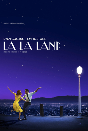
LA LA LAND

Directed by Damien Chazelle

Perhaps the most talked about film of this still young awards season, Damien Chazelle’s sophomore feature after his Oscar-winning breakout Whiplash (2014) is a one of the year’s most audacious films.  Chazelle tells a story of the movie capital of the world today with some of the tools that the city was built upon.  With classic style musical numbers that harken back to memories of movies like Swing Time (1939) and Singing in the Rain (1952), La La Land is blissfully nostalgic, but it’s the story in between the songs that really makes this movie stand out.  The movie is about the harsh reality that many young dreamers have to go through when they move to a place like Los Angeles and find that their dreams of love and success may sadly always be out of their reach.  In the film, we follow two characters played wonderfully by Ryan Gosling and Emma Stone, who seek love as well as success, and sadly realize towards the end that in order to achieve one, they may have to give up the other.  In this movie, director Chazelle clearly knows his film history, and he tries his best to bring the magic of the old Hollywood dream machine into a very modern story.  It’s a celebration of the wonder that is Los Angeles, as well as a cautionary tale.  And, considering that I myself am an aspiring writer living in Los Angeles and trying to find success on my own, it’s easy to see why I identify a little with the main characters of this story, and the ups and downs they go through.  Chazelle’s direction may be at times a little too inconsistent, but when you have moments as creative and unique as a dance number on an LA freeway during rush hour, you can easily forgive the shortcomings and just enjoy the spectacle.

9.

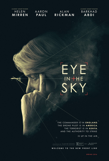
EYE IN THE SKY 

Directed by Gavin Hood

One of the most interesting discoveries this year was this little seen but extremely effective thriller about military drone strikes.  After struggling in the Hollywood machine for the last decade, with underwhelming to bad films like Ender’s Game and X-Men Origins: Wolverine, director Gavin Hood finally delivers a provocative and intense film that shows the full potential of his talents.  Taking place in real time, the film presents a scenario of a difficult military decision to surveillance potential terrorist and decide whether or not to preemptively strike once they learn of the deadly plot that is being hatched.  The fascinating part of this movie is that we see the entire decision making process unfold from all the participants and how such decisions must go through several hurdles before they are executed; which becomes especially complicated when they are faced with the possibility of severe collateral damage when an innocent little girl ends up in the crossfire zone.  Told from three different perspectives (the command center in Britain, the drone pilot station in America, and on the ground with the spies watching the terrorists closely) the movie plays out like 12 Angry Men in a war film, and it’s the debate before the actual strike that provides the best tension throughout.  The actors play their roles well, and are surprisingly effective against type in some cases.  Helen Mirren is wonderful as always, and Breaking Bad’s Aaron Paul holds his own with some heavy hitters.  But especially memorable is Alan Rickman in what is sadly his final film role.  Watching him perform here just reminds you how much he will be missed, and it’s a worthy finale to his incredible career.  This movie was, so to speak, under the radar all year, but it is well worth seeing because it’s more than just your average war film and it spotlights an issue that’s well worth talking about more.

8.

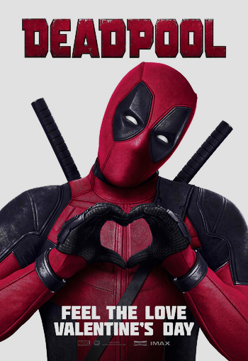
DEADPOOL

Directed by Tim Miller

I know that in my earlier review of this movie that I was a bit more reserved in my judgement on the film, knocking some points off for some of it’s generic super hero origin bits.  But, if there was ever a movie this year that grew on me, this would be it.  It’s hard to believe that the best Marvel super hero movie of the year was one that was not made by Marvel Studios.  Sure, I like Civil War and Doctor Strange well enough, but in the long run, I think that Deadpool offered something more to the genre; that being a very much needed skewering.  With a script that was worked on for years and a lead actor who believed so much in this role and could not have been better cast, Deadpool is a near perfect translation of Marvel’s iconic “merc with a mouth” to the big screen; far better in fact than most other characters we’ve seen from other recent Marvel and DC properties.  It is also one of the flat out funniest movies of the year.  From the hilarious opening credits to the appropriately absurd film end credits tag, every moment of this movie is perfectly constructed to tickle our funny bone.  Whether it’s Deadpool’s constant fourth wall breaking quips, the running gag centered on the main villain’s real name, or the several jabs at a certain Aussie actor from the X-Men franchise, every gag hits it’s mark.  This was a movie that actor Ryan Reynolds and crew had to make under the radar at Fox and it’s great to see it pay off.  And for a genre that’s starting to show signs of fatigue, this movie was very much needed right now.  It’s a genre send-up that holds it’s own among the finest.  If The Avengers (2012) was the super hero genre’s Magnificent Seven (1960), this would be it’s Blazing Saddles (1974), and that’s a high, high compliment.

7.

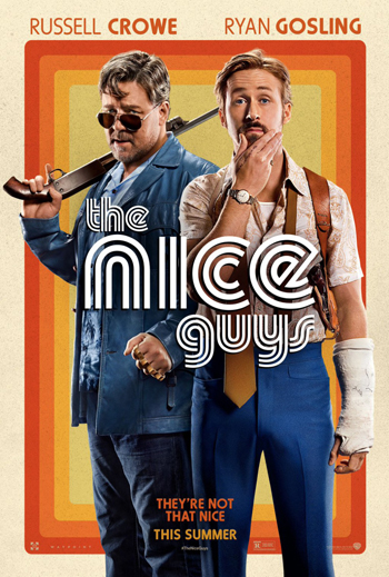
THE NICE GUYS

Directed by Shane Black

The even better genre throwback starring Ryan Gosling from 2016.  This movie finds the genius mind behind Lethal Weapon (1987), The Last Boy Scout (1991), and Kiss Kiss Bang Bang (2004) back on familiar ground and in his element.  After a disappointing venture into the Marvel universe with Iron Man 3 (2013), director Shane Black feels much more at home working within this tongue-in-cheek throwback to buddy cop movies of the 1970’s.  But what is especially surprising is that he got these comical performances out of two actors not known for their comedic chops.  Ryan Gosling and Russell Crowe prove to be remarkably adept at matching the sometimes absurdist style of Black’s character driven comedy, feeling almost like they’ve been working off each other for years like an Abbott and Costello style team.  Gosling in particular gets the film’s biggest laughs as a perpetually drunk and inept private eye.  One bit where he tries to bust open a window with his bare hand only to cut open his wrist and bleed in the process is one of the movies best moments and a brilliant dissection of a genre cliche.  The whole movie is like this and it makes for both a great parody of a long worn out Hollywood genre as well as a worthy representation of it.  And like the previous genre throwback with Ryan Gosling on this list, it is also a fantastic love letter to the city of Los Angeles, only this time spotlighting the grittier, sleazy side of the city that defined it in the 1970’s, in which this movie is set.  My hope is that Shane Black continues to deliver more character driven genre farces like this one, and that both Gosling and Russell Crowe continue to branch out into more comedic territory, because this movie showed that they have a surprisingly strong knack for it.

6.

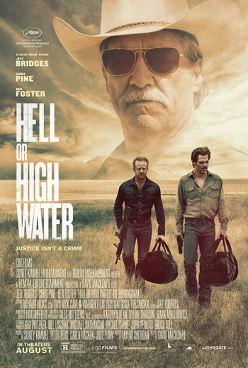
HELL OR HIGH WATER

Directed by David Mackenzie

There are some movies out there that really transport you into a different place that feels like a different time, but is really just a window into the everyday world that the people in this setting live everyday.  This Neo Western comes from the same screenwriter (Taylor Sheridan) who wrote my favorite film of 2015, Sicario.  And like SicarioHell or High Water throws the viewer head first into it’s world with all it’s detail, only instead of showcasing borderland drug wars, this movie focuses on the quiet isolation of West Texas.  Following two bank robbing brothers (played by Chris Pine and Ben Foster) as well as the dogged state trooper in pursuit of them (played by wonderfully grizzled Jeff Bridges) the movie plays out like a snapshot of Americana come to life, with rich characters and setting driving the narrative.  I loved the way that this movie sort of steps backs and let’s the story play out naturally without any melodramatic tampering.  It’s gorgeous to look at, with the wide Texas plains dominating the landscape, and the detail put into the setting is exquisite.  There is plenty of local flavoring that gives this movie character, like a great bit where Bridges stops at hole in the wall diner and has to deal with the tough as nails waitress who works there.  The performances too are exceptional.  Bridges is in his element here, riding a fine line between being affable and intimidating.  The way he teases his put upon partner (played by Gil Birmingham) also gives the movie some much needed levity.  Chris Pine also is wonderfully restrained here, and helps to ground the movie as a whole.  But, it’s Ben Foster that steals the movie with his performance as the brother on a deadly death wish spiral throughout the movie.  It’s one of the year’s most beautifully atmospheric films and a modern Western that does the genre proud.

5.

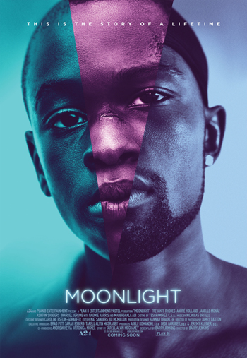
MOONLIGHT

Directed by Barry Jenkins

This little indie wonder takes a very difficult and often times overlooked subject, and paints this beautifully visual poem around it.  The movie follows the life of a young African-American boy living in the projects of the City of Miami through three different ages in his life; late childhood, high school, and early adulthood.  And in those different time periods, we see him struggle through many different issues that plague his life and ultimately close him off from the rest of the world.  He suffers through an abusive relationship with his drug addicted mother (played brilliantly by Skyfall’s Naomie Harris), finds a father figure in a drug dealer (played by House of Card’s Mahershala Ali), get’s bullied in school, and all the while he is struggling to deal with the growing awareness of his homosexuality.  The movie is grounded in it’s humanity, but it’s also not afraid to delve into some very lyrical moments.  There are some beautifully constructed moments that are both dreamlike and nightmarish at the same time, giving a cinematic window into the inner turmoil of our main character.  The three actors who play the main character (going by the names Little, Chiron, and Black at the different stages) all do a superb job.  You really get a sense from this movie of the evolution this person has gone through, and how he has been shaped by where he has come from and the people he has known.  I also really admired the very delicate way that it deals with the issue of being gay in the black community.  It doesn’t sensationalize the issue, but instead makes the character’s struggle a very personal one, and as a result make it feel much more authentic as an issue.  It’s hard to believe that this is a feature debut for director Barry Jenkins because his grasp of style and story is remarkable here and it stands as one of the better artistic statements made at the movies in recent years.

4.

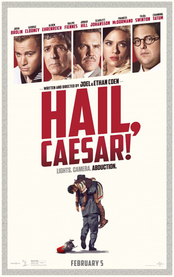
HAIL, CAESAR!

Directed by Joel and Ethan Coen

This movie came out so early in the year, that I think a lot of people have forgotten that this was a 2016 release, which unfortunately has led to it being mostly forgotten by year’s end.  However, I didn’t forget and I especially want to give it it’s due as one of the year’s best because this is yet again another masterpiece from some of the best filmmakers working today; the always brilliant Coen Brothers.  Hail, Caesar is a pitch perfect send up of classic Hollywood; much more so than the also commendable La La Land.  In it, we see all the quirks behind dream factory, and the often eccentric people who live and work within it.  Like all the best Coen Brother comedies, it’s the characters that make this movie memorable; from George Clooney’s dimwitted leading man, to Scarlett Johansson’s foul-mouthed beauty queen, to the wonderfully hokey singing cowboy played by the scene-stealing Alden Ehrenreich.  And like other Coen Brother movies, the film is grounded by a put upon character in the form of Josh Brolin’s studio executive, who unfortunately has to keep his studio under tight control even with all the missteps committed by his sometimes lackwitted cast and crew.  There was just something about this movie that tickled the classic Hollywood cinephile in me, and I think the thing I adored the most were the beautifully constructed representation of old Hollywood film-making.  Really, every single parody of a classic film within this movie is something i would honestly watch without sarcasm.  You can tell this was a cinematic love letter, but, it’s also not without the Coen Brothers’ patented sense for the absurd.  With literal Communist conspiracies, misguided self-destructive behavior, and tabloid driven back stabbing, the Coens show that the Hollywood dream machine was often built on a very corrupt and shady foundation.  And through that, the Coen’s find the catalyst for some brilliant comedy.

3.

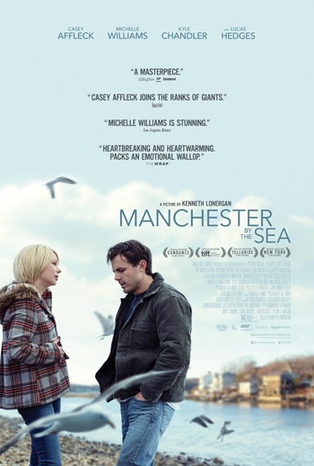
MANCHESTER BY THE SEA

Directed by Kenneth Lonergan

Veteran screenwriter Lonergan rarely steps behind the camera, with 2000’s You Can Count on Me and 2011’s Margaret being his only other two directorial efforts.  But, when he does, he proves to be a master at portraying slice of life stories in small town America.  Manchester by the Sea is a brilliantly told story about a man (played in a stand out performance from Casey Affleck) dealing with grief that too often proves inescapable.  In the movie, Affleck’s character learns of his older brother’s untimely death and has to return to his titular hometown in order to look after his teenage nephew (played by Lucas Hedges).  As he deals with this new tragedy in his life, we also slowly piece together what exactly made him leave town in the first place, and it’s a devastating revelation that tells you all you need to know why someone would turn their back on a quaint little paradise like Manchester.  The movie is very deliberately paced and never melodramatic, which helps to greatly absorb us the viewer into the story.  Lonergan has this incredible knack for capturing authenticity in his characters, and making it feel like they are real people to us, and not just actors giving a performance.  Affleck in particular gives one of the best performances of the year in a quiet, understated portrayal that perfectly conveys the mindset of a tortured soul just trying to make it through life.  The supporting cast is also wonderfully realized in their roles, including Michelle Williams as the ex-wife who has one scene in the movie where she confronts Affleck’s character that is heartbreaking and achingly authentic.  The wintertime New England setting is also beautifully presented and does a wonderful job of transplanting us into this community.  It’s another triumph for Kenneth Lonergan who, even though he has a small body of work to his name, still shows amazing talent as a director.

2.

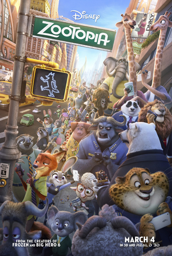
ZOOTOPIA

Directed by Byron Howard and Rich Moore

Disney had a stellar year at the box office, but it seems fitting that the best film to come from the studio this year was from out of their legendary Animation department.  Zootopia is not just the best animated film of the year, but also one of the best animated movies ever made, and one that stands strong alongside many of the other classics from the legendary studio.  The premise seemed simple enough from the outset; a world like our own, only inhabited by animals instead of humans, which is brilliantly realized in the film.  But beyond the skill of the animation, it’s the story behind it that really made this movie exceptional.  This is one of the smartest scripts I’ve ever seen for an animated film, as it tackles the very serious subject of prejudice in society in a way that speaks to audiences of all ages.  Most other animated films tend to sugar coat issues like racism and bigotry in their movies, or sometimes forget the subtlety of their portrayals as well.  Zootopia deals with it perfectly by showing the full reality of it head on, and how sometimes even the good guys can be guilty of perpetuating an unfair system of prejudice.  Honestly, if there was ever a movie that summed up the year 2016, this would be it, as issues of racial division, excessive force from law enforcement, and a political climate manipulated to drive communities apart for the benefit of a select few have dominated our public discourse this year.  But, even with the more serious subject matter, Zootopia is wonderfully entertaining in the way that the best Disney films are.  Also, Jason Bateman and Ginnifer Goodwin give some of the best vocal performances in recent memory for an animated film, and endear their characters of Nick Wilde and Judy Hopps as among Disney’s best.  It’s amazing that the best portrayal of human behavior in our modern society this year came from a movie starring an all animal cast.  It’s a cinematic social lesson that I hope leaves a valuable impression on younger audiences, and motivates them to rise above the prejudices that plague us in society today.

And finally….

1.

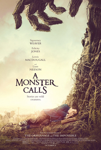
A MONSTER CALLS

Directed by J. A. Bayona

It was a tough call between this and Zootopia as the best film of 2016 for me, but in the end, A Monster Calls just won me over with it’s devastatingly beautiful story.  I caught the film in limited release here in LA, and it is just now being rolled out nationwide, and I strongly recommend it to everyone.  Although, be forewarned; this is a devastating movie that will drive some of you to tears.  The movie deals with a young boy (played by newcomer Lewis MacDougall) who is trying to cope with the failing health of his cancer-striken mother (played by Rogue One’s Felicity Jones) which leads him to a surprising confrontation with a giant, tree born monster (voiced by Liam Neeson) who asks the boy to listen to three stories.  The stories of course are meant to educate the boy and help him deal with his grief, and it proves to be a surprisingly effective form of therapy for him.  The movie may not be for every, and I acknowledge that some of the movie is intentionally manipulative.  But, I was completely absorb by the near perfect execution of this film.  It represented the best cinematic storytelling that I saw all this year and it’s what propelled it to the top of my list.  It felt like a spiritual successor to the character building boyhood movies of my childhood like E.T. The Extra-Terrestrial (1982) and The NeverEnding Story (1987), which underscored the story of a young boy’s coming of age with extraordinary supernatural elements.  The animation of the monster himself is exceptional, riding that fine line between feeling authentically alive, but still cartoonish enough to be a magical manifestation.  Also, Lewis MacDougall gives one of the best performances from a child actor that I’ve seen in recent memory and he carries this film on his shoulders like a true pro.  Blending fantasy and reality together in such a vivid way, A Monster Calls is a new classic in the making and the best cinematic experience I had this last year.

Now, as promised, I will include my choices for the worst films of the year. Keep in mind, I usually try to avoid wasting my money on movies that I know will be bad, but even still, I still managed to wander into a few that sadly reinforced all my worries about all the bad things about the Hollywood machine.  And like 2016 itself, some of them were too ugly reminders of the society we live in.  So, let’s go through the worst movies I saw this year.

5. ALICE THROUGH THE LOOKING GLASS – The Tim Burton movie was bad enough, but this lifeless sequel added nothing better, and just felt like nothing more than the obvious cash-in that it was.  And again, it’s another troubling failure for the once reliable Johnny Depp, who is in desperate need of a new direction in his career.

4. THE LOBSTER – Sometimes there are surrealist films that manage to land and become entertaining, and then there are those that have their head up their ass.  This one is sadly the latter.  A surrealist film that’s confused whether it wants to be a comedy or a drama, and succeeds at neither.  It also wastes committed performances from the likes of Colin Farrell and Rachel Weisz.  In the end, it was one of the most boring experiences I had at the movies this year.

3. THE BROTHERS GRIMSBY – Sascha Baron Cohen rocked the world with his delightfully absurd film Borat (2006), but a decade later, he has lost much of the brilliance in his comedy and is now sadly just falling back on disgusting bodily humor to carry his films.  This spy movie spoof makes you sit through scenes of elephant sex, teabagging, and many more gross-out scenarios that only makes you cringe and never laugh.  Even a bit where Donald Trump ends up accidentally swallowing AIDS tainted blood falls flat.

2. GHOSTBUSTERS (2016) – Honestly, the ugly controversy surrounding this film was worse than the movie itself, but the movie was still bad regardless.  The all-female cast was one of the better aspects of the film, but they are handcuffed by a lame script that is completely devoid of any of the brilliance that was found in the original Ghostbusters (1984).  What we get instead is a studio driven cash-in that is masquerading as a revival of the series.  This movie is a lesson in Hollywood hubris and how you can’t just manufacture a hit franchise, you need to let it be it’s own thing.  Never did I ever think that a movie called Ghostbusters would fail to entertain me, but here it is.

And the worst of 2016 is…

1. INDEPENDENCE DAY: RESURGENCE – There were plenty of bad sequels in 2016, but this monstrosity managed to stink the worst of all.  The original Independence Day (1996) was a dumb movie as well, but it had charm to it, as well as a charismatic performance from star Will Smith.  Both the charm and Smith are missing from this movie, and it’s probably the smartest move for an actor’s career since Keanu Reeves sat out Speed 2 (1997).  Sadly, the other returning actors were not as smart.  Even the always entertaining Jeff Goldblum can’t save this.  Unlike most other filmmakers who refine and mature with every new feature, Roland Emmerich somehow seems to get worse with each new film he makes; and Resurgence is his worst one yet.  Seriously, fans of the original had to wait 20 years for this?  How is it possible that the visual effects for a two decade old movie look better than the ones seen in it’s “more advanced” sequel?  This is a mind-numbingly dumb movie and far and away the most infuriating movie experience that I had last year.

So, there you go.  My 2016 film experience in a nutshell.  Overall, it was a mixed year.  There were fewer movies that I outright hated this year, but also very few that actually left a positive impact as well.  It was more a less a year of passable cinema, which to some is not a good sign of things to come for the industry.  I for one am hoping for 2017 to be a year of pleasant surprises.  In the months ahead, we are going to see if DC Comics are able to sink or swim in this competitive super hero genre as they release their long awaited Justice League and Wonder Woman movies.  Disney hopes to continue it’s hot streak with the ambitious Beauty and the Beast remake, as well as films from their Pixar (Cars 3 and Coco) and Marvel (Guardians of the Galaxy 2, Spiderman: Homecoming, and Thor: Ragnarok) divisions.  Also, let’s not forget the juggernaut that is Star Wars, with the continuation of it’s saga in Episode VIII.  There are also ambitious continuations of the Fast and the Furious, Pirates of the Caribbbean, Alien, Planet of the Apes, and Transformers franchises as well; some audiences are looking more forward to than others. We are also going to see the next big epic from Christopher Nolan (Dunkirk), as well as some new re-imaginings of old monster movies as well (The Mummy and Kong: Skull Island).  Of course, the upcoming festival season will also provide us with movies to look forward to in the more critically acclaimed fall season, but it’s anyone’s guess where the best and worst of 2017 will be found.  As every year before, I will continue to share my thoughts and critical opinions on all the new offerings this year.  I hope my 2016 list helpful for spotlighting some great films you may have missed and that you all continue to have a fun time watching movies this next year.