All posts by James Humphreys

Pacific Rim – Review


pacificrim
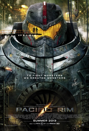
Michael Bay, take note.  This is how you make a movie about giant fighting robots.  From the gloriously fertile mind of director Guillermo del Toro, Pacific Rim is a breath of fresh air in a summer full of depressing films.  One of the trends that I have noticed in the recent slate of Summer blockbusters has been the tendency of filmmakers making their films dark and gritty, to the point where it feels out of place.  This is probably due to the success of Christopher Nolan’s Batman films, all of which benefited from a darker tone.  But when filmmakers try to work any kind of intellectual property through that same mold, the results come out awkward and un-inspiring. Movies like The Amazing Spiderman, Green Lantern, Man of Steel, and The Lone Ranger would have benefited from having a less confused tone and more of an idea of what kind of movie they wanted to be.  Pacific Rim manages to avoid that trap effectively and becomes a film with an actual identity.
Remember when summer movies used to be fun?  Del Toro clearly remembers, and he makes every moment in Pacific Rim a treat for audiences.  It’s funny without being corny; playful without being condescending; and artistic without being pretentious.   It’s all something that’s very surprising for a movie that’s basically about giant robots fighting giant alien monsters.  I had my reservations about the movie to be sure when I first saw the film’s trailer.  I couldn’t be happier to see my doubts proven wrong.  It’s a refreshing summer movie that actually takes it’s premise to its full potential; as simple a premise as it may be.  Guillermo del Toro doesn’t try to force feed his audience anything that this movie doesn’t need.  We come to see giant fighting robots; we get giant fighting robots. There’s no unnecessary interplay and buffonery among the characters like you would see in a Transformers movie.  Also, the movie isn’t padded with pointless comedic incidents like with The Lone Ranger.  It’s a simple story done on spectacular scale and in the end, that’s all it needs to be.
Taking place in the near future, Pacific Rim has a story-line familiar to any monster movie buff. Deep in the Pacific Ocean, an inter-dimensional rift opens up and unleashes giant alien monsters that wrecks havoc on the major population centers along the coastlines of the titular Pacific Rim.  In response to the threat, human beings have invented giant robots named Jaegers to battle and destroy these monsters that they’ve called Kaiju.  To pilot the Jaegers, there needs to be two people sharing the controls and they both have to be linked neurologically together.  To make the mechanisms work perfectly inside the robots, the two pilots have to be compatible physically and psychologically; so the pilots are often related by blood to one another.  One pilot named Raleigh Becket (Charlie Hunnam) has lost his brother in a fight with a Kaiju, which leads him to abandon the Jaeger program altogether.  But, soon he’s brought out of retirement by the program’s director, Marshall Stacker Pentacost (Idris Elba).  Paired up with a fresh new co-pilot named Mako Mori (Rinko Kikuchi), who also has a tortured past of her own, Raleigh reenters the fight with a renewed purpose.
There isn’t much of a story beyond that premise.  The Jaeger team must seal the rift with a nuclear device, but are met with interference from even bigger Kaijus.  There is a subplot involving a set of eccentric scientists (Charlie Day and Burn Gorman) attempting to study the true intentions of the Kaiju, and there’s a run-in with a black market dealer played by Del Toro-regular Ron Pearlman, but together it all doesn’t matter.  They are just the connecting thread for the spectacular fight sequences that make up most of the film.  I’ve never been more content with a film that had thinly drawn characters like these in it.  The characterizations in this movie would make the ones in Top Gun look Shakespearean, but I believe that was the intention of the director and the stars.  We are only given enough development to have the characters earn our sympathy, and then the movie moves on quickly to the action.  Overall, the writing in this movie, from a script by Del Toro and writer Travis Beacham, is deceptively balanced.  By having characters that are simple and strong, the story is able to breathe and stay focused, because it’s not overly complicated with personal dilemmas.  Like Bogart said in Casablanca, “The problems of three little people don’t amount to a hill of beans in this crazy world,” and Pacific Rim‘s characters seem to understand that.  What do our petty issues matter when there is a giant monster coming at us?
Because of this, Pacific Rim is a refreshingly breezy film.  It runs 2 hours and 11 minutes, but it feels a lot shorter.  The pacing is invigorating and doesn’t waste a moment, with only a couple of brief lulls throughout.  The tone is also consistent, demonstrating Guillermo del Toro’s skill as a storyteller.  We’ve seen director Del Toro tackle stories that have ranged for the tragic (Pan’s Labyrinth) to the disturbing (The Devil’s Backbone) to the playful (Hellboy).  Pacific Rim is his most ambitious film to date, and it shows all the work that he’s done to build himself up to this point.  Del Toro is clearly a fan of the kind of monster movies that inspired this story, and that love is felt in every frame on screen.  From the production design of the creatures (many done by Del Toro himself) to the staging of the fights, everything is perfectly crafted to excite and satisfy audiences. Sometimes a crowd-pleasing film will sink to some baser elements just to get a rise out of people, but this film deftly avoids being just a stupid actioner.  There’s creativity on display here and action that actually serves a purpose in the story rather than creating a lot of noise.
The performances also work to the advantage of the film.  Everyone involved knows what kind of movie they’re in and they play their parts accordingly.  I liked how the characters we’re playing off of the archetypes in the genre, very much like how a comic book would portray its characters. There’s no brooding, introspective personalities here; everyone is a walking stereotype, and that’s part of the fun.  I particularly liked the scientist characters, because they were about as cartoonish as you could possibly make them; which is in sync with the tone of the movie, and the actors were perfectly cast.  Charlie Hunnam of Sons of Anarchy fame makes a fine protagonist and he thankfully keeps his character consistently simple throughout.  He just needs to look good fighting, which he does very well.  Rinko Kikuchi is given a little more darkness to her character, but she doesn’t feel out of place here and also plays the part well.  Idris Elba gives a strong commanding performance that helps to anchor the film perfectly and hopefully this movie boosts his star power, because he deserves it.  And I’m probably not alone in saying this, but Ron Pearlman is so Badass.
The film only has a couple, very minor low points; and while they don’t spoil the film overall, they do stand out.  It’s clear that the film is conscious of the cliches of the genre, but every now and then they do affect the movie negatively.  The dialogue is definitely tongue-in-cheek ridiculous throughout, but I could sometimes find it irritating too.  Idris Elba’s Stalker delivers your typical rousing speech to the troops near the end, and while I liked his delivery, I wish that the speech had been stronger.  A moment like that make me think that Del Toro took a “good enough” approach to the scene, which clashes sharply with the more creative parts of the movie.  Other moments like this happen sporadically, though they are thankfully few.  Also, there are a lot suspension of disbelief moments in the film, which audiences are not likely going to think about, but if you start to, they can be hard to swallow; particularly one near the end (At what point did we invent inter-dimensional radio technology?).  But still, they are minor complaints in an otherwise overwhelmingly solid movie.
This was the first movie this summer that made me want to watch it again right away.  That’s a good sign of the movie’s staying power.  This is a textbook example of how to make a Summer blockbuster.  It delivers on its potential and doesn’t try to complicate things with needless plotting. Giant Robots fighting Giant Monsters for a whole movie may not be for everyone, but I can see little else this summer will satisfy anything else that an audience wants.  I personally couldn’t be more grateful to Guillermo del Toro for this movie.  This made my inner 10 year old boy squeal with delight.  It’s the kind of movie that we all created in our minds when we played with our action figures as kids, and now Del Toro has brought it to the big screen.  This is a dream come true for the teenage boy crowd, though I think most girls will also come away entertained as well; and most people too, regardless of age.  It’s been a long time since we’ve seen a movie just forget about trying to be all things for all people and just be what it wants to be, which in the end does make it appeal to all people.  Hollywood should take note.  This is what happens when you let a quality filmmaker make something fun and entertaining without making it follow a trend.  Sometimes it’s better to be different.
Rating:   9/10

Top Ten “Passion Project” Films That Worked

This summer, The Lone Ranger and After Earth came into theaters amid a lot of bad buzz and with bloated budgets.  The failures of these films are noteworthy, but not surprising.  They follow a long line of “Passion Projects” that have come out of Hollywood every now and then.  What makes a movie a “Passion Project” is when a filmmaker puts too much personal investment into a film project that other people, or a studio, doesn’t believe will be a commercial success; but because of the clout that that filmmaker has, the project still moves forward regardless of the risk and the expense. This has often led to disastrous results.  Last week, I highlighted one such example of a film driven by unchecked egos: Heaven’s Gate.  The Lone Ranger  and After Earth do fit the mold of “Passion Projects” that have failed, albeit for different reasons; one was the misguided attempt by producers who felt they could transform any old property into a money-making juggernaut and the other was a movie star trying to elevate his not-ready-for-the-spotlight son into becoming a blockbuster star in the wrong kind of movie.

Though these ego driven  movies often do fail, there are exceptions when they do succeed. Sometimes it happens unexpectedly, while other times it’s when a filmmaker deviates from their proven formula and takes a risk that proves rewarding.  A good “Passion Project” is a film that resonates beyond a good story.  It’s one where you can feel the personal touch of the filmmaker, and see their love for the material on display.  For this column, I have selected 10 films that I believe showcase the most successful “Passion Projects”; some with very unexpected results.
10.
ThatThingYouDo
THAT THING YOU DO (1996)    Directed by Tom Hanks
Tom Hanks was riding high in the mid-90’s, having just won two back-to-back Oscars and starring in another highly acclaimed blockbuster (Apollo 13); so he had the power to do whatever he wanted at this point in his career.  What he chose next was to direct and write his own film, which chronicled the rise and fall of a 60’s rock band.  Though there wasn’t much risk in the actual production of the film, considering it’s modest budget, there was talk about whether or not Tom Hanks was risking his star power in the making of a movie that had limited genre appeal.  This was long before shows like Mad Men made 60’s nostalgia cool, and the story line was very insider driven, detailing the making and marketing within the music industry.  Luckily for Tom Hanks, audiences did soak up the period nostalgia and the film became a modest success.  It didn’t win any awards, but it did cement Tom Hanks’ place as a force to be reckoned with in Hollywood beyond his talents as a actor.
9.
malcolmx
MALCOLM X (1992)    Directed by Spike Lee
Racial politics have always been a touchy issue in movie-making.  Most of time, Hollywood tries to avoid an intelligent argument over race and usually just dumbs down the issues in an attempt to not offend anyone.  Spike Lee has made a reputation of tackling racial issues head on in his films, which he did with the universally praised Do the Right Thing (1989).  Thanks to that film, Lee was able to grab the attention of other filmmakers, who were eager to see what he was going to make next.   What Mr. Lee had in mind was a 3 1/2 hour biopic centered around one of the most divisive leaders of the civil rights movement; Malcolm X.  Suffice to say, producers were worried about how audiences would react to such a film; plus Spike Lee was still a young filmmaker who had never tackled a film on this kind of scale before, or with this kind of seriousness.  The end result ended up being a surprising nuanced and fulfilling epic.  Bolstered by a solid performance by it’s star, Denzel Washington, the movie was praised by critics and generally accepted by audiences. While not a blockbuster, the film did garner a favorable reputation over the years and it showcased the maturity of Spike Lee as a filmmaker.
8.
nightmare christmas
THE NIGHTMARE BEFORE CHRISTMAS (1993)  Produced By Tim Burton
Back in the late 70’s and early 80’s, Tim Burton was a struggling animator at the Disney Studios. After working on films like The Fox and the Hound (1981), Burton wanted to pitch a project of his own to the studio based around his own artistic style.  The studio heads scoffed at the idea, saying that Burton’s art and story-line was too dark for the family audiences that they were aiming for.  Soon after, Burton left Disney to start a new career as a film director.  He found success with films like Pee Wee’s Big Adventure (1985) and Beetlejuice (1988) before hitting it big with Batman (1989).  After Batman crushed box office records, Disney was ready to listen again.  Tim Burton had the clout now to make his story about the collision of two holidays finally become a reality.  But instead of doing it in Disney’s traditional animation style, he decided to have it animated with stop-motion.  The project was a risky sell for Disney, considering the Gothic style, but the end result proved to be a success.  Twenty years later, the film’s hero Jack Skellington has become one of Disney’s most popular characters.  Which goes to show that it’s sometimes worth it to hold on to a good idea until its ready.
7.
INCEPTION
INCEPTION (2010)          Directed By Christopher Nolan
Christopher Nolan supposedly worked on the script to this film over 10 years.  Initially, he had planned to pitch it as his next film after Memento (2001), but at the time, he didn’t have the reputation as a director to pull off something on the scale that he wanted.  Inception was an enormously complex story that required a lot of time to get right, and Nolan chose to sit on the script for a long time as he continued to build his talents as a filmmaker on subsequent projects. Before long, he was trusted with the struggling Batman franchise, which he brought back in a big way.  After The Dark Knight (2008) became a box office phenomenon, Nolan felt the time was right to finally make Inception.  By this time, he had a script that had been finely polished and was ready to be green-lit.   Warner Bros. approved a substantial budget for the film, based on the goodwill Nolan had earned with them, which helped the director achieve the scale that he always wanted for the film.  The end result paid off as Inception became a box office hit; unusual for a high-concept film like this that’s based off an original idea and not a sequel.
6.
citizenkane
CITIZEN KANE (1941)      Directed by Orson Welles
Though Mr. Welles did have an enormous amount of personal clout in the entertainment industry as he took on his first film project, the movie did prove to be a risky adventure.  For one thing, his film targeted the most powerful man in media at the time, William Randolph Hearst, as it’s subject. Orson Welles had already had the reputation of stepping on powerful toes for the sake of art in his years working on the stage, but going after someone like Hearst was an enormous risk, because it could have led to the end of Welles’ career in Hollywood completely.  Not only that, Welles was putting incredible personal effort into doing things his way on the film.  He was given something that few first time directors ever get in Hollywood; complete artistic freedom, which can be misused if given to the wrong person.  Welles did persevere through the controversy, and the movie was a success when it first premiered.  Over the years, it has been considered one of the best films of all times, if not the best.
5.
titanic
TITANIC (1997)        Directed by James Cameron
James Cameron had earned the reputation of being a larger than life figure in Hollywood.  Someone who would always take enormous risks, and in some cases indulging his ego a bit with what he was capable of getting on film, but would always be counted upon to deliver at the box office.  After a string of successful action films, Cameron decided his next project would be an epic love story set around a notorious catastrophe.  The project went forward based upon Cameron’s reputation as a filmmaker, but soon the project looked to be in big trouble.  The budget ballooned to a then unprecedented $200 million, which no one believed could ever be recouped.  Critics believed that the movie would be dead on arrival the moment it reached theaters, earning the project the nickname “Cameron’s Gate.”  And for a film that was over three hours and featured two unproven stars as it’s leads, it looked like Cameron’s luck would run out.  When the film finally was released, it became not just a hit, but the biggest moneymaker of all time, disproving every preconception in the book.  $600 million dollars and 11 Oscars later, Cameron’s reputation in Hollywood was sufficiently secured.
4.
snowwhite
SNOW WHITE AND THE SEVEN DWARFS (1937)    Produced by Walt Disney
While America suffer through the depression in the 1930’s, the Disney Studio was thriving.  Walt Disney had built enormous success with his animated shorts, especially the ones starring the company’s star character, Mickey Mouse.  Seeing the potential of the medium, Disney decided to take the next step forward and make a feature length animated film.  Most of Hollywood thought the idea was ridiculous, believing that audiences would be bored by an animated film longer than 7 minutes.  Walt Disney set out to make it work by putting enormous personal investment into the crafting of the story and the refining of the artwork.  He chose the story of Snow White for the project, which was familiar enough for audiences to understand, but presented its own challenges, particularly with the portrayals of the Dwarfs in the story.  After a while, Walt Disney spent so much money on the project that he actually had to put up his studio and his home as collateral in order to get bank loans to complete the project.  When it finally premiered, the film not only was a success, but it became the biggest hit of the year, out-grossing all other films.  With that success, Walt Disney became a household name and a player in Hollywood to be reckoned with.
3.
passion
THE PASSION OF THE CHRIST (2004)    Directed by Mel Gibson
Before he had his public meltdowns, Mel Gibson had a strong reputation as both an actor and as a filmmaker.  He won an Oscar for directing Braveheart (1995), but it would be years before he would take another stab in the director’s chair.  When he chose his next project, it was one that turned quite a few heads in the industry.  The very devout Catholic Gibson wanted to make a film about the crucifixion of Jesus Christ, depicted in very graphic detail and with characters speaking entirely in ancient languages like Latin and Aramaic.  Setting aside the overtly religious nature of the film, and the controversial accusations of antisemitism, this was a project that the film industry was understandably weary of.  Mel Gibson, in an attempt to preserve his artistic vision, decided to fund the film himself, investing $30 million of his own money.  To help promote the film, he went the unconventional route and previewed the movie for church organizations, in an attempt to earn their seal of approval.  When the film opened on Ash Wednesday in 2004, it shocked the industry by earning $120 million dollars over a five day period.  Hollywood didn’t know what to make of this, and the film ended up changing the way movies with controversial subjects are marketed today.  After grossing $375 million, Mel Gibson had sufficiently earned back his investment and left a significant mark on the film industry.
2.
schindler
SCHINDLER’S LIST (1993)            Directed by Steven Spielberg
Spielberg’s reputation as a filmmaker in the 1980’s was one of someone who made films that had childlike wonder to them, but unable to make anything deeply serious.  That all changed when Spielberg chose to tackle the horrors of the Holocaust in this film.  Documentaries had begun to bring attention the events of the Holocaust, but no one knew how to dramatize it.  Initially, Spielberg approached the project as a producer, taking a personal interest in the subject matter due to his own Jewish heritage.  He handed it off to a variety of directors, including Martin Scorsese and Holocaust survivor Roman Polanski, but in the end, he decided to take on the project himself.  Thanks to Spielberg’s goodwill in Hollywood, he was able to find financial backing, but few believed that he had it in him to give the subject matter the seriousness that it needed.  Not only that, but Spielberg chose to shoot the film in black and white, and the final cut ran a staggering 3 hours and 16 minutes.  No one believed that audiences would be able to sit through such a harsh reconstruction of the horrors of the Holocaust for that length of time, but Spielberg stuck to his vision.  The end result became a touchstone film, earning the Best Picture Oscar as well as a Best Director award for Mr. Spielberg.  The film also earned over $90 million at the box office, proving that audiences would in fact sit through a film like this.  In the end, Spielberg did finally grow up as a filmmaker.
1.
rocky
ROCKY (1976)                                      Directed by John G. Avildsen
What makes Rocky the number one overall “Passion Project” is because of it’s seemingly inexplicable success and underdog status.  Sylvester Stallone wrote the screenplay at a time when he was struggling as an actor.  He didn’t have any clout or any reputation to uphold.  He merely had a deeply personal story to tell about beating the odds and succeeding.  Getting the movie made at all came as a blessing to Stallone.  Much like the hero in the story, the production of Rocky was about underdogs rising to the challenge and not bowing to pressure.  With a modest budget, an unknown cast, and an unproven director, no one expected much out of Rocky.  The movie was also an optimistic story made in a very cynical, post-Watergate time.  As it turns out, that proved to be Rocky’s greatest strength.  It hit a bulls-eye with audiences and became a phenomenal hit that transcended it’s genre.  Stallone became an A-list star over night and the film would go on to win the Oscar for Best Picture.  Overall, Rocky represents the best example of putting personal investment into film-making.  Stallone put what little he had into a story he believed in and it paid off it bigger ways than anybody ever expected it to.
Whether an underdog surprise like Rocky or an expensive gamble like Snow White or Titanic, a successful “Passion Project” can end up pleasing more than just the ideals of the filmmaker, it can mark a significant achievement in film-making and become an unforgettable experience for audiences.   The ten films I chose fit that ideal, and each has a story behind their creations that is just as interesting as the movies themselves.  Good art takes passion, and though it may fail sometimes when the vision is unclear, a successful attempt is all the more worthwhile.

Collecting Criterion – Heaven’s Gate (1980)

HeavensGate

For those who are unfamiliar with the Criterion Collection, it is like manna from heaven for film nerds.  Criterion is an independent home video publisher that includes in its library films that range from the classic to the obscure.  Many of them are foreign masterpieces not widely seen by American audiences (such as the classics of Akira Kurosawa and Ingmar Bergman), but Criterion also adds many lost classics to its library including the films of Charlie Chaplin, or Terry Gilliam’s Brazil (1985), or cult hits like 1958’s The Blob.  What’s so great about the Criterion Collection is that not only do they release these hard to find films onto the market, but they also give them much needed restorations along with a healthy collection of behind the scenes material as extra features. For film buffs, it’s essential to have at least one or more Criterion title in their home video collection. If you’re an avid collector like me, a Criterion set would be like having a masters course curriculum on your shelf.  That’s why I want to highlight select films from the collection with you in this series of reviews, in the hope that it will make some of you consider looking at the Collection as a way broadening your film knowledge as a whole.
Since this week marks the release of a notoriously over-budgeted and under-grossing Western into theaters (The Lone Ranger), I thought it would be appropriate to look at another such Western that had a troubled history.  Today I’m reviewing Criterion Collection #636, Michael Cimino’s Heaven’s Gate (1980).  Heaven’s Gate has earned the reputation over the years as being one of the biggest box office disasters of all time; so much so that it actually led to the bankruptcy of the company that made it, United Artists.  UA had existed since the early years of cinema, when it was founded by D.W. Griffith, Charlie Chaplin, Mary Pickford, and Douglas Fairbanks; the first film company not owned by Studio executives, but rather by the artists themselves.  It was one of Hollywood’s greatest success stories and the company made many classic films over the years, including being the home of the James Bond franchise.  But things turned sour when the company put their money behind director Cimino’s ambitious new epic.  What followed was a perfect storm of ego-clashing and unchecked ambitions that ultimately led to the destruction of many careers.
While it’s unfortunately not included on the Criterion release, there is an excellent documentary that the Trio Channel created called Final Cut: The Making and Unmaking of Heaven’s Gate, which goes into more detail as to what the hell happened with the making of this film.  Basically, the documentary states that Heaven’s Gate was made at the tail end of a period of time when film directors had enormous clout in Hollywood, and were given free reign to make whatever films they wanted.  While this paid off sometimes, such as with George Lucas’ Star Wars and Steven Spielberg’s Close Encounters of the Third Kind, what more usually happened was that studios ended up pouring money into self-indulgent productions that satisfied the filmmakers, but were a tough sell for audiences.  Michael Cimino had just come off his Oscar-winning success with The Deer Hunter (1978), and he was ready to tackle an epic retelling of the Wyoming Johnson County War of the 1890’s as his next film.  What looked like a sure win on paper turned into a nightmare scenario, as United Artists found the film going over-schedule and over-budget within the first week of production.
Cimino’s refusal to play by the rules was one of the main issues behind the film’s problems, according to the documentary, as was United Artists timidity in addressing those problems. The film ended up costing close to $44 million; nearly four times it’s initial budget.  Cimino finished the film after a long 11 month production period, and his first cut came in at an un-releasable 5 hours in length.  UA managed to get Cimino to cut it down to 3 1/2 hours for it’s premiere, which still proved to be a disaster for all.  Critics panned the film and it made only $3 million at the box office.  In today’s numbers, that equals a loss of over $100 million.  The fallout from this could be felt for years afterward.  Of course, United Artists lost it’s independence as a company and ended up selling off all of it’s assets to MGM.  Michael Cimino’s career has never recovered too; he’s only made a handful of modest films since.  Only the cast seemed to come out unharmed, though they don’t look back fondly on the experience.  For a film with this kind of stigma attached to it, it’s a surprise that Criterion has chosen to include it in their collection.
The story follows a Harvard educated lawman named James Averill (Kris Kristofferson) as he tries to defend the immigrant population of Johnson County, Wyoming, of whom many have been put on a death list by the greedy cattle barons of the region, led by Frank Canton (Sam Waterston). While maintaining the peace in his town, Averill is also caught up in a love triangle with a local brothel owner, Ella Watson (Isabelle Huppert) and her volatile hired gun boyfriend Nate Champion (Christopher Walken).  Averill soon learns that he’s powerless against the forces coming up against him, and all he can do is stay true to his position in life, which is to protect the helpless.  Keep in mind, this is a very simple story that takes 3 1/2 hours to tell; one of the main problems with the film.
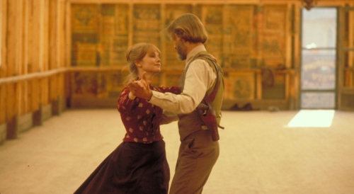
As far as my reaction to the film, I didn’t think it was as bad as the reputation behind it would have you believe.  Is it flawed?  Absolutely, but I’ve seen more tedious films than this.  One of the key problems is the pacing.  It’s not so much slow, as inconsistent.  Some of the scenes are very full of life and engaging, such as the roller-skating dance or the final battle at the end, while other scenes drag on longer than they need to; particularly the ones surrounding the love story elements.  What helps carry the film along are the visuals.  You can see that Michael Cimino put special care into the compositions of his shots, and the cinematography by cameraman Vilmos Zsigmond is top quality. The vistas from the location shooting in Glacier National Park are absolutely breathtaking and really help to transport the viewer into the old West.  The cast likewise is also excellent; with Christopher Walken being a particular standout.  Kris Kristofferson does okay with a main character that is sadly very generic.  Good supporting performances also come from John Hurt and Jeff Bridges, and you also get to see actors like a very young Mickey Rourke and Lost‘s Terry O’Quinn in their first film roles.  All in all, it’s a fascinating watch, seeing this film separated from the toxic reputation behind it.
While the film is a mixed bag, the Criterion edition is nothing short of excellent.  Housed in a two disc set is the restored director’s cut of the film, with a restoration supervised by Michael Cimino himself.  The restoration is top notch, especially on Blu-ray.  When the film was first released, there were no tools available to do an accurate color correction on the picture, so for many years Heaven’s Gate looked washed out in very brownish hues.  Roger Ebert once called it “one of the ugliest films I have ever seen.”  Now, with the technology we have today, Cimino was able to restore the film to the way it was meant to look, especially when it comes to the coloring.  Gone is the brownish tint and all the blues and greens are now in full splendor in this restoration.  The film takes up the whole first disc, while the second is devoted to extras.  Among them is a new, 30 minute audio interview with Cimino, where he details his experiences and perspective on the film. Also included are short video interviews with star Kris Kristofferson, composer David Mansfield, and 2nd Assistant Director Michael Stevenson.  A booklet is also included in the set which includes scholarly essays, as well as a print interview with Cimino.
So, while I would give the film a pass, I do give the Criterion set a strong recommendation.  This set represents what Criterion does best, which is to give a film a proper release where it where it wouldn’t otherwise.  It’s been over 30 years since Heaven’s Gate crashed and burned in theaters, which has led the film to being rediscovered by a whole new generation today.  While I don’t think the film will ever shake off it’s toxic reputation in Hollywood, it can nonetheless stand on its own as a film thanks to the care that Criterion put into their edition.  In any case, watch the film and judge for yourself.  This is a prime example of a quality Criterion release.  I hope to share more with you as this series goes along.  Look through the collection yourself and see if you find a lost gem worth rediscovering.
Criterion

The Lone Ranger – Review


loneranger
One thing you’ll be asking yourself once you leave the theater after watching this film is, “was The Lone Ranger really a character worth investing $250 million dollars into?”  This new film, starring Johnny Depp and Armie Hammer and directed by Pirates of the Caribbean helmer Gore Verbinski, arrives this Fourth of July weekend amid a lot of bad buzz surrounding its bloated budget and lack of interest from advanced audiences.  To their credit, the production company, Disney, did show concern over the production problems early on and nearly canned the project when the first budget estimates were made.
But apparently producer Jerry Bruckheimer reassured them that the film would be worth the huge investment and that by having Disney’s “golden boy” Johnny Depp involved, the production would be a guaranteed international success.  Unfortunately for Disney, it seems that their worst fears are coming true.  There’s little excitement for this film, despite a valiant effort by the Disney marketing team that managed to get someone like me interested.  But the opening night showing I saw was only half full, which doesn’t bold well for the film’s chances this weekend.  All this would lead you to believe that Disney has a huge mess on their hands and yes, the film is a spectacular mess; but it’s also an entertaining one.
The problem that the movie faces is that it is trying to jump-start a franchise that hasn’t been relevant since the WWII era.  Even my parents didn’t grow up that much with the Lone Ranger, so we have a character whose several generations removed from the audiences who knew him best.  The filmmakers are probably aware of this to some extant, so what we have in The Lone Ranger is a story that borrows what we know best about the character (the mask, Tonto, his horse Silver, the William Tell Overture theme music, etc.) and places them within an prototypical Western plot.  The story involves a lawman named John Reid (Armie Hammer), who’s tracking down a notorious criminal named Butch Cavendish (William Fichtner).  Butch ambushes Reid and his posse of deputies and leaves them dead in the desert.  Reid, however, was not mortally wounded and finds himself being buried alive by a quirky Indian guide named Tonto (Johnny Depp).  Tonto believes that Reid has been brought back to life for a reason and the two agree to help one another out as they uncover Cavendish’s villainous plan, which involves silver mining and the Trans-continental railroad.  In order to protect his identity, Reid soon assumes the name of the “Lone Ranger.”
The film’s best aspect is that it does present the world of the “Lone Ranger” very well.  The film is gorgeously shot and feels quite epic at times.  You can defiantly see where all the money went on screen.  The movie presents a version of the West that’s both familiar to audiences, but also skewed a bit to feel unique and of it’s own world.  This was very clear in a scene where The Lone Ranger and Tonto visit a brothel owned by a madam named Red (Helena Bonham Carter).  First of all, I think this is the first time that I can recall seeing prostitution depicted openly in a Disney film, and second of all, it’s a spectacular set piece.  There’s a lot of macabre details thrown about here that really shows off the scale of the film, like an elevated boxcar used to create an arched entrance to the brothel, as well as a carnival atmosphere surrounding it.  Gore Verbinski seems to be channeling Sam Raimi a bit in these scenes, with a mix of both the weird and the epic working throughout, which is understandable given that he did much of the same in Pirates of the Caribbean films.  Though it may have the same vibe as Pirates, I do credit the film for not being a carbon copy of that franchise.  It does have a unique tone that helps it stand apart.
Where the film falls apart, however, is in it’s story.  The Lone Ranger is 2 1/2 hours long, and most of that is due to a lot of needless padding.  You’ll find a lot of scenes that could have been resolved with a simple 30 second conversation turned into lengthy ten minute long action set pieces that have no point to them.  This is clear at the beginning when Tonto and John Reid are trying to escape from a runaway train.  The scene is action packed and features some nice effects work, but it just goes on and on, and in the end has nothing to do with the rest of the plot other than to have the two heroes meet for the first time.  Many other scenes are like that and they do little to enhance what is ultimately a very paper thin plot.  The writers Ted Elliott and Terry Rossio (the same men who wrote the Pirates movies) throw out a lot of twists and turns in the story that show some cleverness, but in the end don’t really add up to much.  The plot is cliche riddled and the big plot mysteries could be figured out within five minutes by a kindergartner.  While some of the Pirates movies could feel bloated at times, there was a sense of urgency that helped to propel the stories along.  Here, it’s missing because the writers seemed to put more effort into the story’s tone rather than the plot.
The characters are a mixed bag as well.  When it comes to the main characters, The Lone Ranger and Tonto work for the most part.  I’m actually glad that Johnny Depp doesn’t just copy his Jack Sparrow shtick in his portrayal of Tonto.  You can tell he put the work into crafting a whole new character, though like Captain Sparrow, the character is mostly played for laughs.  Depp certainly helps carry the film along, and you can see why the filmmakers wanted to play upon his charisma here.  The Lone Ranger is not as smoothly portrayed unfortunately.  Here, John Reid is more Jimmy Stewart than John Wayne.  But, to Armie Hammer’s credit, he plays that aspect of the character very well.  I found myself enjoying his performance and I believe that he can work well as a leading man.  The fault in the character is in how he’s written and not how he’s portrayed.  A lot more could have been done with the development of the Lone Ranger, who unfortunately has the spotlight taken away from him by his more colorful sidekick; as well as a scene-stealing horse.
The villains are also a mixed bag.  William Fichtner gives what is probably the film’s best performance as Butch Cavendish; one of the most loathsome and graphically violent villains to ever appear in a Disney film, if not the most.  Fichtner chews up the scenery throughout the whole movie and brings some much needed life into the film whenever he’s on screen. Most importantly, he brings real menace to the character, which is missing from the film’s other villains.  Part of Cavendish’s characterization involves his taste for human flesh, which he demonstrates by cutting out someone’s heart at one point and eating it.  Graphic onscreen cannibalism, another first for the House of Mouse.  It all makes for a gruesome, but ultimately memorable character.  The same can’t be said for the film’s other villains.  Tom Wilkinson plays a railroad tycoon named Latham Cole, your typical corporate A-hole character who ultimately is behind everything.  Cole’s a bland, forgettable character and a complete waste of an actor as talented as Wilkinson.  Barry Pepper also appears as a prototypical and bland military hotshot, though Pepper does try to add a bit more depth to his performance.
Most of the problems that you can attribute to these characters and the plot is that there is a lot of time wasted on nothing but indulgent visual stimuli.  It all looks good for a second, but after a while, you just wish the story would move on.  The movie suffers a lot from this, until you get to the final climax, which truth be told is one of the best things I’ve seen this whole summer.  The final climax is actually a great, almost perfect finale, which makes you wonder why the rest of the movie wasn’t like it.  It involves a chase with two steam locomotives that’s both playful and heart-pounding at the same time; like something out of Indiana Jones.  I won’t spoil any more, but it almost makes the movie worth it in the end.  You just have to sit through a long 2 hours to get there.
So, again, why was this story worth $250 million?  I’m sure that Disney is asking that question right now.  There are flashes of brilliance thrown about, particularly at the end, but there’s a whole lot of nothing as well.  I think that if they had trimmed this film down to under two hours, they could have had a better movie.  It’s not a bad film by any means, and to be fair I did enjoy my time watching it. But I’m sure not many people out there share my same level of patience.  I think the movie is going to have a bad run domestically, and it might be a hard sell overseas; Westerns are not that big outside the U.S., unless they can capitalize on Depp’s popularity.  As far as bloated, over-budgeted Westerns go, this is still way better than Wild, Wild West (1999), which was just garbage.  There’s some value to The Lone Ranger in the end and you can admire the work that went into it.  Fans of the “Ranger” should be pleased as well as fans of the Western genre in general.  It maybe be an expensive and fatty meal, but it will still fill you up if that’s what you’re looking for.
Rating: 7/10

Stanley Kubrick at the LACMA – Film and Art Museum Report


Kubrick11
Stanley Kubrick was an enormously popular filmmaker not just among his peers and among film buffs, but also within the art community at large.  The body of work that he has developed over the years has transcended all forms of art and collected all together, it is quite a sight to see on display. The Los Angeles County Museum of Art (LACMA) has always spotlighted the art of film within its galleries in the past.  Given that it’s in the “entertainment capital of the world,” I would be shocked if they hadn’t.  But I’m sure that few have been as impressive and as eye-catching as this recent exhibition on the filmography of Stanley Kubrick.  Kubrick made only 13 films in his whole career, which doesn’t sound like much, but each one of those films is considered a classic and they are touchstones for both the film history and cultural history over the last 50 years.  LACMA has put together an impressive collection of artwork, props, costumes and personal documents from each of Kubrick’s movies and has given everyone who visits a great visual history of both the man and his work.
Kubrick2
Kubrick3
Upon entering the gallery, you are greeted appropriately enough by a movie screen displaying selected scenes from Kubrick’s films.  The next room opens up with a large display of film posters at it’s center.  Some of the posters are pretty unique and ones I’ve never seen before, while others I’m sure can be seen hanging on the wall in any film buff’s home.  Across the floor, there is an impressive collection of the camera lenses that Kubrick used on all of his films, including the Todd-AO lenses used on 2001: A Space Odessey (1968) and the extremely large, light sensitive lens used on Barry Lyndon (1975).  The first room also showcases the early works of Kubrick, including Paths of Glory (1957), Spartacus (1960), and Lolita (1962).  There is also a display of Kubrick’s collection of photos, taken during his early years as a photographer for Look magazine.  It’s a lot to display in the first room, and I wish that there had been more emphasis on certain films, particularly with Spartacus and Dr. Strangelove (1963).  I did however find the photography section fascinating, mainly because it shows how Kubrick trained his eye early on in photography, which would have a huge influence in the years ahead.
Kubrick4
The next room highlights Kubrick’s most renowned film, 2001: A Space Odyssey.  This section was the largest in the gallery, and definitely the most popular as well.  On display are original costumes, as well as set pieces like the bright red lounge chairs found on the orbiting space station.  You’ll also find elements used in the making of the special effects in the film, such as the miniature model of the spaceship and the “Star Child” itself.  There’s a collection of research materials found throughout, which gives you a good idea just how well thought out and researched the whole film was.  The displays are impressive, and this is where the exhibition really demonstrates why film art has it’s place within an art museum.  Everything on display demonstrates the work that goes into creating a striking visual image, and each can stand on its own as a work of world-class art.  This is the first room in the gallery that focuses on a singular film, but it’s not the last, as the gallery devotes the rest of it’s space to the later years of Kubrick’s career.
 Kubrick5
Kubrick6
The next section showcases Barry Lyndon, which was a unique film in itself.  The most interesting thing about the movie is that Kubrick used space-age technology to tell a very old-fashioned period piece.  What he did was use very high tech cameras, with the same lenses used by NASA on the Hubble Telescope, to shoot interiors with no artificial light.  It was a technique never done before on film, and it made Barry Lyndon one of the most intentionally artistic films in Kubrick’s career.  It’s good to see that Barry Lyndon is given a lot of attention in this gallery, given how groundbreaking it was in terms of how it was shot.  On display here is the actual “A” camera itself, along with a collection of costumes used in the film.
Kubrick7
Kubrick8
The next two rooms cover two of Kubrick’s darker films, A Clockwork Orange (1971) and The Shining (1980).  These rooms are not quite as detailed as the 2001 room, but do feature some great pieces within.  Primarily, there are a lot of the props from the films displayed here.  You’ll find the mannequins from the Kerouva Milk Bar and the cane used by Malcolm McDowell in A Clockwork Orange, as well as the typewriter and fire ax props from The Shining.  Also on display are some original costumes, including the dresses worn by the two girls in the hallway from The Shining.  Both rooms also do a nice job of matching the color schemes of the two films, with Orange obviously dominating the first room, and stark white walls and blood red carpet dominating the room after it.  Given that these are two of my favorite Kubrick movies, this was obviously one of my favorite sections of the gallery.  They may not have been given the same amount of space as 2001, but it’s still a great display nonetheless.
Kubrick9
Kubrick’s last films, Full Metal Jacket (1987) and Eyes Wide Shut (1999) are given less attention, with only a few props and documents available.  The remainder of the gallery covers the research that went into a project that Kubrick never got to make.  It was a film named The Aryan Papers, which would have been Kubrick’s attempt at a Holocaust film.  Kubrick poured a lot of time and effort into researching the story, but he ultimately abandoned it mainly because Schindler’s List (1993) was about to be released by Kubrick’s friend Steven Spielberg, and because he believed that it was too depressing a subject matter for him to get right.  This section as well as other sections devoted to abandoned projects by Kubrick, like Napoleon and A.I. Artificial Intelligence, give a fascinating look into what might have been.  The Napoleon project in particular looks like it could have been a very impressive epic, and some of the location research into authentic French palaces gives a nice sense of the kind of scale Kubrick was going for.  It also helps to underline the overall theme of the gallery, which is to show the evolution of an artist from one project to another.
Kubrick10
Kubrick111
Overall, this was a worthwhile exhibit to visit and I recommend it to anyone who is a fan of both art and film.  Residents in Los Angeles should hurry though, since the exhibition ends on June 30th, meaning this is the final week to see it.  Admission to the gallery is $20 for adults and it includes admission to all other galleries at LACMA, which has a very impressive collection of both classic and contemporary art.  The Kubrick exhibit was definitely the highlight of my trip, given how much a fan I am of film in general.  As a writer, I especially liked the fact that every section of the gallery included Kubrick’s personal copies of the scripts for each pertaining film.  You get to look over the notes he written on certain scenes, which gives a glimpse into seeing the artist cultivating new ideas on the fly.  There’s so much I could go on about, but it’s better to see it for yourself if you can.  Kubrick is a filmmaker worthy of a place within an art gallery and LACMA should be proud of the show they put on in honor of this visionary man.
Kubrick13
Kubrick12

Man of Steel – Review


manofsteel
Superman has always had a shaky history making it to the big screen.  The character has single-handedly been responsible for some of the most beloved superhero films of all time, as well as some of the absolute worst.  Undoubtedly, there have been more iterations of this character on both the big and small screens than any other superhero, but is it because no one can get the character right?  Hardly.  The Richard Donner-directed, Christopher Reeve-starring Superman:The Movie (1978) is rightfully considered a classic and is still considered a gold-standard by which most superhero movies are judged by today.
The problem with Superman is that he’s a somewhat out-of-date character who constantly needs to redefined to appeal to modern audiences.  Superman was created in a more innocent, pre-WWII period in comic publishing when readers were able to accept the idea of a super-strong man solving crime in tights and a cape.  In the years since, as the world had become a harsher place, more grounded characters like Batman and Spiderman eclipsed the Man of Steel in popularity, and have found an easier road to box-office success.  Superman has had to re-adapt more times than these characters who stay unchanged across history, and this has become the common thread in his cinematic adventures.  Ever since the Christopher Reeve era, we’ve seen no less than 6 new Superman reboots in film and television;  2 on the big screen, 2 on the small screen, and 2 in animation.  Following 2006’s lackluster Superman Returns, we have another, more grittier reboot of the Superman franchise in 2013’s Man of Steel.  Does the film mark a triumphant return of the character, or does it reinforce the character’s irrelevance in modern times?  The former is thankfully what I experienced after watching the movie; for the most part.
The story covers familiar ground for anyone who is a fan of Superman.  It’s pretty much the origin story retold again, but with some significant departures here and there.  In this version, we see Jor-El (Russell Crowe) sending his infant son Kal-El to Earth as the planet Krypton is in it’s final days.  At the same time, the vengeful General Zod (Michael Shannon) is sentenced to exile for attempting a military coup on Krypton.  Zod vows to escape his imprisonment with the intent of finding the son of the man who betrayed him, Jor-El.  Young Kal-El makes it safely to Earth and grows up on a farm raised by the Kents (Kevin Costner and Diane Lane), who name him Clark and help him learn how to focus his unusual powers as well as teach him the moral ways to use them.  As an adult, Clark Kent (Henry Cavill) searches out the clues to his past and learns the purpose of why he was meant to be Krypton’s last survivor.  Once he finally dons the cape, he encounters a tireless journalist named Lois Lane (Amy Adams), who becomes both a confidant and a resourceful ally as he begins to build his new identity as Superman.  Unfortunately, this also draws the attention of General Zod, who has made it to Earth with the intention of building a new Krypton, committing mass genocide in the process.
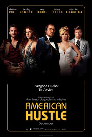
The film takes a few liberties with the Superman mythos and I’m sure that it will split the audiences’ reaction to the film.  For the most part, I really liked the new direction taken with the story of Superman.  It’s more grounded and less reverential to what has come before it.  The good aspects of the Superman character are expanded upon in a big way and the film takes on a very epic feel.  When Superman flies in this movie, it’s with the speed and velocity of a fighter jet, and the film conveys that adrenaline rush perfectly.  At the same time, the movie downplays or outright removes some of the cornier aspects of the character and his mythology.  The relationship between him and Lois Lane is much more maturely portrayed here than in previous installments.  Sorry Donner’s Superman fans, but there’s no romantic nighttime flight with Lois in this version.  The role of Jor-El in this movie is also expanded upon in a way that actually benefits the film’s structure without getting in the way.
A lot of credit goes to director Zack Snyder and producer Christopher Nolan for resisting the urge to play it safe with the character.  This film is a reboot in the truest sense of the word.  The problem that I had with Bryan Singer’s Superman Returns was that it was trying to hard to be a continuation of the original Richard Donner Superman, which caused it to lack an identity and in the end made it a complete bore of a film.  In Man of Steel, there is no confusing this with any other version of the character.  This is a Superman film we have truly never seen before.  I would compare this to how different the Christopher Nolan Batman films are to the Tim Burton ones.  Both have their merits and are interesting interpretations of the character, but can stand on their own apart from one another.  Zack Snyder’s Man of Steel does what Batman Begins did, which is make a clean slate for the character, unbound from everything that has defined him in the past.
The difficult thing with doing a franchise reboot is that you’ve got to deliver a whole lot of back-story that audiences already know and still make it feel fresh.  Man of Steel does manage to fit in a lot of story without feeling forced or bloated, but not everything works so well as a whole.  One thing that does drag the film down is the lack of character development, particularly with Superman himself.  Clark Kent is a fairly one-dimensional character here, who doesn’t go through a whole lot of change throughout the story.  The film is missing a lot of his inner-turmoil, which is briefly touched upon in childhood flashbacks, but never fully fleshed out.  Once Clark becomes Superman, it feels more like an inevitability rather than a payoff to the man’s journey in life.  To his credit, actor Henry Cavill does the best he can to give the character some weight, and he does come off charming as the character, which is a good thing.  But I believe that writer David Goyer should of done a better job of fleshing out the characters here, because they mostly feel like archetypes rather than individuals.
The most rounded character in the film oddly enough is Jor-El, who manages to become a surprisingly involved character in this story-line.  I won’t go into too much detail as to what role he plays in the movie, but his presence does add a little extra depth to the overall story.  Thanks to a balanced performance by Russell Crowe, Jor-El manages to come off as noble, heroic, resourceful, and even sometimes funny, which helps the character stand out amid the rest.  I also like the portrayal of Lois Lane in the film.  We see a lot more of her tenacity and resourcefulness as an investigative reporter here than in any other version of the character.  Amy Adams manages to make the role her own without straying too far from the essentials of the character.  She especially captures Lois’ determination, showing us just how good she is at her job.   Michael Shannon chews up a lot of scenery as the villainous Zod, but he manages to keep it from becoming a distraction and works it well into this film.  In addition, Diane Lane and Kevin Costner give nice grounded performances as Clark’s adoptive parents.  Most of the performances do manage to work in this movie, even if the material is lacking.
Comparisons to Nolan’s Batman reboot are going to be inevitable, and I’m not going to say that Man of Steel reaches that level of success.  What Batman Begins did so well was to build up the character of Bruce Wayne and explain to us why he became the Batman.  Man of Steel doesn’t have that same kind of depth and instead we are shown the “how” of Superman’s origin and not the “why”.  What the film does deliver well is the action.  We see Superman doing what he does best in newer and bigger ways.  This is far and away the most ambitious Superman film I’ve ever seen; at least on a technical level.  Zack Snyder is a visual filmmaker first and foremost, and he does not hold back on the imagery here.  Man of Steel is a very pretty film to look at, and thankfully it is a stylish departure for the franchise.  While it may anger some fans, I am glad to see DC Comics and Warner Bros. taking risks again with this iconic character.  Whether or not everything works in this reboot, it is a step in the right direction and I’ll eagerly anticipate whatever comes next for Superman.
Rating: 7.5/10

The Terrible Threes – The Hard Road of Second Sequels


second sequels
The number 3 seems to be unlucky for film franchises.  That’s the thought that came to mind when I watched The Hangover Part III.  Short review; it sucked, and I’m beginning to see how it falls into a pattern.  Movie franchises seem to fizzle out around the point that a third entry is released.  Unless its a part of a pre-planned trilogy, like The Lord of the Rings, it is very rare to see a second sequel rise to the level of its predecessors.  So, why do so many filmmakers insist on moving forward with a series that has clearly lost steam after two films.  The simple fact is that sequels are easy to make and unfortunately the law of diminishing returns applies far too often.  In many cases, the first and second sequels just repeat the formula of the initial films, and that not only shows a loss in creativity, but it also defeats the purpose of building up the brand in the first place.  Audiences naturally want to see new things when they watch a movie, even when it comes from a sequel.  Some sequels do manage to breath new life into familiar stories; even deviate from the previous ones in wild and interesting ways.  But while you can sometimes catch lightning in a bottle in two tries, it almost rarely happens again.
There are many factors that go into making a great sequel.  A sequel has to know what made the first film a success and do exactly the same, only bigger.  In some cases, a sequel can even far exceed its predecessor.  Director James Cameron seems to take that principle to heart when making the sequels to his films.  In the case with Terminator 2 (1992), he not only continued the story of the first film, but made it bigger and more epic in the process.  For many people, it’s the movie they most think about when the hear the word “Terminator.” It’s no simple feat for a sequel to be the definitive entry in a series.  A more recent example of this would be Christopher Nolan’s The Dark Knight (2008), which became so popular, that it changed the way we market superhero movies today.  We no longer look at Nolan’s films as the Batman Begins trilogy.  Instead, it’s considered the Dark Knight trilogy, which is the direct result of the sequel overshadowing the first film.
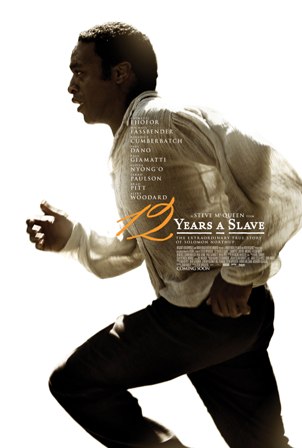
Though the track record for a first sequel is good, there’s less success when it comes to the second sequel.  Once a series hits its third entry, that’s the point where it begins to show signs of exhaustion.  By this point, filmmakers are almost trapped by their own success; having to keep something fresh and interesting long after the good ideas have been used up.  Like I mentioned before, unless a series was planned long ahead of time as a trilogy or more, then most of the creativity will be spent by the time the third film comes along.  It’s very hard to be a sequel to a sequel, and audiences can only take so much of the same story before they lose interest.
The genre that seems to suffer the most from this 3rd film curse is the superhero genre.  Usually superhero films that carry a 3 next to it’s name have ended up being the most criticized by their fans.  We’ve seen this with films like Superman 3, Spiderman 3, X-Men: The Last Stand, and now it appears from this year as well, Iron Man 3.  Even Christopher Nolan’s critically lauded The Dark Knight Rises failed to deliver for some fans.  As is the case with most of these films, they are the follow-ups to very some very beloved sequels; ones that fans had hoped these trilogy cappers would’ve built upon.  There are a couple reasons that could explain why these films have fallen short: one, the audiences’ expectations were just too high for the filmmakers to deliver; two, the filmmakers decided to deviate too much from a proven formula as a means to spur on their creative juices; or three, the filmmakers had clearly lost interest and were just trying to fulfill their obligations. The worst case is when a series decides that it’s ready to be done, without the foresight of establishing a means of wrapping up the story.  This was the case with X-Men: The Last Stand (2006), which haphazardly crammed in a bunch of story points and characters in a film that didn’t need them in order to please the fans expectations as they cut the story off way too short.  The final result was jumbled mess that ended up pleasing no one and it hurt the brand for years to come.
Other franchises also suffer from this pattern, but out of some very different outcomes.  Sometimes, a series does plan ahead and creates a trilogy based off the original film’s popularity, leading to the production of two films at once.  This, however, is a huge risk because it puts the pressure on the middle film in the series to deliver; otherwise the third film will be left out to dry if it doesn’t work.  This has happened on several occasions, such as with the Back to the Future trilogy, the Matrix trilogy, and the Pirates of the Caribbean series.  The Pirates films in particular became so notoriously over-budgeted, that it actually led to the end of studios making simultaneous productions for sequels.  While the receptions of the films are mixed, there was no denying that these series lost steam the longer they went on.  The same happens with the opposite as well, when an unnecessary third film is made many years after the previous sequel.  The Godfather Part III (1990) is probably the most famous example, having come nearly 16 years after the last film, and which extended a story that people thought was perfectly resolved earlier, for no other reason other than to do it all over again.
That’s exactly what most 3rd films end up being: unnecessary.  That’s what I thought when I saw The Hangover Part III.  The series has long exhausted it’s potential and is now running on the fumes.  Could the series have sustained enough interest over three films is another question entirely.  It certainly had enough clout for one sequel.  But whether or not a film series makes it too a 3rd film should entirely be the result of the need to explore the possibilities of the story, and not just to repeat the same formula for the sake of making some quick cash.  These films must be able to stand on their own and not just be an extension of what came before.  The best trilogies are ones where each entry has its own identity, and can entertain well enough on their own without feeling like the extended part of a greater whole.  Films like Return of the Jedi, Indiana Jones and Last Crusade, Goldfinger and The Return of the King are beloved because they entertain while also being an essential part of their overall stories.  And most importantly, they didn’t waste their potential.  Something that the filmmakers behind the Hangover films should’ve considered.

Your Movie is Loading – Digital Innovations and the Resulting Tightened Gap Between Cinema and Home Entertainment


home theater
Growing up through the 80’s and 90’s, it was clear that going to the movies and watching one on TV were very different experiences.  But in the years since, technology has revolutionized the ways in which we experience a movie.  Thanks to innovations like Movie on Demand and digital camera and projection, that line between the two experiences has been clearly redefined.  Film companies can now premiere their projects on multiple platforms whereas years ago, you had to wait for sometimes even a year before you were able to buy a film on video after it left the theaters.  The accessibility of the internet has influenced that shift more than anything; allowing people to see what they want, when they want, all through the process of video streaming.  Like most new things, this shift in how we watch the movies has its pros and cons.  For one thing, it gives exposure to movies and media that normally wouldn’t have been seen years ago, while at the same time, causing previous standards of the movie industry to become obsolete and forgotten.  We live in an era where things are changing rapidly, and I wonder if these changes are just trends or are here to stay for good.
One thing that has changed movie watching dramatically is the actual digitizing of media for home viewing.  Before, we had to to buy a tape or a disc to watch a film at home, but nowadays, many people are opting to just cut the middle man out and download a film off the internet.  Places like iTunes allow for the purchasing of a digital version of a film the same day it’s released in stores, and sometimes even earlier on certain exclusives.  It’s a good place to purchase a movie for those who don’t want to clutter their shelves with DVD boxes.  This has also changed the rental business, with sites like Netflix and Hulu putting old juggernaut rental chains like Blockbuster out of business.  That development right there spells out just how powerful this new trend has become.
But what’s interesting about this change is that the film industry has yet to figure it out.  Accessing a movie through a digital copy or through a streaming service is difficult because there is no standardization.  You have certain movies available on some formats and unavailable on others.  It all depends on who has the contract with the retailer.  At least in the years past, you had standardization with all movies released on the preferred format.  Yes, VHS and Blu-ray had to gain dominance over BetaMax and HD DVD in order to become the standard, but once they did, selections in a video store became only a matter of which title the person wanted.  Nowadays, a person who wants the digital copy of a film has to download multiple media players onto their computer or mobile devices just so that they can watch the movies that they want.  And all of these media providers are competitive enough to survive in this market, so any standardization will not be happening soon.  Perhaps its a good thing for there to be competitiveness in the market of media sharing, as it leads to more innovations, but it has the consequence of making the market difficult to navigate.
One of the things that I do find to be a troubling change is the loss of a movie being an actual physical thing.  It may be strange to think of a movie as an object, but I consider myself a collector as well as a fan of cinema, and when I like a movie, I want to include it in my collection.  I have been collecting movies since childhood, and that has included VHS tapes, DVD’s and now Blu-rays.  I am the kind of person that has multiple copies of a single film in different formats and my library is bound to continue growing for a long time to come.  To me, its just a nice feeling to be able to look at a film sitting on my shelf and see it as a part of a physical history of cinema.  This is why I haven’t digitized my film collection.  I am far more likely to buy a disc of a film rather than download one, mainly because I still prefer holding a movie in my hand, even though the idea of having everything stored on a computer is one that I do understand.  For many, a digital copy is a preferred method for people who have been wanting it for a long time and in many ways it’s the faster and easier mode of distribution.
This trend has definitely changed distribution in Hollywood in a good way.  Some movies in the past have struggled to get appropriate distribution, whether they lacked the funding or they were just too risky a project for the studios to make a fuss about in the first place.  In some cases, movies would become hits long after their run in theaters, once they were seen on cable or home video; cult classics like Office Space (1999) or Clerks (1994).  Now, it is possible for a film to bypass the pressure of a theatrical exhibition and be seen almost immediately on whichever format a person chooses.  This is especially true with documentaries, which can be seen on anything from movie screens to YouTube, and not lose any of their impact.  Director Kevin Smith saw the potential in this multi-platform model of release, and decided to self-distribute his most recent film Red State (2011) outside the Hollywood system.  The results were mixed on the success of the release, but Kevin Smith did make waves due to the attempt, and it has made multi-platform distribution just as viable a trend as anything else we’ve seen in the past few years.
Another surprising thing that technology has done to the film industry is to change the way films are both made and processed nowadays.  Digital photography has advanced so much, that it’s oftentimes hard to tell if a movie is shot digitally or not.  Digital projection has certainly taken over cinemas completely, as it’s now hard to find a place that still runs film prints; another sad change, where a film stops existing as a physical thing.  But digital projection has been around long enough to make audiences no longer see any real difference, unless they have a trained eye.  The same goes for digital photography.  Digital cameras are now able to shoot in such high resolutions that it actually exceeds the clarity of regular 35mm film.  This has enabled some new advancements in the presentation of movies, like Digital 3D and 48 frames per second.  While unique, these trends are sometimes just a gimmick, and are usually dependent on the quality of the film to work for an audience.  But the trend has moved in favor of digital photography for a while now.  Only a few filmmakers have stuck by traditional film, like Quentin Tarantino and Steven Spielberg, but for many filmmakers who have limited means and want to bypass the film processing phase, they are embracing the new technology with great enthusiasm.
This has also crossed over into television as well, which has made that line between cinema and home entertainment even more blurred.  TV shows today are filmed mostly with digital cameras, and that has significantly changed what kinds of TV productions that are seen now.  Shows like Game of Thrones and The Walking Dead are done with such complexity in their production, that they can be comparable to the quality of a theatrical film.  This is thanks to digital camerawork that is able to replicate film clarity and allows for manipulation in post production, either through color grading and/or the additions of visual effects.  Years ago, there was no mistaking the difference between what a film looked like and what a TV show looked like.  They were completely distinctive forms of entertainment.  Now the gap has tightened, and it’s probably what has drawn more people towards home viewing.  Can you imagine what shows such as M.A.S.H and Happy Days would be like if they were made with today’s technology.
It’s an interesting tug-of-war that we are seeing today between film and television; one that has been brought about through digital innovations.  While some things will never change, there are other trends that have clearly made things different than what we grew up with.  I for one have my line with what I’m willing to embrace from these new trends, but I am pleased to see so many advancements made in the last few years.  I certainly like the increased accessibility to films that I would normally have had trouble finding.  Digital photography has also made television a whole lot better in recent years.  But, I also miss the experience of working with actual film.  My years as a projectionist gained me a strong appreciation for the look and feel of a film print, but it’s sad to see it become an obsolete tool in film presentation today.  Also, while digital presentation and video streaming are convenient and innovative, the movie itself is what will make or break the investment in the end.
Ultimately, there’s nothing that beats a good time at a movie theater with an auditorium full of people.  Home entertainment may be at a high standard now, and techniques like 3D and high frame rate may be eye-catching, but it ultimately comes down to the human factor.  I enjoy watching a movie, no matter what technology is behind it, as long as it remains entertaining.  And that’s an experience that will always be timeless, even if the ticket prices are getting painfully and astronomically higher.

Top Ten Movie Posters

Apart from the making of a good movie, the most important thing in the film industry is being able to sell your production to a wide audience.  A movie can be made and undone on the effectiveness of its marketing, regardless of the quality of the film itself.  The greatest outcome of a good marketing campaign is when great works of art can come out of it.  Movie posters have become popular collectors items over the years, and in some rare cases, can become more famous than the film itself.

Oftentimes, a great movie poster creates an iconic image that not only conveys the film its trying to sell, but can also stand alone as a work of art.  I know of many people who will gladly hang a movie poster up in their home or apartment instead of a classic painting.  Great artists like Saul Bass and Drew Struzen have dedicated their entire careers to crafting film art, and have left an incredible legacy in their wakes.  I have chosen here what I think represent the best of the best.  The following are chosen mainly for how well they draw the eye of the consumer in, convey the basic elements of the movie and how well they stand on their own as a work of art.

10.
Vertigo_Afiche
VERTIGO (1958)
One can’t talk about film art without mentioning the name of Saul Bass.  This artistic Renaissance man was the most prolific designer of his time.  He designed everything from movie posters, to title designs for a films opening credits (many of the Hitchcock films), to novel covers (James Bond Series), to even corporate logos (like AT&T and United Airlines).  Bass’ was a favorite of Alfred Hitchcock, and his artwork is all over a film like Vertigo.  The poster above represents Bass at his absolute height, and features some of his most haunting imagery.  The spiral at the center immediately draws your attention and gives the observer a sense of falling, which is interpreted well with the silhouetted figures floating within the center.  Bass almost always used large blocks of color and sharp geometric shapes to convey an image.  The poster for Vertigo stands apart because of how perfectly it ties all of Bass’ many tricks together.
9.
 moon
MOON (2009)
One of the more striking and original posters in recent memory was this image from the brilliant, but sadly under-seen indie film Moon, directed by Duncan Jones.  Designed at the All City Media agency in Britain, this poster is a perfect example of the “less is more” approach.  The image contains the film’s star, Sam Rockwell, standing on a spherical spiral, against an empty black space.  The design seems very influenced by the work of Saul Bass, given the geometric and patterned sphere in the place of an actual Moon surface.  The poster is able to very simply convey the film’s theme of isolation, without giving anything away about the plot.  And again, the shapes draws your eye in; with the strange patterns that your vision creates when you look at a spiral for a period of time.  This poster shows how even a small, quiet film can have an A-quality movie poster.
8.
silenceofthelambs
THE SILENCE OF THE LAMBS (1991)
The Silence of the Lambs had a lot of elements that could have easily been exploited in an ad campaign.  Although, at the same time, the controversy of the subject matter may have caused the marketing team to stress caution when selling this film.  Either way, audiences were treated to the striking image above, which not only presented us with creepy imagery, but also an ambiguous-ness about what it means, which perfectly underscores the fact that this is a mystery film, and not just a horror show.  What strikes me is that the designers (BLT Communications) never used the iconic character of Hannibal Lecter in any of the poster art.  Instead, we have a ghostly image of star Jodie Foster, with her mouth covered up by a moth with a skull-like pattern on its back.  When you watch the film, the moths are hardly a factor in the story at all, and not once do they fly onto Jodie’s mouth.  The team behind this poster had the good sense to draw on their own imaginations and create a poster image that instantly drives the viewers curiosity, and appeal to their twisted sides, even when it’s detached ultimately from what the film is about.  In the end, getting the mood right is what matters.
7.
Casablanca
CASABLANCA (1943)
This is the quintessential classic movie poster.  It does what every good ad from the era should do, and put its stars front and center.  The poster is appealing because of the way the different characters are collaged together, with their eyes all meeting to an axis point in the center.  The titles also do a nice job of selling the stars as well; with the names Bogart, Bergman, and Henreid in big, bold letters.  The title of the film is boldly highlighted in red lettering, which instantly grabs the attention of the viewer.  Back in the old studio system, the stars meant everything when it came to selling a film, and this poster presents that idea with great style.  I particularly like how Bogart has his gun out and ready, obviously drawing upon his already strong reputation from the crime films he had done in the past.  The poster is packed, but not cluttered, giving each character a clear mugshot on the poster; though Bogie is given preference to be sure.  This poster is often the inspiration for many retro posters for period films we see today (i.e. Captain America), which shows a good classic design never goes away.
6.
darkkight
THE DARK KNIGHT (2008) – JOKER ONE SHEET
Comic book films often inspire some great artwork for their ad campaigns.  Sometimes, the posters can simulate a feeling of a comic book come to life better than the movie itself.  The Dark Knight Trilogy from Christopher Nolan took it’s source material in a particularly gritty direction, especially when it came to the characters.  In the middle film, The Dark Knight (2008), audiences were treated to the return of Batman’s arch-nemesis, The Joker, and it is clear that the marketing for the film wanted to give this iconic character his due.  There was a lot of Joker related artwork made to sell this film, but the one above really stuck out.  It’s a disturbing, ghostly image of the Joker, standing in front of a window glass and writing the phrase “Why So Serious” out in what appears to be blood, complete with a bloody Joker grin.  This image, also from BLT Communications, sets up this new take on the Joker perfectly, being both chilling and alluring at the same time.  This poster took on a whole different resonance only weeks after its release, due to the passing of Heath Ledger, the actor who played the Joker in the film.  The fact that actor is obscured within a ghostly mist in the image, makes the artwork feel all the more haunting.
5.
jaws
JAWS (1975)
Jaws marked the beginning of the age of Blockbusters, and that was in large part due to the inventiveness of its advertising.  Artist Roger Kastel was commissioned to create an image that would perfectly sell a troubled movie production about the hunting of a Great White Shark.  What he came up with is the now iconic image of a female swimmer on the water surface, with Jaws the Shark lurking and ready to attack right underneath.  It’s a frightening image that tells a story all on its own, without any context with the movie itself.  In the actual movie, the shark doesn’t actually appear until halfway through, but that didn’t matter in the end.  People’s imaginations were already piqued by the image on the poster and they were willing to sit through the first half, just so that they could see the Shark once he finally appeared.  In many ways, the poster image helped to save the filmmakers who were worried that there weren’t enough scenes that showed the actual shark, due to technical problems.  The audiences filled in all the off-screen mayhem with their imaginations, knowing what kind of creature was causing all of it and in the end, the shark did work. Just not the one on the screen.
4.
Chinatown
CHINATOWN (1974)
Being both a retro flashback and a sleek work of modern art itself, the poster for Chinatown is almost a great metaphor for the movie that it’s selling.  The movie, directed by Roman Polanski, is a brilliant neo-noir that is clearly inspired by the era that it’s trying to recreate, the 1930’s, but done with the styles and and the cynicism that were a part of the era of the 1970’s.  In the poster image, painted by artist Jim Pearsall, we see that mixing of two eras in a striking and beautiful way.  The image of Jack Nicholson, playing Detective Jake Gittes, looks like its been pulled off the cover of some pulp crime novel from the height of the 30’s.  Above that, we get a trail of smoke that frames the ghostly image of actress Faye Dunaway’s face.  This part of the image feels very psychedelic in nature, which is representative of the period in which this film is made.  Like the movie, the poster is both very classical and very modern; using the best of both styles to create an instantly striking image.  The colors also balance well off each other, with the sickly yellows, greens, and blues.  It’s a beautifully layered image that reveals a lot more than what’s on the surface.
3.
Amadeus
AMADEUS (1984)
This is one of the best examples of movie posters as an art-form.  Inspired by the original stage production art, the movie’s ads kept the same iconography, but embellished it more, creating the image above.  I have always been struck by the image of the masked figure in this poster.  The piercing eyes instantly draws your eyes in, like a macabre Renaissance portrait.  In addition, the tri-fold hat it’s wearing looks like a crown, with the performer surrounded by stars in the center looking like a radiant jewel on top of it.  And the figure holds out its arms, like it’s trying to embrace you and welcome you in.  I was fascinated by this image for years before I even saw the film.  Nothing about this image told me that it was about the story of Mozart, and that the mysterious figure is a representation of his father, but I was still fascinated none-the-less.  Thankfully, the film lived up to the promise.  The poster is a great example of transcending the story it’s trying to tell.  Yes, the image does represent a key part of the film, but even without that, it is still intriguing to the eye.  It does what great art should do; make the observer want to look deeper into it.
2.
JurrassicPark
JURASSIC PARK (1993)
This is the best example of simplicity in poster art.  Steven Spielberg’s thriller showcased some of the most remarkable visual effects ever put on screen, and featured some of the most realistic looking dinosaurs anyone had ever seen.  Yet, the marketing for the film avoided showing all that; at least in the one-sheets.  In the poster art, we get nothing but the logo used in the film for the titular park, set against a black background, with the phrase, “An Adventure 65 Million Years in the Making” below.  And in the end, that’s all we really need.  The image of the logo alone perfectly conveys what the movie is about; an attempt by man to control nature and recreate a race of extinct creatures, merely for the purpose of amusement and financial gain.  In a way, the poster is almost mocking the idea of targeted marketing, with the innocuous design of a corporate logo, while at the same time trying to market the film.  The designers knew about the power of logo design and used it perfectly here as a way of marketing the film without revealing too much.  Simple and effective, and instantly recognizable; all of which makes a great poster.
1.
backtothefuture
BACK TO THE FUTURE (1985)
Drew Struzen is the not a household name, but he should be.  The man has created some of the most iconic poster art in the last 30 or more years.  He’s the guy responsible for the poster art on all 4 Indiana Jones films, along with several other Spielberg blockbusters.  He’s also done poster art for the Star Wars prequels and movies like Blade Runner, The Goonies, Harry Potter, and The Muppet Movie just to name a few.  With his hand-painted artwork, Struzen has the remarkable ability to not only convey the elements of a movie, but to also make it feel as big as possible, even if the movie is not as epic as he’s portraying it.
 What I think best exemplifies Struzen’s style, and what also makes it the best film poster of all, is the one above for Back to the Future.  The movie at it’s most basic level is a Sci-fi comedy, done on a modest budget with a solid script.  In the hand’s of Drew Struzen, we’re delivered an image that seems to convey a great Sci-fi adventure, just by the way the poster is composed with it’s coloring and staging.  Struzen took the image of Marty McFly and the DeLorean time machine and embellished it with a glowing aura coming from within the car itself.  Add to that, the fire tracks on the ground and the smoke in the sky and we get a sense just by looking at the image that something amazing has happened.  This poster is actually one of Struzen’s simpler designs, which makes it a standout.  Struzen’s art is often imitated, but I’ve rarely seen one out there copy this.  It’s a great example of simple design that gets the point across while at the same time making it seem larger than life.  This is a poster that you’ll find in many film geek collections, and with good cause.  It’s represents Struzen at his best and is the best movie poster ever created.
That’s my list of the Top Ten film posters of all time.  I’m sure this list could change over time whenever there are more great ad campaigns in the future.  For those reading this, I would gladly like to hear what you think are the best movie posters ever made.  I will also gladly hear any suggestions for future top ten lists.  I may do a worst 10 poster list someday, but it may be a while, given that there are so many bad ones out there.  Anyway, thank you for reading.

Star Trek Into Darkness – Review


STAR TREK INTO DARKNESS
Four years ago, the Star Trek franchise boldly went in a different direction by doing something unexpected; going all the way back to the beginning.  In the plainly titled Star Trek (2009), audiences were treated to a surprisingly effective reboot of the series featuring the original, iconic characters.  The reboot was a huge risk, given the backlash that could have come from the hardcore Trekkie fanbase, but the end result proved to be a resounding success, becoming the highest grossing Trek film ever.  I believe that a large part of the film’s success came from the unconventional choice of a director; in this case, famed TV Writer/Producer J.J. Abrams.  Abrams had only directed one film prior (the underwhelming Mission: Impossible 3) and had stated that he was never much of a Trek fan before taking the job.  This proved to be a good thing for the making of Star Trek, because Abrams set out to make a film that he would want to watch, broadening the appeal of the series beyond its fanbase.
This is why I liked the reboot so much because like Abrams, I was never much of a Trek fan myself.  Star Trek was a movie that finally helped me to understand why this series has been a fanboys’ and girls’ dream all these years, and I was incredibly pleased to finally see a big budget movie that put emphasis back on the characters and plot rather than in the special effects.  I particularly loved the casting in the film, as far as finding actors who could embody these characters without trying to mimic the original actors’ performances.  Of course, given the movie’s enormous success, a sequel had to happen.  After a long wait, the much-anticipated follow-up has come.  Star Trek Into Darkness, picks things up right where the previous film left off and returns the entire cast and crew, along with J.J. Abrams back in the directors chair.  A lot of hype has surrounded this film, given the strong reception of its predecessor, and I was certainly among those hoping to see a great follow up.  Thankfully, this sequel is no let-down.
I can’t really go far into detail in the plot without revealing a few spoilers.  Basically it follows Captain Kirk (Chris Pine) and the crew of the Starship Enterprise as they track down a mysterious terrorist named John Harrison (Benedict Cumberbatch), who has struck the very heart of Starfleet, murdering many high-command officers in the process.  Kirk is given charge to hunt Harrison down and kill him without mercy, an order the vengeful captain gladly accepts.  Despite protests from his crew, including Spock (Zachary Quinto) and Scotty (Simon Pegg), Kirk finds Harrison hiding out on Kronos, the Klingon home planet, which is un-friendly ground for defenders of the Federation.  After a confrontation, in which Harrison single-handedly takes on a whole army of Klingons, he and Kirk finally meet, and this is where the mystery starts to unfold.  The remainder of the story is full of revealed secrets that both pay homage to past Trek lore, while at the same building a solid mystery at the center of the film’s plot.
Without spoiling a lot, suffice to say, the story holds up very well.  This is an excellent follow up to the previous film; staying true to what’s been done before, while at the same time taking big risks and pushing the series further.  One big difference is the size and scope of the movie.  J.J. Abrams gives Into Darkness a much more epic feel than the previous film.  The action set pieces are incredibly ambitious and will have most audiences on the edge of their seats.  At the same time, the film still manages to keep its focus on the characters in the story, another excellent carry-over from the previous installment.  I’m still very impressed with the actors playing the crew of the Enterprise.  Zachary Quinto manages to hold his own as Spock, even when sharing the screen with the original Spock himself, Leonard Nimoy.  Chris Pine still pulls off any amazing feat of playing James T. Kirk without ever slipping into any Shatner-isms.  The film also features a lot more of Simon Pegg as Scotty, which is always a good thing.  In fact, every iconic character gets a good moment in this movie; even Chekov (just watch his reaction when he’s told to put on a red shirt).
However, the standout here is definitely the villain.  Benedict Cumberbatch delivers an astounding performance as John Harrison; a man who is much more than he seems.  There is a big reveal half-way through the film about his character that could’ve easily been done poorly if played by the wrong actor.  Thankfully Cumberbatch sells it perfectly and is able to make the character work well enough as the film’s antagonist, even setting aside where he fits within the Trek universe.  The performance is so nuanced and memorable, that it really doesn’t matter who John Harrison really is in the end.  He could be named anybody else, and the character as he is in the film would’ve still made a memorable villain.  I’m hoping that this movie gives Benedict Cumberbatch a good career boost.  If you haven’t seen his work on the BBC’s Sherlock, I highly recommend you do.  He’s a very talented actor, and I’m happy to see him utilized so well in this film.
Unfortunately, the movie is not without some flaws.  In particular, it has a very lackluster final act.  Without going into too much detail, I will only say that the film oddly loses some of its focus in the last 30 minutes or so and starts to rely too heavily on plot conveniences and action film cliches.  One of the things that these movies have done so well is pay homage to the original Trek films and series with several well placed references.  For the most part, the references are well handled here, until the later part of the movie, when they start to become very heavy-handed.  One scene in particular is almost lifted entirely from an previous film, and it will probably rub some die-hard Trekkies the wrong way.  Not only that, but the final confrontation with the villain is kind of a letdown, given how the rest of the film has been leading up to it.  The especially problematic part is that it leads to some out-of-character decisions made by the good guys, many of which don’t make that much sense.  All of this creates a remarkably messy finale, which is not made better by a very rushed ending.
This doesn’t mean that it ruins the movie as a whole.  I very much liked 2/3 of it, and I would still strongly recommend it to everyone.  Most things are done right and I definitely think it’s a worthy follow-up to the previous film.  The last 30 minutes of the movie does make it a lesser film, however, and I’m puzzled as to why J.J. Abrams and his writers decided to go in the direction that they did in the final act.  They had done such a nice job with the previous 90 minutes, so what happened?  It seemed that either Abrams was under a lot of pressure to fulfill audience expectations or he just didn’t know how to make old familiar tropes feel authentically in place in his story-line.  Whatever happened, the movie still works.  He may have stumbled over the line, but Abrams was still able to finish the race.
This also marks J.J. Abrams final outing as the standard-bearer of the Star Trek franchise.  In 2015, Abrams will take over the reigns of the Star Wars franchise, crossing a bridge between two beloved galaxies that no one ever thought could be crossed.  Into Darkness does end with the promise of more adventures to come, and I definitely would love to see more, especially if they keep this cast intact.  That ultimately is the best thing about this particular film; it left me wanting more in the end.  Despite its flaws, Star Trek Into Darkness is an enormous crowdpleaser, and it should be embraced by all audiences, Trekkie or no.  I look forward to seeing more adventures with the crew of the Enterprise in the future, because after seeing how well the door’s been opened to new possibilities by Mr. Abrams, the sky really is the limit.
Rating: 8/10